7 Common Image Editing Mistakes That Make Your Photos Look Worse
A photo can get brighter, smoother, more colorful, and apparently sharper—and become less convincing at every step. The problem usually isn’t a lack of editing tools. It’s using the wrong adjustment for the problem, or judging an improvement in isolation instead of looking at the finished image.
Not every photograph needs natural colors, open shadows, or razor-sharp detail. A deliberate creative treatment is different from accidentally destroying texture or making your subject harder to see. These seven mistakes focus on that distinction: how to recognize when an edit is hurting the photo, and what to do instead.
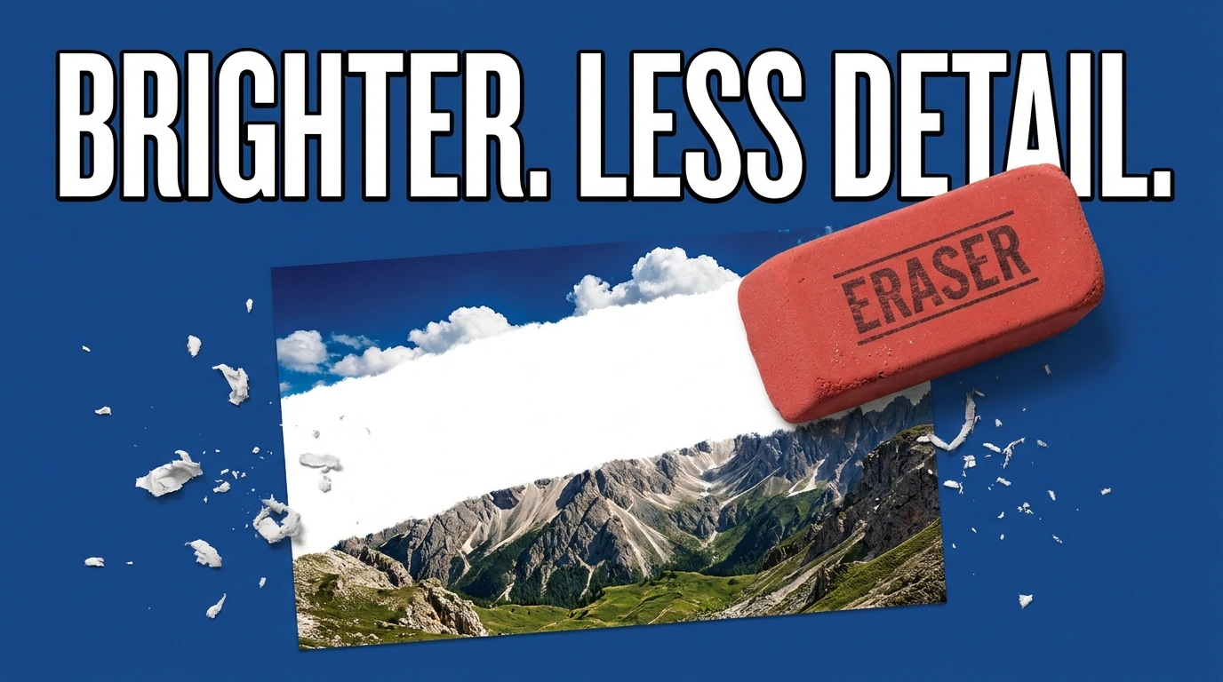
1. Pushing brightness and contrast until important detail disappears
Making a photograph brighter doesn’t automatically make it better. A white shirt can become a featureless patch, clouds can lose their shape, and a person’s forehead can look washed out. The opposite mistake—darkening everything to create a “moody” look—can hide eyes, clothing texture, or the product you’re trying to showcase.
The useful question is not “Does this image look bright enough?” It’s “Can the viewer still see the information that matters?”
Watch a few specific areas while adjusting tone: folds in bright fabric, texture in dark hair, and detail on the main subject. If those areas lose their internal variation, you may be trading useful information for a stronger first impression.
A histogram helps you see the tonal distribution: dark values sit toward the left, bright values toward the right. Adobe’s visual guide to reading histograms explains the graph and clipping warnings. But don’t try to force every photo into a centered bell curve. A snowy scene and a nighttime street should not have identical distributions.
A more reliable correction sequence is:
- Set overall brightness by looking at the main subject, not just the background.
- Check whether important highlights and shadows retain texture.
- If only one region needs help, adjust that region locally rather than moving the entire image.
For example, a backlit portrait may need a brighter face, not a brighter sky. A local adjustment can solve that separation problem without sacrificing the background.
In Photoshop, a Levels adjustment layer also lets you adjust midtones separately from the black and white endpoints. As shown in Adobe’s Levels instructions, holding Alt on Windows or Option on macOS while dragging the black or white input slider previews clipping.
Some pure black or white may be intentional, especially in silhouettes or tiny reflections. The mistake is clipping the details your photograph depends on—not allowing any clipping whatsoever.
2. Using saturation to compensate for incorrect white balance
If faces look orange, white walls look green, or a product’s color seems wrong, more saturation usually makes the problem louder. Less saturation may conceal it, but often leaves the photograph lifeless without fixing the underlying color cast.
Separate two questions: Are the colors balanced correctly? And how intense should those colors be?
Start by temporarily backing off any dramatic color treatment. Then correct white balance using Temperature for the blue–yellow balance and Tint for the green–magenta balance. Adobe’s Camera Raw color-adjustment guide explains these controls, along with selective color adjustments.
If you use a white-balance eyedropper, sample something you know should be neutral. A gray reference card is useful; a random beige wall is not. Avoid a completely blown-out white patch or a shiny reflection, since neither provides a dependable neutral reference with meaningful tonal detail.
You don’t need Photoshop to make this correction. Apple’s white-balance instructions for Photos on Mac show how to use a neutral-gray sample and Temperature/Tint controls in that editor.
Once the balance looks plausible, decide whether color intensity needs changing. Often the better move is reducing one distracting color—such as overly vivid foliage—rather than increasing or decreasing saturation everywhere.
Two situations deserve extra care. First, mixed lighting may leave one side of a face warm and the other cool; a single global correction cannot independently balance both regions. Second, warm sunset light may be exactly what makes the picture work. Don’t neutralize an intentional atmosphere just because an eyedropper can.
A useful final test is to inspect a neutral object, a person’s skin, and the most saturated object in the frame. If one looks right only when the others look wrong, revisit the correction rather than adding another global filter.

3. Making every surface gritty—or smoothing away real texture
Clarity, texture adjustments, dehazing, and noise reduction can all help a photograph. They can also pull it in opposite directions: one makes every surface aggressively detailed, while another removes the small variations that make those surfaces believable.
The overprocessed version often has exaggerated skin texture, harsh transitions around buildings, or outlines around objects against the sky. The oversmoothed version has waxy skin, clumped hair, and fabric that looks painted instead of woven.
Clarity is primarily a local-contrast adjustment, not a replacement for missing resolution. Adobe’s effects-and-detail tutorial demonstrates how excessive Clarity creates an over-crisp appearance and how Dehaze can also increase color intensity. That matters when several “make it pop” adjustments are stacked together.
Noise reduction involves a different trade-off. More smoothing can remove unwanted grain, but it can also remove actual fine detail. Adobe’s noise-reduction documentation explains how its detail and contrast controls balance preservation against cleaner-looking results.
Instead of inspecting the whole photo vaguely, check three areas:
- A smooth region, such as a wall or sky, where unwanted noise is easy to spot.
- A fine-detail region, such as eyelashes, hair, leaves, or fabric.
- A high-contrast boundary, where halos and unnatural transitions become obvious.
Evaluate these at 100% magnification, then return to the intended viewing size. Reduce the offending adjustment if the detailed region becomes smeared or the boundary develops an obvious rim.
Also toggle related adjustments off individually. If the image already has strong local contrast, additional texture enhancement and sharpening may push it too far.
The goal is not necessarily a perfectly smooth image. A little visible grain can be preferable to losing the texture that tells the viewer what they’re looking at. And once excessive smoothing has removed detail from a rendered image, aggressive sharpening is not a reliable way to restore it.

4. Trying to sharpen your way out of insufficient resolution
A small image stretched across a large composition has a different problem from an adequately sized image with slightly weak edge contrast. Sharpening can improve the latter. It cannot make the former contain the same captured information as a larger original.
This is why an undersized photo can look simultaneously blurry and over-sharpened: the broad shapes remain vague, but their edges acquire harsh outlines.
Before adding another detail-enhancement adjustment, check the actual pixel dimensions. A 1000 × 750 image intended for a 2000 × 1500 output needs a twofold increase in both dimensions. Changing its resolution label from 72 to 300 PPI without resampling does not add pixels; Adobe’s explanation of image size and resampling makes that distinction clear.
First look for a better source: the original camera file, the full-resolution download, or the image before a tight crop. A screenshot or thumbnail is rarely the best starting point when a larger version exists.
Use enlargement for a size problem
If the best available source is still too small, upscaling is the relevant operation. Conventional interpolation calculates additional pixels from the existing image. AI-based enlargement can go further by inferring fine texture and producing a more detailed-looking result.
For folders of undersized assets, Bulk Image Upscaler: Batch-Enhance Resolution automates Photoshop enlargement and export. It offers Firefly, Topaz Gigapixel, and Topaz Bloom in fixed 2× and 4× variants, alongside traditional Photoshop resampling methods with custom factors from 1.1× through 25.0×.
That distinction is useful: a precise 1.7× enlargement calls for a classic method, while an AI workflow uses the supported 2× or 4× factors. The plugin exports separate results and leaves the source files unchanged.
Its automatic AI output-limit handling also matters in mixed-size folders. An oversized 4× request can switch to the corresponding 2× method; if necessary, the source is proportionally reduced before the 2× operation. Check the actual exported dimensions rather than assuming every result will be four times the original. AI operations also require a Generative Credits acknowledgement.
Judge added detail, not just added pixels
AI enlargement is not proof that newly visible texture existed in the original scene. Adobe’s model descriptions explicitly distinguish preserving existing detail from adding new creative detail.

Inspect faces, lettering, logos, repeated patterns, and product features against the source. For documentary or accuracy-sensitive work, treat generated texture as interpretation—not verified recovered information.
Once the dimensions are suitable, evaluate sharpening separately. Bulk Image Upscaler includes optional post-upscale Unsharp Mask, but if you plan a dedicated sharpening pass afterward, leave that option off initially so you can judge one finishing treatment rather than two stacked treatments.
5. Skipping sharpening—or using one pixel radius for every image
A technically usable image can still look weak if its important edges lack definition. Modest sharpening can help eyes, fabric, lettering, and product boundaries read more clearly, giving the finished composition more presence.
But this is not a rule that every photo needs another sharpening pass. A camera-rendered JPEG or previously edited image may already be sharpened. Judge the actual result rather than automatically adding more.
For output sharpening, make the final pixel-size decision first. Then inspect at 100% and at the intended viewing size. A setting that looks impressive when zoomed in may look harsh in the finished layout.
With Unsharp Mask, three controls do different jobs, as explained in Adobe’s Unsharp Mask guide:
- Amount controls the strength of the effect.
- Radius controls how many pixels around edges are affected.
- Threshold controls how different neighboring values must be before sharpening is applied.
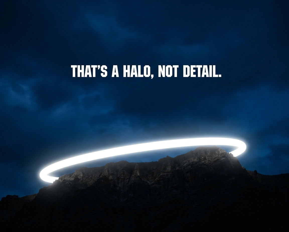
If edges develop broad bright or dark rims, revisit Radius rather than endlessly adjusting Amount. If smooth areas become gritty, reconsider the strength, Threshold, or where the sharpening is being applied. For manual Photoshop work, Adobe’s Smart Sharpen instructions explain its edge-contrast controls and recommend evaluating the effect at 100%.
The mixed-resolution mistake is often about Radius, not Amount
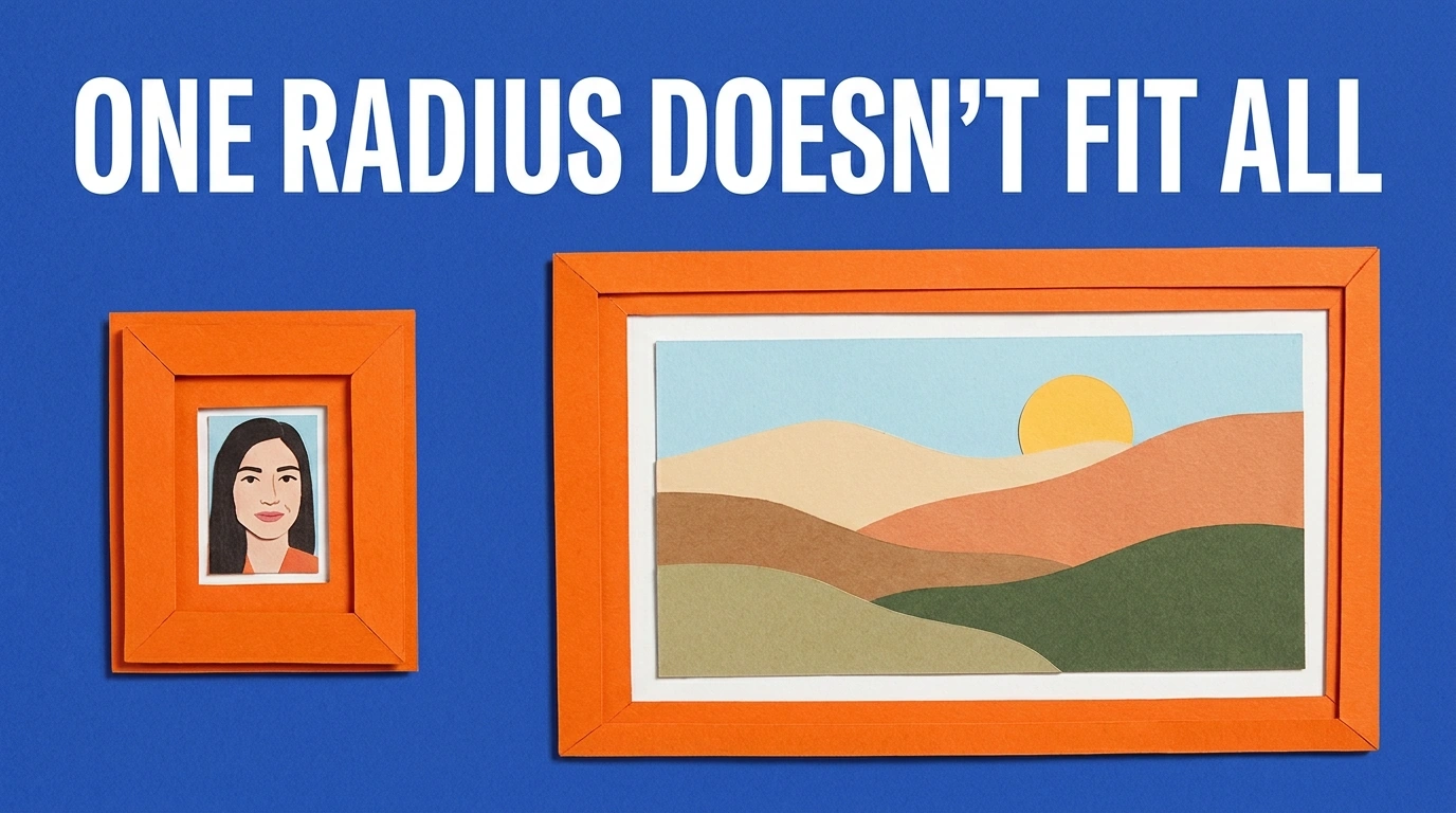
“I used the same sharpening amount on every image” sounds like the problem, but equal Amount values are not necessarily wrong. The less obvious issue is that a fixed pixel radius has a different relative scale on differently sized images.
A 2-pixel radius occupies a much larger proportion of a 500-pixel image than a 5000-pixel image. Depending on the content and viewing conditions, one fixed recipe can be too coarse for smaller files and too subtle for larger ones.
This is where Bulk Image Sharpener: Automated Sharpening provides a particularly relevant batch control: Scale Radius To Image Size (1000px Baseline).
When enabled, it calculates the applied radius as the configured radius multiplied by the document’s longest edge divided by 1000. A configured 1.5-pixel radius therefore becomes 0.75 pixels on a 500-pixel-longest-edge image, 1.5 pixels at 1000, and 6 pixels at 4000.
For Unsharp Mask, only Radius scales; Amount and Threshold remain fixed. For Smart Sharpen, the main, shadow, and highlight radii scale, while the other settings remain fixed. This normalizes sharpening geometry—it does not automatically choose the ideal strength for every subject.
The plugin can apply that workflow across a folder, save the configuration for reuse, and include the actual applied Radius in output filenames. That removes repetitive radius calculations and image-by-image filter setup while making the results easier to inspect.
Test a small image, a large image, and a noisy image before committing the whole folder. Different crops, source blur, and subject textures still matter. If every image will ultimately be delivered at the same pixel dimensions, prepare those final-sized versions first; adaptive scaling is not a substitute for sharpening at the correct output size.
6. Editing your only copy and repeatedly reworking compressed exports
Some editing mistakes are hard to fix because the information needed to undo them is gone. You’ve baked a strong color adjustment into the pixels, merged the working layers, or replaced the original with the finished file.
A reversible workflow gives you somewhere to return when yesterday’s “perfect” contrast looks excessive today. Adobe’s nondestructive-editing guide explains how adjustment layers, masks, separate retouching layers, and Smart Filters let you revise changes without overwriting the underlying image data.
Keep three roles separate:
- The untouched source: your starting point if you need to rebuild.
- The editable master: the version containing your working adjustments and layers.
- The delivery export: the file prepared for a particular website, layout, or print job.
When a revision arrives, return to the master instead of opening the delivery JPEG, editing it, and saving another JPEG generation. Ordinary Photoshop JPEG export discards data to reduce file size; repeated editing and lossy re-encoding can add compression artifacts.
Simply viewing or copying a JPEG does not degrade it. The concern is using successive compressed exports as your working originals.
Also distinguish source preservation from layer preservation. Bulk Image Sharpener leaves original files unchanged, but its Sharpen Entire Image target merges visible layers in the processed document. Exporting that result as PSD does not restore the original visible layer stack. Keep the layered master separately if future editability matters.
The practical benefit is more than safety: you can correct an excessive edit by reducing the original adjustment instead of trying to counteract it with another adjustment.

7. Approving the edit without checking its final destination
The Photoshop document is not necessarily what your audience will see. The exported file, the image displayed on a website, and the printed photograph are different checkpoints—and an edit is not finished until the relevant one has been checked.
Start with a dependable viewing environment. Keep screen brightness and room lighting consistent, and avoid judging color with a deliberately warm screen filter enabled. If color accuracy matters, calibration and profiling provide a firmer basis than assuming the display is neutral. The International Color Consortium’s display-calibration guide explains how those processes work together.
For conventional SDR web delivery, sRGB is a sensible default unless the destination specifies otherwise. Adobe’s online color-management guidance recommends converting images to sRGB for web use. Embed the appropriate profile when your export workflow supports it.
Convert is the important word. Assigning a different profile changes how existing color numbers are interpreted; converting recalculates them to preserve appearance as closely as the destination color space allows. Adobe’s profile-conversion instructions explain the difference. Assigning sRGB to a correctly tagged image in another space is not an equivalent shortcut.
For print, follow the printer or lab’s delivery requirements. When an appropriate printer-and-paper profile is available, Photoshop soft proofing can help preview the output. Its reliability depends on the profiles, display, and viewing conditions; an important print still deserves a physical test.
Finally, reopen the actual export. Inspect it at 100% for artifacts, then at its intended display size for readability and overall balance. For a website, inspect the uploaded version in context. For a composition, check the photo beside the other elements, where its brightness, color, and sharpness need to fit the whole.
A successful edit does not have to announce itself. It should make the subject easier to read, retain the textures that matter, and hold up at the size and destination where people will actually encounter it. Fix the specific problem first—and stop when another adjustment adds more damage than value.