7 Useful AI Tools for Graphic Designers

The most useful AI tools for graphic designers do more than generate images. They help turn an unclear brief into design criteria, find workable typography, explore color without rebuilding artwork, reuse existing assets, and reduce repetitive production work.
The seven tools below serve different purposes: briefing, font pairing, vector recoloring, reference-guided image creation, cutout preparation, raster enlargement, and visual-attention analysis. Some work in a browser; others require Illustrator or Photoshop. Choose according to the task that slows you down, rather than trying to add all seven to every project.
1. ChatGPT: Turn a Loose Brief Into Clear Design Criteria
ChatGPT earns its place here as a briefing and reasoning assistant—not as a replacement for your design software. Its useful role is helping you organize project information before you commit to a visual direction.
For example, a client might request a campaign that feels “premium, approachable, bold, and minimalist.” Rather than immediately asking for design ideas, first establish what those words mean for this particular audience and deliverable.
Paste the approved brief or supply its text, then try this instruction:
“Separate this brief into audience, communication objective, required content, visual constraints, deliverables, and unanswered questions. Distinguish explicit requirements from your interpretations. If information is missing, label it ‘not specified.’ Do not invent audience research or brand rules.”
ChatGPT supports document analysis, extraction, and comparison through its file-upload functionality, subject to account and usage limits. That makes it useful for comparing a project brief against existing brand guidance or identifying conflicting requirements across supplied documents.
Make it produce decisions, not more adjectives
Once the requirements are clear, ask for three distinct art directions. Require each direction to specify:
- A typographic approach.
- A color strategy.
- An image-treatment approach.
- A composition principle.
- The brief requirement it supports.
- A reason you might reject it.
That last item matters. A direction can look compelling while being wrong for the audience, expensive to execute, or unsuitable for the smallest required format.
Use the output as a discussion document, not evidence that a concept will succeed. Verify every claimed fact against the original materials. Before uploading client information, confirm permission and review OpenAI’s data controls; account settings do not replace a client’s confidentiality requirements.
2. Fontjoy: Find Type Pairings Worth Testing
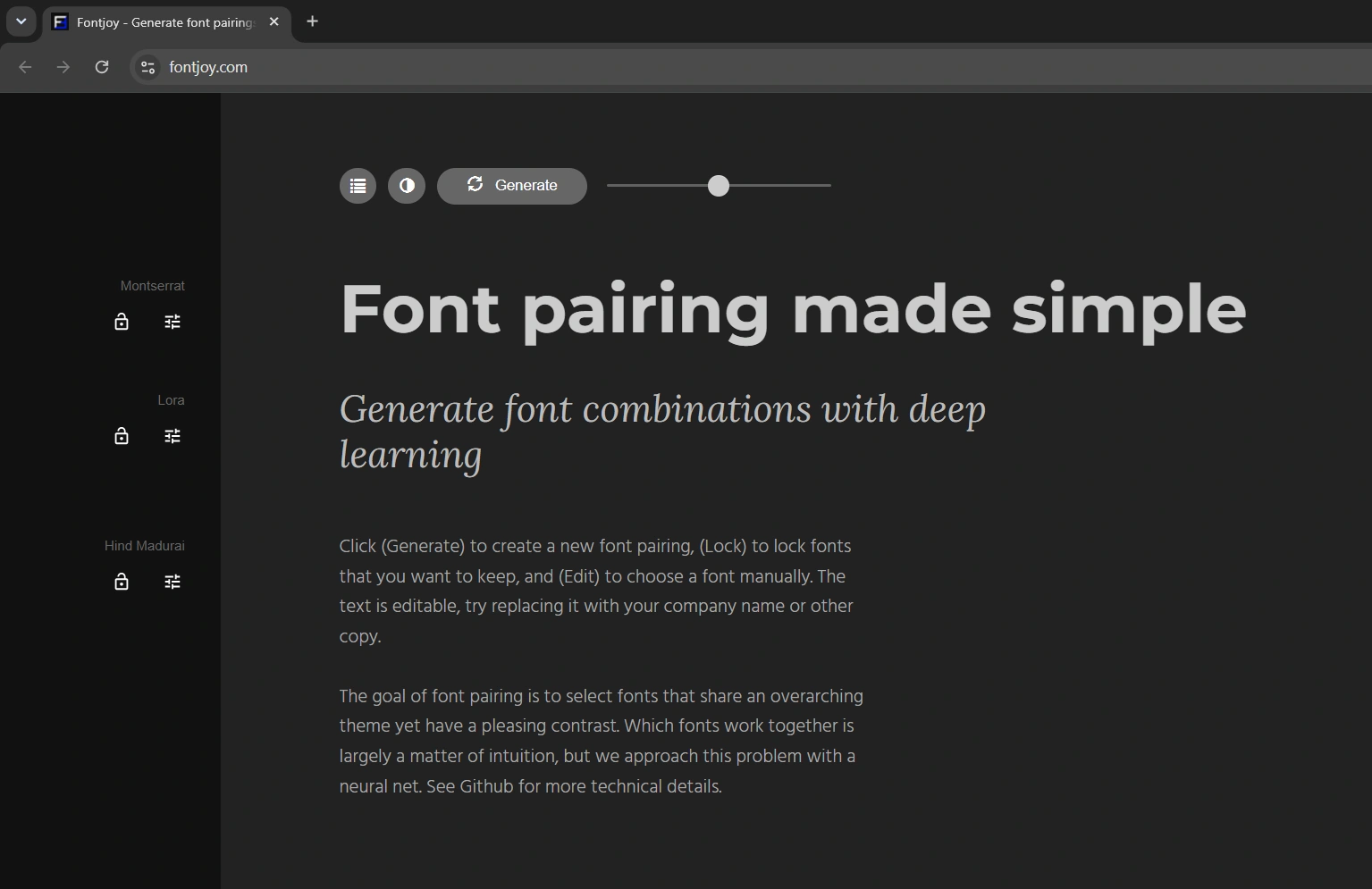
Fontjoy uses deep learning to suggest font combinations. Its practical advantage is a focused interface: generate a pairing, lock a font you want to keep, or choose one manually. You can also replace the sample text with your own copy.
This is useful when a design direction is established but its typography is not. Instead of browsing unrelated font specimens indefinitely, you can explore combinations around a candidate you already like.
A productive way to use it is to choose a potential headline face, lock it, and generate supporting options. If the client’s required font is unavailable, treat the suggestions as exploratory references—not permission to substitute a different brand typeface.
Test the actual content before choosing
A pairing that looks attractive in a short specimen may fail in the finished layout. Replace the demonstration text with material that exposes the real demands of the project:
- The longest headline, not just the shortest one.
- A realistic paragraph at the intended body size.
- Prices, dates, percentages, or other important numerals.
- Accented characters and any required languages.
Then move the shortlist into your design application. Check line breaks, spacing, hierarchy, and readability at the final viewing size.
You do not have to use every font in a generated combination. A two-family system—or one family with a well-chosen range of weights—may be more coherent. Fontjoy is a way to discover candidates; licensing, character coverage, and suitability for the finished design still need checking with the font’s distributor.
3. Illustrator Generative Recolor: Explore Colorways on Existing Vector Artwork
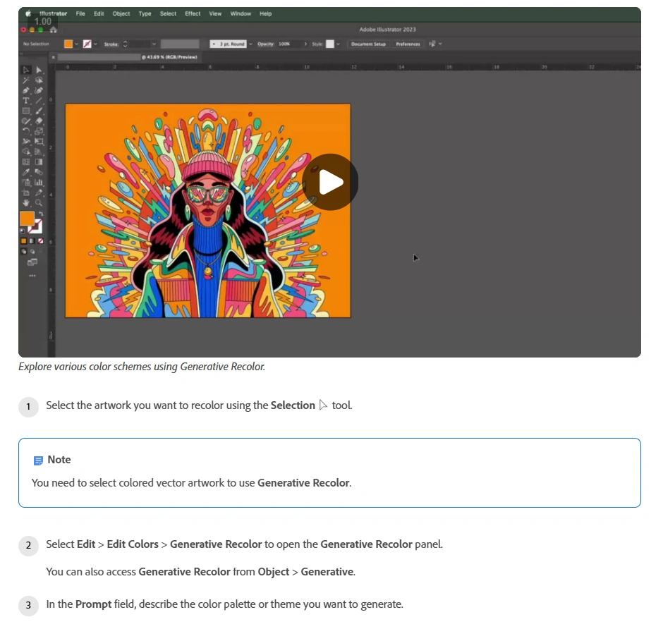
Adobe Illustrator’s Generative Recolor is particularly useful when you already have vector artwork worth keeping. Rather than generating a replacement illustration, it lets you explore alternative color schemes on the selected artwork using text prompts.
Think of a completed packaging illustration, an event-poster graphic, or a set of decorative brand elements. The composition may be approved while the color direction is still open.
Select colored vector artwork, open Edit > Edit Colors > Generative Recolor, and describe a palette or theme. Illustrator returns variations that you can preview on the artwork. You can also add up to five colors to guide the generation.
For more useful experiments, describe a constrained direction rather than a vague mood:
- “Two dominant colors: deep navy and warm cream, with a small coral accent.”
- “Muted botanical greens with a pale neutral background.”
- “High-contrast editorial palette with one bright accent color.”
Keep approved logos and elements that must retain exact colors outside the selection. After finding a promising variation, refine it through Illustrator’s standard Recolor Artwork controls.
The important distinction is exploration versus specification. Suggested colors can guide the design, but manually verify any required brand values and production swatches before delivery.
For web-facing designs, also check text/background combinations against WCAG’s contrast guidance. A visually appealing palette is not automatically readable: the Level AA minimum is generally 4.5:1 for normal text and 3:1 for qualifying large text, with defined exceptions.
4. Bulk AI Image Creator: Use Existing Project Assets to Explore New Scenes
Bulk AI Image Creator: Batch Generative Fill automates Photoshop Generative Fill across a CSV of prompts. For graphic designers, its especially useful capability is Attach Reference Images: you can supply existing visual work instead of starting every generation from text alone.
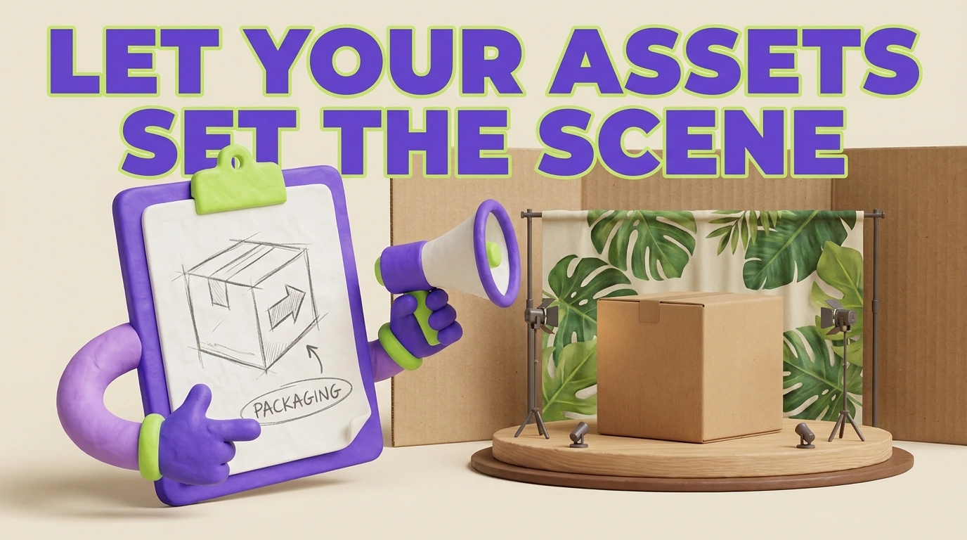
That matters when you have already developed a product render, campaign illustration, character concept, or another project asset. Reference-guided generation gives you a way to explore how that visual material might inform different settings, compositions, or presentation scenes.
For example, after designing a packaging concept, you might want to explore a studio presentation, a retail environment, and a lifestyle scene. Your existing concept can provide visual guidance while the prompts describe the different contexts.
A reference-guided workflow for a design project
- Choose one or two reference images that communicate the project clearly. Use assets you have permission to supply.
- Put them in a dedicated reference folder containing no other supported image files.
- Select a reference-compatible model, such as Gemini 3 (Nano Banana Pro) or Flux Kontext Pro.
- Enable Attach Reference Images and choose that folder.
- Create a CSV with TEXT PROMPTS in cell A1 and one prompt per row beneath it in Column A.
- Set the batch-wide dimensions, DPI, export format, and filename structure.
- Run a small pilot batch and review the results before expanding the prompt list.
The plugin supports a maximum of two reference images. Its reference workflow is available with the three Gemini choices, FLUX2 Pro, and Flux Kontext Pro; the plugin’s Firefly model choices do not support it.
Possible prompts for a packaging-concept exploration could include:
- “Create a presentation scene informed by the supplied packaging concept on a pale stone surface with soft side lighting. Leave open space on the right for a headline.”
- “Explore a boutique retail setting informed by the reference imagery with a restrained background and a clearly separated foreground subject.”
- “Create an outdoor campaign concept informed by the supplied assets with warm evening light and room above the subject for typography.”
These are generation requests, not guarantees of faithful placement. The references provide guidance; Photoshop and the selected model control how that guidance is interpreted. Inspect packaging geometry, lettering, logos, and other identity-critical details. When exact reproduction matters, retain the original artwork and composite it into the final design rather than relying on a generated approximation.
Organize the batch around one visual direction
The same references, model, dimensions, DPI, and export settings apply to every prompt in an operation. If another product or campaign needs different references, run a separate operation. This encourages a useful production discipline: one batch for one asset set and one intended treatment.
Export All Generated Image Variations is enabled by default. The plugin checks how many variations Photoshop actually returns and exports each one; it does not promise a fixed number. Disable the option when you want only the first variation exported.
Including {text-prompt} and {AI-model-used} in filenames helps identify the request and model behind an output, although prompt text is sanitized and shortened. The plugin requires a Generative Credits acknowledgement before processing. Review Adobe’s Generative Credits guidance rather than assuming a prompt count translates into a particular credit total.
5. Bulk Background Remover: Prepare Consistent Cutouts for Layout
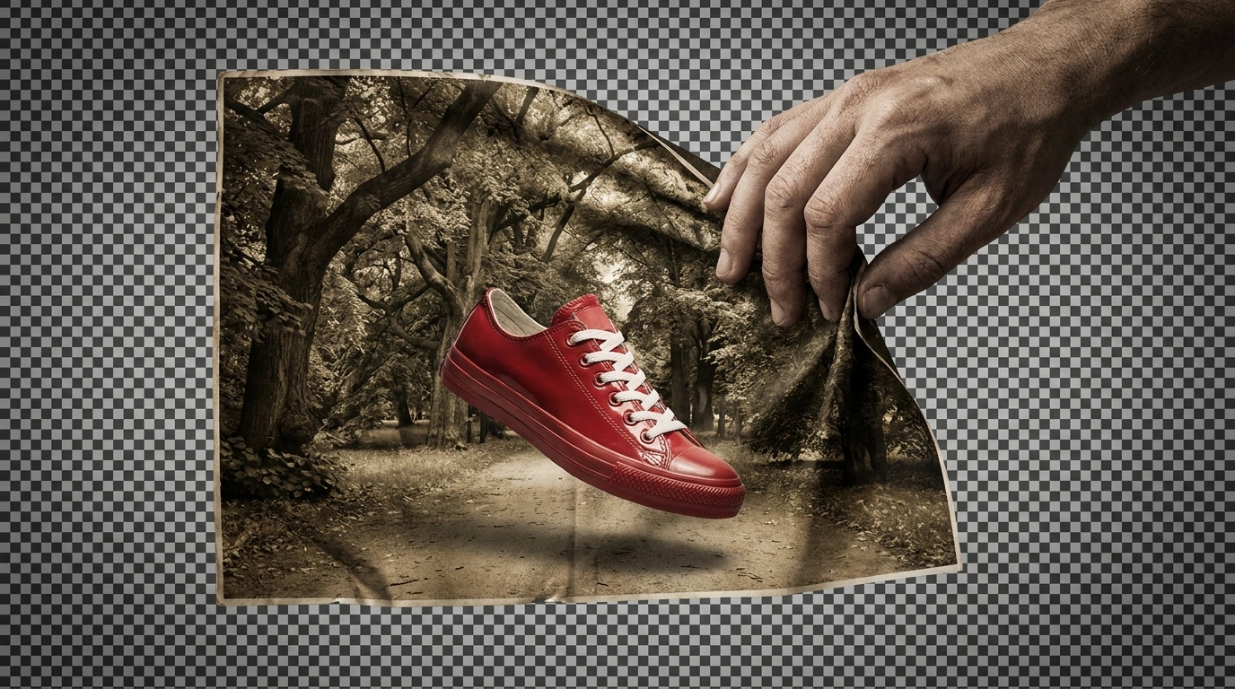
Bulk Background Remover: Automated Cutouts is useful when the design problem is not inventing more imagery but preparing existing images for composition. Product photographs, portraits, and other approved assets often need transparent backgrounds before they can be used consistently across layouts.
The plugin automates two Photoshop-native methods: Select Subject & Remove Inverse and Remove Background Using AI. It does not use an independent segmentation model.
The default Select Subject method validates that Photoshop produced a meaningful selection, then creates a subject-revealing layer mask. Optional Feather, Contract, or Expand refinement modifies that mask before export.
Standardize the canvas without accidentally enlarging the subject
For a catalog project, a useful configuration might be an exact 2000 × 2000-pixel transparent canvas with Center / Bottom alignment. The normalization workflow trims the cutout first, proportionally reduces it if it is too large, and positions it on the requested canvas.
Smaller cutouts are not enlarged to fill that canvas. This is an important distinction: identical output dimensions do not necessarily mean identical apparent product sizes. You may still need art direction or additional adjustment when products must occupy a consistent proportion of the layout.
If you need a common canvas shape rather than common dimensions, ratio normalization expands transparent canvas to reach the requested ratio without intentionally cropping visible subject pixels. For tightly bounded individual assets, Crop To Remaining Pixels simply removes transparent outer margins.
Before processing a large folder, test representative images and inspect the results against both light and dark backgrounds. Pay particular attention to hair, translucent materials, small gaps, and edges that resemble the original background. A global refinement setting should be judged across those examples, not selected because it improves one easy image.
There are several workflow limitations worth knowing:
- Skip Images Containing Transparency is a complete skip: those files are not refined, normalized, or exported.
- Remove Background Using AI can trigger a Photoshop-controlled popup that pauses processing. The plugin recommends Select Subject & Remove Inverse when unattended reliability is the priority.
- The plugin does not automatically try the other method when the selected method fails.
- Visible source layers are merged during preparation, so PSD or PSB export should not be treated as preservation of the original layer structure.
Outputs can be saved as PNG, TIFF, PSD, PSB, or WebP. The original source documents are closed without saving, leaving the input files unchanged.
6. Bulk Image Upscaler: Make Approved Raster Assets Large Enough for Delivery
Bulk Image Upscaler: Batch-Enhance Resolution automates enlargement and export across a folder of images in Photoshop. It is useful when you have selected the right raster assets but their pixel dimensions are too small for the deliverable.
Start by calculating what you actually need. If a print brief calls for an image eight inches wide at 300 pixels per inch, the required width is 2400 pixels. A 1600-pixel-wide source therefore needs a 1.5× enlargement to reach that width.
Merely changing the resolution value without resampling does not add pixels. Adobe’s explanation of image size, resolution, and resampling is useful when interpreting print specifications.
Choose between generative enlargement and conventional interpolation
The plugin offers Firefly Upscaler, Topaz Gigapixel, and Topaz Bloom in fixed 2× and 4× variants. It also provides eight traditional Photoshop resampling methods with configurable enlargement from 1.1× to 25.0× in 0.1× increments.
This distinction gives you a practical choice. Use an AI workflow when that treatment suits the image and project. Use traditional resampling when you need a particular multiplier, such as the 1.5× example, or want to avoid Generative Credits. The AI methods require a credit acknowledgement and keep the DPI control at AUTO; classic methods allow user-entered DPI.
Do not assume every enlargement problem calls for AI. For a logo, text-heavy graphic, or simple illustration, first look for the original vector file or editable artwork. Re-exporting that source may be a better production decision than enlarging a small raster copy.
Check actual dimensions, especially after a 4× request
AI models have output-size limits, and the plugin automatically handles them. When necessary, it can change a 4× request to the corresponding 2× method. If even 2× would exceed the limit, it proportionally reduces the working source just enough before performing the AI enlargement.
For example, a 2000 × 1500-pixel image would become 8000 × 6000 at 4×, exceeding Firefly’s 6144-pixel limit on either dimension. The corresponding 2× result fits, so automatic limit handling can produce 4000 × 3000 instead.
Consequently, selecting 4× does not guarantee an output four times the original dimensions. Include actual width and height in the filename if downstream layouts require specific sizes; the plugin’s dimension tokens reflect the final result.
Upscale approved assets rather than every exploratory variation. Compare the outputs with their sources, checking lettering, faces, patterns, and material detail before using them in a deliverable. More pixels should serve a defined output requirement, not become a substitute for visual inspection.
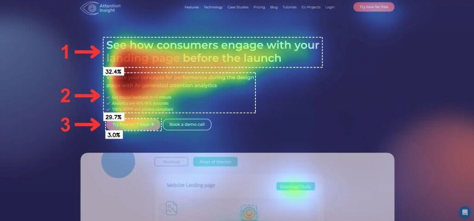
7. Attention Insight: Check Whether the Layout Emphasizes the Right Things
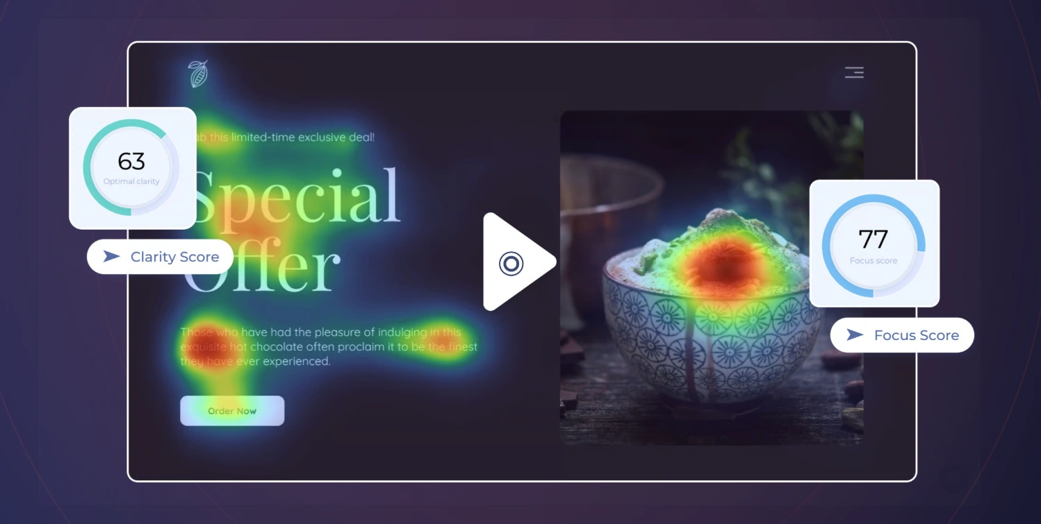
Attention Insight provides AI-predicted attention heatmaps for visual designs. Unlike another image generator, it helps you examine the composition you have already made: does the headline attract attention, or is a decorative element overpowering the message?
The distinction between predicted and measured attention is important. The service uses models trained on eye-tracking data; a heatmap is not a recording of your particular audience viewing your particular design.
That makes it useful as an early diagnostic for ads, promotional graphics, and landing-page compositions—not as proof that a design will convert.
Define success before looking at the heatmap
Choose the important regions before running the analysis. For a product-launch graphic, those might be the product, the offer headline, and the call to action. Attention Insight’s heatmap interpretation guide recommends establishing key areas in advance to reduce the temptation to rationalize whatever result appears.
Then compare two deliberately different versions. For example, keep the imagery and copy fixed while changing headline scale and placement. Or keep the layout fixed while simplifying a visually busy background.
A useful review asks:
- Are the intended information-bearing elements prominent?
- Is something incidental competing with them?
- Does the revised version make the desired hierarchy clearer?
- What would still need checking with real viewers?
Attention is not comprehension. A prominent headline can still be confusing, an obvious button can still communicate the wrong action, and a visually quiet element may be intentionally secondary. Use the prediction to identify questions and revisions, then evaluate readability, meaning, and actual audience response separately.
You do not need all seven tools to improve your workflow. Start with one recurring task: clarifying briefs, choosing type, exploring color, developing reference-guided scenes, preparing cutouts, meeting resolution requirements, or checking hierarchy. Test the relevant tool on a real deliverable and judge the result by usable work, revision effort, and production accuracy—not simply by how many alternatives the AI produces.