7 Ways To Improve Your Product Photos Without Reshooting Them

A disappointing product photo does not always need a replacement shoot. Sometimes the product is clearly photographed, but the color is wrong, the lighting hides its texture, or the framing makes it look insignificant. Other times, the image works perfectly well as a small thumbnail but falls apart when someone opens the zoom view.
The useful question is not “How can I make this photo more dramatic?” It is “What is stopping this photo from showing the product clearly and convincingly?” These seven techniques address different problems. Use them as a repair menu, not a checklist of effects to apply to every image.
Start with the largest original file you have, keep an untouched copy, and separate two goals: improving the photograph you already took and creating new, reference-guided imagery from it. Both can save a reshoot, but they require different kinds of quality control.
1. Correct the color cast before adding more saturation
A beige cushion that looks yellow or a navy backpack that looks purple has a color problem, not a vibrancy problem. Increasing saturation usually makes the mismatch more obvious.
Begin with white balance. In Adobe Camera Raw, the White Balance eyedropper lets you identify an area that should be neutral; Temperature and Tint then provide finer control. Adobe’s guide to color and tonal adjustments explains the controls and how to choose a useful neutral sample.
- Find something genuinely neutral in the photograph, such as a known gray surface or a white label with visible detail. Do not assume an ivory product should be white.
- Use the eyedropper as a starting point, then refine Temperature for blue–yellow imbalance and Tint for green–magenta imbalance.
- Check the product against a trustworthy reference: the actual item, an approved manufacturer image, or another correctly rendered photograph of the same variant.
Avoid sampling a bright reflection. A shiny white spot on a bottle is not a dependable reference for the color of its packaging.
If one side of the product is blue from window light and the other is orange from a lamp, judge those areas separately. A single global adjustment may improve one while worsening the other; a local color correction is more appropriate than forcing the whole photograph into one compromise.
Also check what happens after export. For web delivery, Adobe recommends converting the image to sRGB. Review the uploaded storefront image, not just the version open in your editor.
The finish line is believable color—not maximum color. Your cream, white, and pale-yellow variants should remain distinguishable after editing.
2. Improve the lighting locally instead of brightening everything
Consider a black handbag photographed beside a window. Its outline is clear, but the front panel and stitching disappear into shadow. Raising the entire image’s exposure might reveal the stitching while washing out the window-side edge.
The better repair is selective: brighten the surface shoppers need to inspect while preserving the highlights that describe the product’s shape.
Adobe Camera Raw’s local adjustment masks allow you to apply exposure, shadow, highlight, and other corrections to selected areas. A feathered Brush or gradient can make the transition less conspicuous.
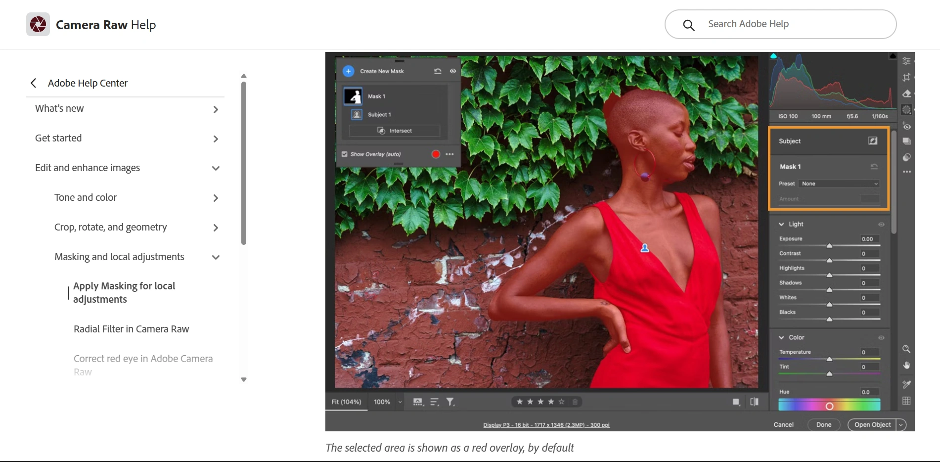
- For a dark label, mask the label and gently lift its exposure rather than brightening the whole bottle.
- For uneven illumination across a box, use a gradual adjustment on the darker side instead of erasing every difference between its faces.
- For excessive brightness on a glazed surface, reduce highlights where useful detail remains.
- For a product that blends into its surroundings, adjust the nearby background separately to improve separation.
Preserve some shadow beneath and beside the object. For this kind of repair, aim for readable surfaces with believable depth, not an evenly illuminated silhouette.
There is also a difference between recovering detail and merely darkening a blank patch. If an exported JPEG contains a solid-white area where the label should be, reducing brightness will not reveal the missing lettering. Try the original raw file if you have it; otherwise, do not manufacture product information to fill the gap.
A useful stopping test: can you now see the important material, contour, and label details without noticing a bright halo around the edited area?
3. Remove shoot-day distractions without redesigning the product
Dust, stray fibers, fingerprints, backdrop creases, and small marks on the shooting surface can make an otherwise competent photograph look unfinished. Cleaning these distractions is often a better use of time than applying a dramatic preset.
Work on a separate retouching layer so you can compare the repair with the original. Adobe’s retouching tutorial distinguishes the useful roles of Spot Healing, Healing Brush, and Clone Stamp.
- Use Spot Healing for isolated specks on uncomplicated surfaces, with the brush slightly larger than the blemish.
- Use Healing Brush when you want to choose the replacement texture while allowing Photoshop to blend its tone with the surrounding area.
- Use Clone Stamp when an edge or repeated detail needs an exact copy rather than a blended repair.
For example, a dust spot in the middle of a plain backdrop is an easy healing task. A fiber crossing the edge of a bottle needs more care: repair the background and bottle separately so the outline stays clean. Sample from an area with similar brightness and texture, and use several small strokes rather than one large sweep.
Pay particular attention to repeated patterns. Copying the same patch of leather grain or wood texture several times can create an obvious visual stamp.
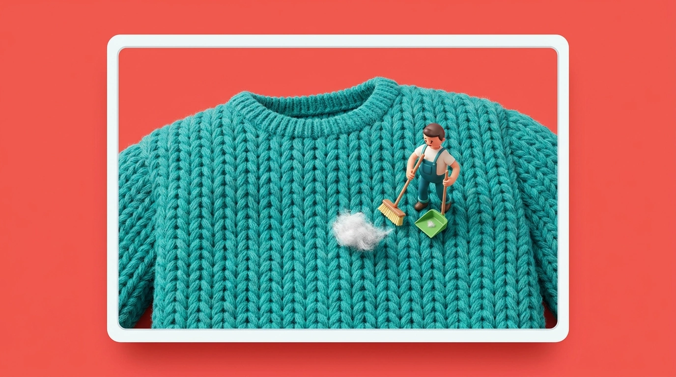
Keep the distinction between contamination and condition. Remove lint that landed on a new sweater during the shoot; do not erase its intentional stitching. If you are selling the exact used item shown, do not retouch away damage the buyer needs to see.
The result should look as though you cleaned the product and set before photographing them—not as though you changed what the customer will receive.
4. Fix the geometry and give the product a more deliberate frame
A tilted box, sloping tabletop, or excessive empty space can make a product photograph feel careless even when its color and exposure are good. Correcting those presentation problems can improve the image without changing its subject.
Start with geometry, then decide on the final crop. Adobe Camera Raw’s Geometry and Guided Upright controls can correct perspective using lines you identify in the image. Adobe recommends applying an available lens correction profile before perspective correction.
Use these adjustments conservatively. A nearly front-facing package with unintended converging sides is a reasonable correction candidate. A deliberately angled three-quarter product view should not be forced into a flat rectangle.
Then make three framing decisions:
- Choose the destination. A square catalog tile, a portrait social image, and a wide banner have different compositional needs.
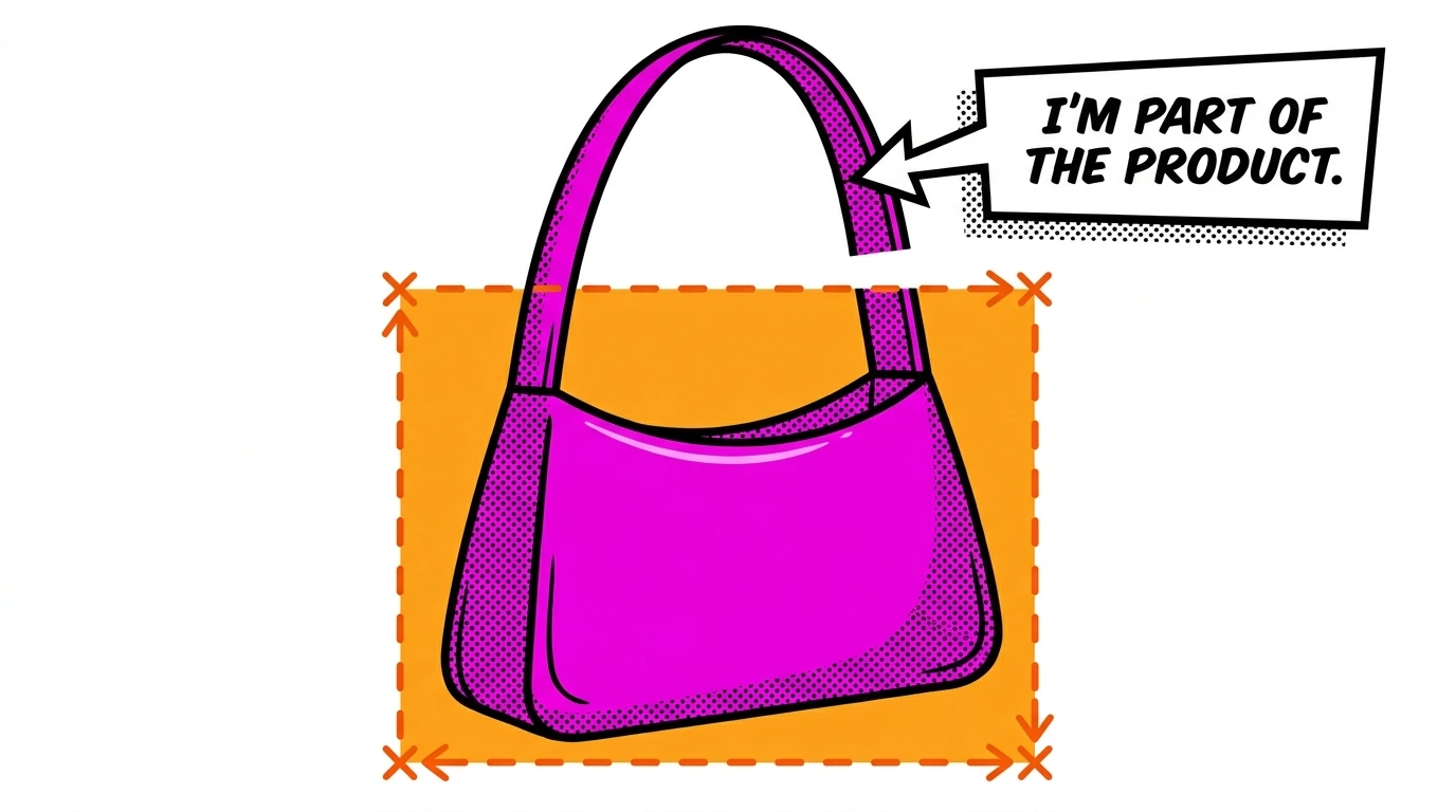
- Set the product’s visual size. Remove unnecessary space, but leave room for handles, straps, shadows, and other important features.
- Establish consistency across related images. Match margins and alignment so color variants do not appear to jump around when a shopper switches between them.
For a row of bottles, try aligning their bases and using comparable breathing room above the caps. For handbags, preserve the entire handle rather than making the body larger at the cost of clipping a useful feature.
Do not stretch a narrow product to fill a wider frame. Change the crop or canvas arrangement instead; the proportions are part of the product information.
Finally, judge the image at thumbnail size. If the product is still hard to recognize, the problem may be its placement or visual separation—not a lack of detail.
5. Sharpen the details that matter, not every pixel
If the photograph is reasonably focused but looks a little soft, sharpening can give labels, stitching, edges, and surface detail a crisper appearance. It increases contrast around existing edges; it does not turn a badly out-of-focus photograph into an accurately detailed one. Adobe’s sharpening tutorial demonstrates that distinction and how to evaluate the effect.
Judge sharpening at 100% magnification, then check the normal viewing size. Watch the product’s outline and fine lettering rather than judging only the overall impression.
For an initial test on a roughly 1500-pixel product image, you might try Unsharp Mask at Amount 70%, Radius 0.6 pixels, and Threshold 3. Treat that as an experiment, not a universal recipe. Adjust it according to the material and the file’s existing processing.
- If a bright rim appears around the product, back off the Radius or Amount.
- If smooth shadows become gritty, reduce the effect or protect those areas.
- If small label text becomes thick and crunchy, compare it with the original before increasing sharpening further.
Turn a successful test into a repeatable batch
When you have a folder of similar photographs, Bulk Image Sharpener: Automated Sharpening can apply the chosen Photoshop sharpening workflow, export the results, and move through the folder automatically. It supports both Unsharp Mask and Smart Sharpen, so you can use a simple finishing pass or a more configurable treatment with noise and shadow/highlight controls.
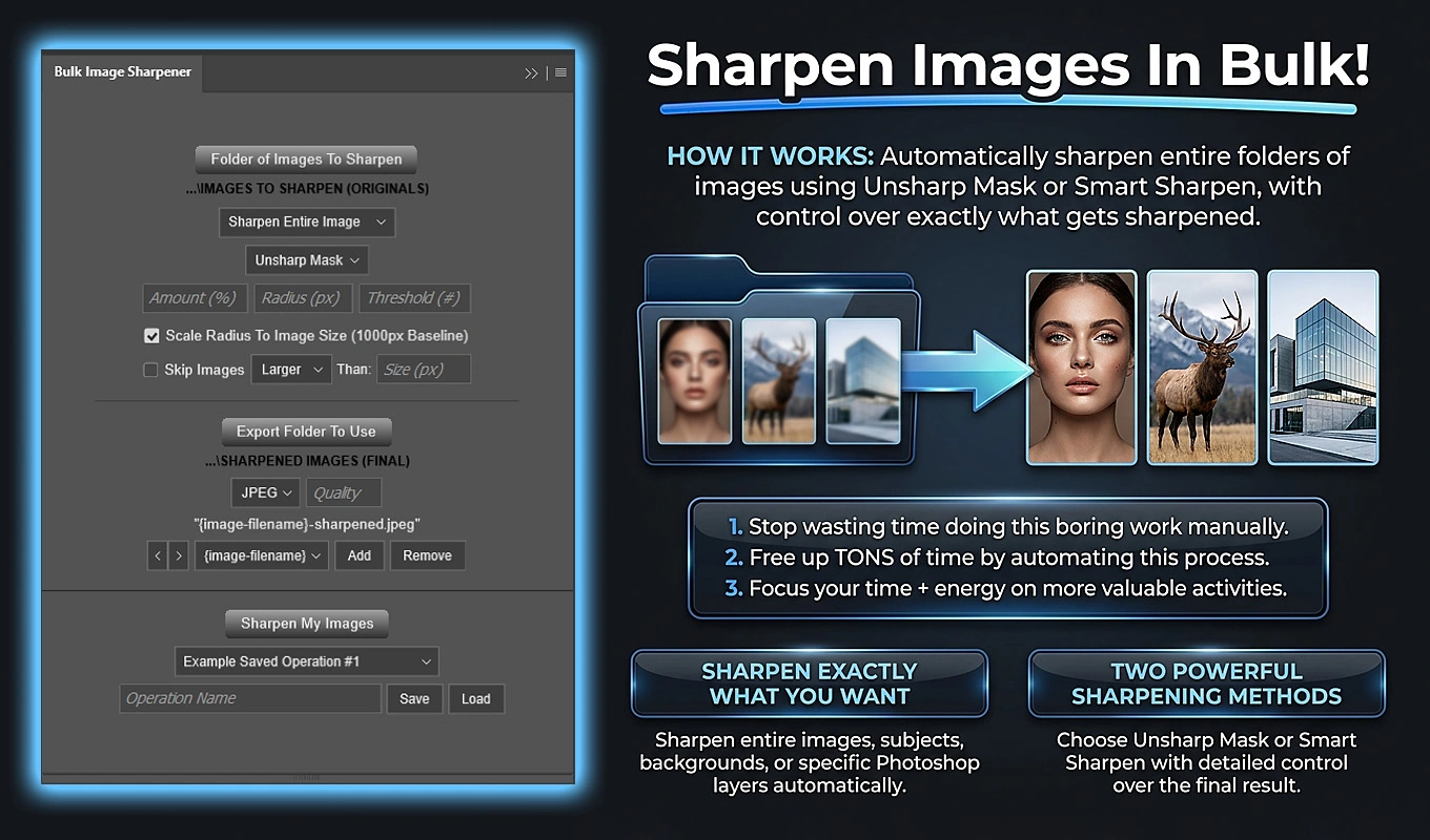
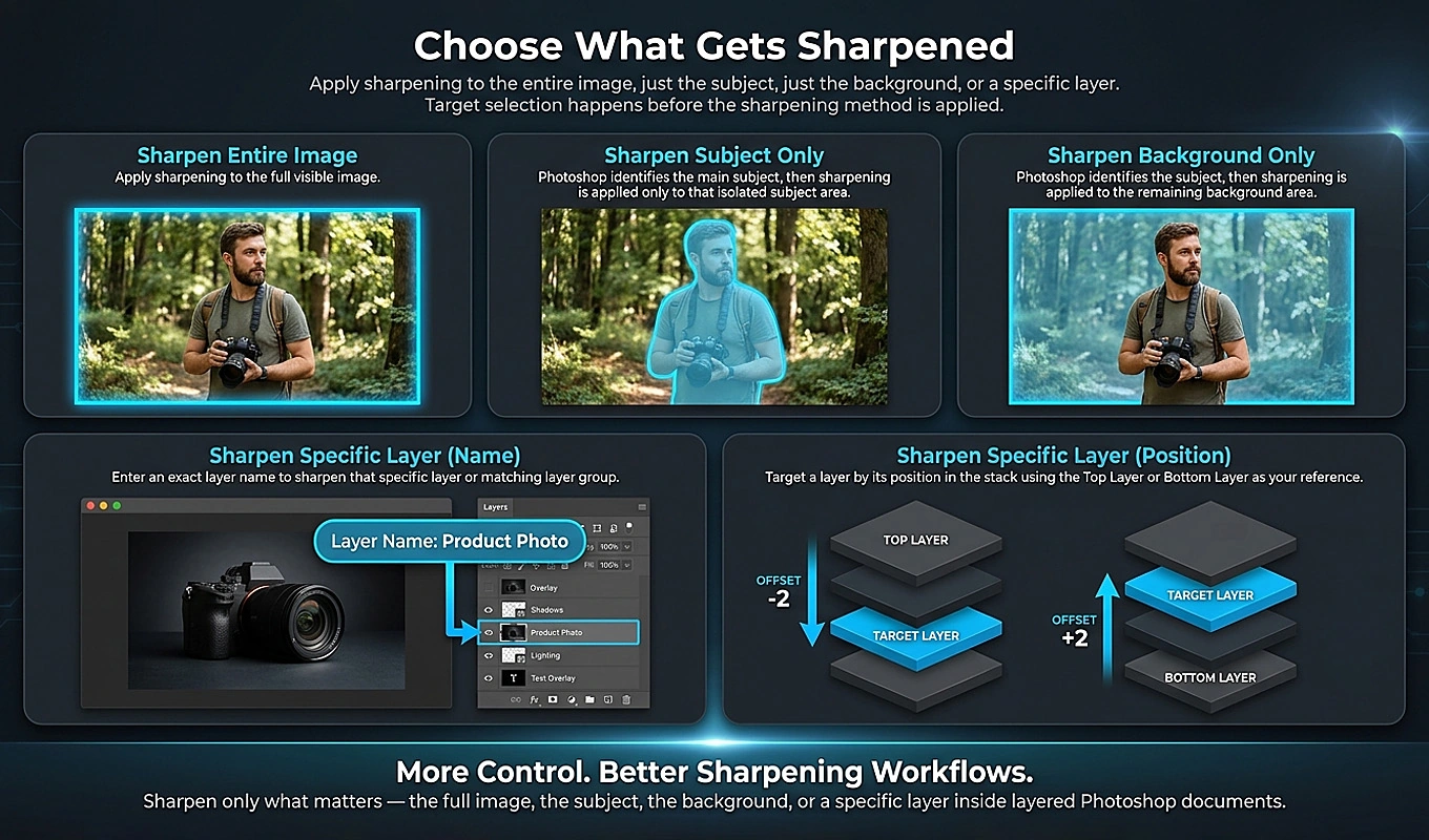
Subject Only is particularly relevant when the product needs extra definition but a textured or noisy background does not. It uses Photoshop’s detected subject as the sharpening target, rather than automatically applying the same treatment across the whole photograph.
For mixed-resolution files, Scale Radius To Image Size uses a 1000-pixel longest-edge baseline. A configured 0.6-pixel Radius becomes 1.2 pixels on a document with a 2000-pixel longest edge. That makes the sharpening radius proportional to document size instead of using one fixed pixel radius everywhere.
Test the smallest, largest, and most textured examples before committing the folder. Group substantially different materials or lighting conditions into separate batches, then save the settings that work for recurring jobs. The plugin exports derivatives and closes the source documents without saving changes.
If you also need to enlarge the images, complete that enlargement before judging your final sharpening pass.
6. Upscale when the photograph is good but the file is too small
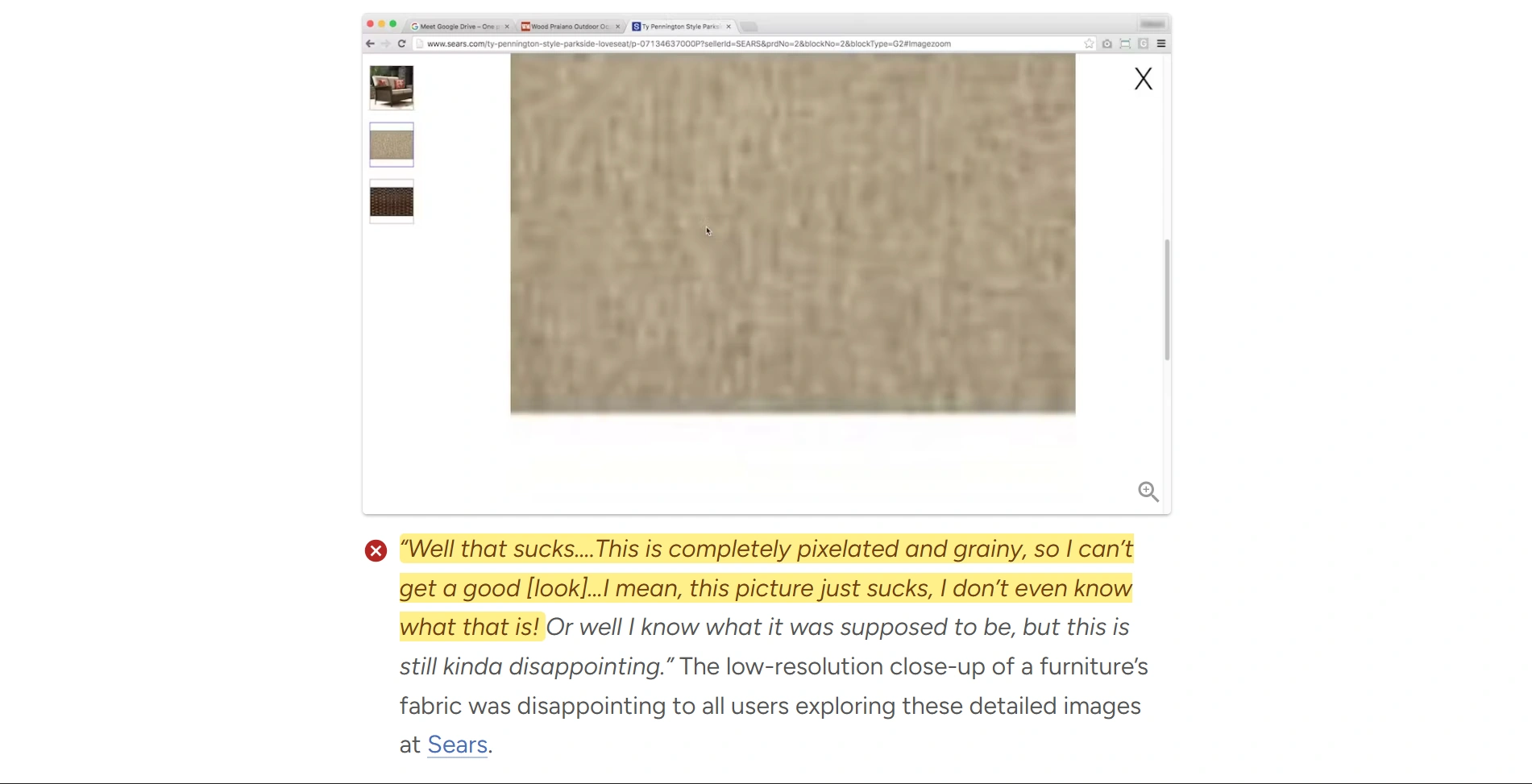
A useful photograph can be undermined by inadequate pixel dimensions. The catalog thumbnail looks acceptable, but the product page’s larger view reveals a small, soft file.
First, check whether you are editing a downloaded storefront thumbnail instead of the original photograph. Recovering the larger source is preferable to enlarging a smaller derivative.
Then establish the actual requirement. If your finished square crop is 900 × 900 pixels and you need an 1800 × 1800 version, a 2× enlargement addresses that pixel-size gap. Simply changing the resolution field to 300 DPI does not add pixels. Adobe’s explanation of resolution and resampling makes the distinction clear.
Check the zoom experience as well as the upload specification. Baymard’s research on product-image resolution and zoom documents how insufficient detail can prevent shoppers from inspecting the features they care about. An enlarged file is useful only if that inspection becomes more helpful.
Choose enlargement according to the image
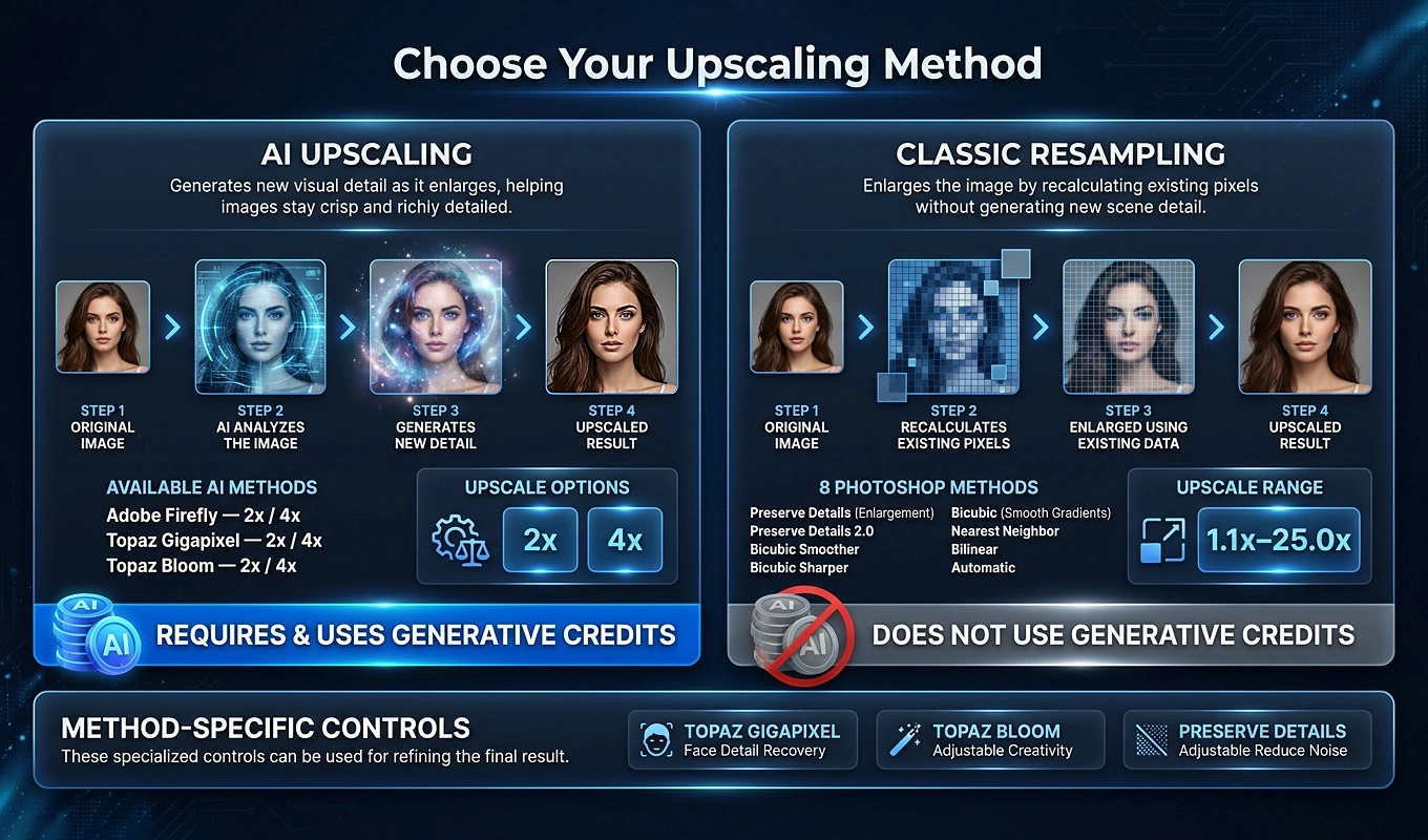
Bulk Image Upscaler: Batch-Enhance Resolution automates enlargement across a source folder using either Photoshop’s standard resampling methods or its AI upscaling workflows.
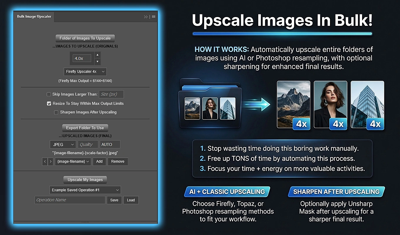
- For a modest, precise enlargement, its standard methods allow factors from 1.1× to 25.0×. A 1.5× or 1.7× adjustment can be enough when the image only narrowly misses your required dimensions.
- For photographic images that need a larger, more detailed-looking rendition, test its Firefly, Topaz Gigapixel, or Topaz Bloom AI workflows, available in 2× and 4× variants.
Compare a representative result before processing the whole collection. Inspect typography, stitching, patterned fabric, small controls, and other features that identify the product. Reject an AI result if it makes the image look more detailed by changing those features.
For a folder containing both small and already-large files, Skip Images Larger Than can exclude sources above your chosen longest-edge threshold. That lets you concentrate the enlargement workflow on images that actually need it.
The plugin exports separate upscaled files while leaving the originals unchanged. It also offers an optional post-upscale Unsharp Mask pass, which is convenient when your enlargement workflow needs a straightforward finishing treatment.
Keep the objective specific: a usable product-page image, zoom view, or print placement—not the largest file you can generate.
7. Use your existing photos as references for better scenes
Sometimes the original photograph’s biggest weakness is the setup itself. The product was shot on a crowded kitchen counter when you wanted a calm spa scene. A functional packshot needs lifestyle context. A usable image has nowhere to place the headline for an advertising banner.
Those are opportunities for reference-guided generation—not just stronger adjustments to the existing pixels.
Bulk AI Image Creator: Batch Generative Fill lets you attach one or two reference images and run a CSV list of prompts through a compatible Photoshop image-generation model. You can use the photographs you already have to guide new product imagery with different surroundings, lighting, and compositions.
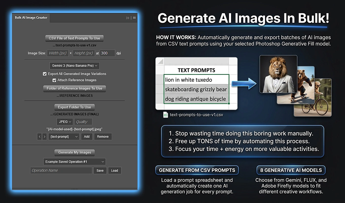
This creates new images guided by the references; it is not a guarantee that the original product pixels, branding, or geometry remain unchanged. Give the model clear instructions, then review the results against the real product.
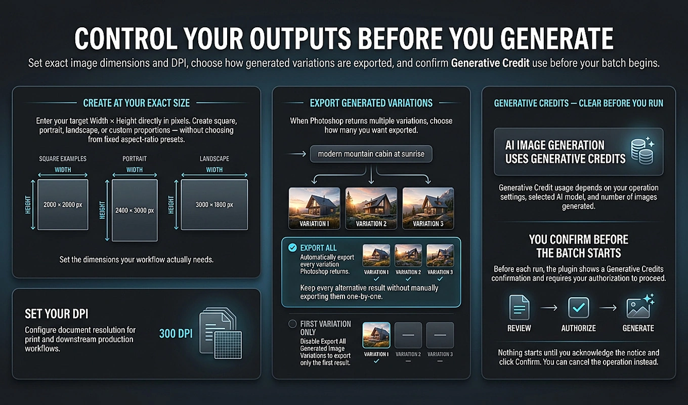
Build a scene batch around one product
- Choose the clearest available photograph of the product. If possible, clean it up and correct its color first so an unwanted cast is not part of the reference.
- Place that image, and optionally a second useful view or clearer detail photograph, in a reference folder.
- Select a reference-compatible model, such as Gemini 3 (Nano Banana Pro) or FLUX2 Pro, and enable Attach Reference Images.
- Create a CSV with TEXT PROMPTS in cell A1 and one scene prompt per row beneath it in Column A.
- Choose the output dimensions and enable Export All Generated Image Variations if you want to save the available alternatives for later review.
The same reference set applies to every prompt in the batch. Run separate operations for different products rather than expecting each CSV row to choose its own product reference.
Eight specific problems you can turn into scene prompts
Use these as starting points. Instructions to preserve the product’s design are requests to the model, not substitutes for checking its output.
-
A candle was photographed on a cluttered counter, but you want a calm, premium setting.
Prompt: “Create a photorealistic scene featuring the referenced candle on a pale limestone surface, with soft window light from the left, a warm neutral background, and a gentle contact shadow. Keep its vessel shape, wax color, and label design consistent with the reference. No extra products.”
-
A skincare bottle has harsh flash glare, but your ideal image uses softer studio lighting.
Prompt: “Show the referenced skincare bottle in the same front-facing orientation against a light gray studio background. Use broad, diffused lighting, restrained reflections, and a soft grounding shadow. Keep the packaging proportions and label appearance consistent with the reference.”
-
A linen cushion was shot under unattractive indoor lighting, but you need a welcoming lifestyle image.
Prompt: “Place the referenced cushion on a simple upholstered armchair beside a bright window. Use soft daylight and a quiet, uncluttered interior. Retain the cushion’s actual color, seam placement, proportions, and woven appearance. Keep the cushion as the main subject.”
-
A backpack looks anonymous against a blank wall, but you want a more purposeful everyday setting.
Prompt: “Show the referenced backpack upright on a clean entryway bench in a minimal apartment, with natural morning light. Keep its silhouette, pocket arrangement, zipper locations, and strap design consistent with the reference. Do not add accessories or change the product.”
-
A mug is centered in every original shot, but you need a wide image with space for advertising copy.
Prompt: “Create a wide composition with the referenced mug in the left third on a pale wooden breakfast table. Leave the right half as a simple, softly lit background with generous negative space. Preserve the mug’s handle shape, glaze color, and proportions. No text.”
-
A stainless-steel bottle blends into its gray surroundings, but you want stronger visual separation.
Prompt: “Photograph the referenced stainless-steel bottle against a pale sand-colored studio background. Use a subtle side highlight to define its outline while retaining a realistic metallic finish. Keep the cap, body shape, and surface details consistent with the reference.”
-
A bracelet was photographed on a busy desk, but you want a cleaner close-up presentation.
Prompt: “Show the referenced bracelet resting on a matte cream display surface in a close-up composition with soft, diffused lighting. Keep its clasp, link structure, metal color, and stone arrangement consistent with the reference. No additional jewelry and no exaggerated sparkle.”
-
A wooden stool has only a plain packshot, but you need imagery that fits a home-interior campaign.
Prompt: “Place the referenced wooden stool in a minimal living room with a neutral rug and soft afternoon light. Show it from the same three-quarter viewpoint as the reference. Preserve the leg arrangement, seat shape, wood tone, and joinery. Keep surrounding decor understated.”
You can also create several prompts for one problem: the same bottle with a neutral studio treatment, soft morning light, and a darker editorial setting. That gives you a range of options without rebuilding a physical set for each idea.
AI scene generation and the Upscaler’s AI methods use Photoshop’s generative functionality and can consume Adobe Generative Credits. Start with a small test before authorizing a large production batch.
Approve the product first, the atmosphere second
Compare each candidate with the source photograph. Check the silhouette, cap or handle, number of parts, label text, logo, color, finish, and pattern placement. Reject attractive results that change the merchandise. Also remove candidates whose props could be mistaken for included accessories, and do not treat a generated room scene as proof of the product’s physical scale.
Keep accurate packshots and detail photographs as the factual backbone of the listing; use approved generated scenes to add context and campaign variety. If you submit generated imagery to Google Shopping, follow Google’s AI-generated image requirements, including its source-metadata requirements, and verify that your final delivery process preserves the necessary information.
The best rescue is not necessarily the most dramatic transformation. Correct the color, reveal the useful detail, remove distractions, and improve the presentation. Enlarge or generate new imagery when those techniques solve a real gap—and keep the product itself accurate throughout.