8 Ways To Make Your Marketing Graphics Look More Professional
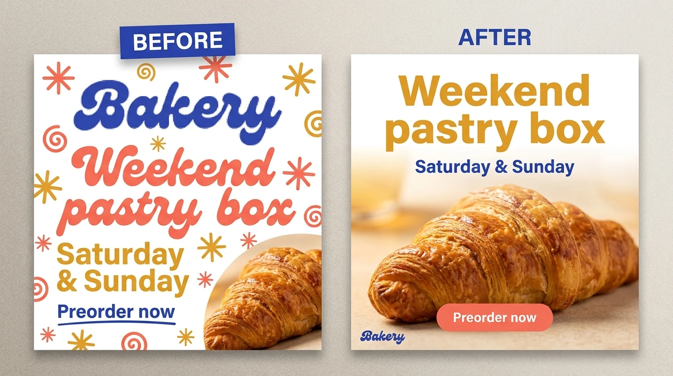

A graphic can have an expensive-looking font, a beautiful photograph, and all the right brand colors—and still look amateurish. Usually, the problem is not a missing special effect. It is a collection of small decisions that do not agree with one another: competing headlines, inconsistent margins, mismatched imagery, or a logo that changes size from one post to the next.
Professional does not have to mean minimalist, luxurious, or beige. A colorful festival poster and a restrained financial-services graphic can both look excellent. The goal is to make your choices feel intentional, appropriate to your audience, and consistent across your marketing.
These eight improvements address both the design decisions and the production problems that get in the way.
1. Give each graphic one clear communication job
Before adjusting the layout, finish this sentence: “After seeing this graphic, the viewer should understand ______.”
Not everything your business does. Not your entire competitive advantage. The main thing this particular graphic needs to communicate.
Consider a hypothetical pottery workshop advertisement. It could contain your studio’s history, five class descriptions, an instructor biography, a discount, your mission statement, and three ways to contact you. Or it could establish a clear reading order:
- Main message: “Make your first ceramic bowl.”
- Supporting information: “Beginner pottery workshop · Saturday afternoon.”
- Next step: “Reserve your place.”
The second version gives the design something to organize around. The headline earns the most attention, the practical details support it, and the action follows naturally.
This does not mean removing information people need. It means separating the main promise from supporting details—and moving longer explanations into the accompanying caption, landing page, or brochure interior when appropriate.
Try a subtraction pass on an existing graphic. Temporarily remove the decorative badge, secondary slogan, extra icon, and redundant contact information. Add something back only if it helps the viewer understand the offer or act on it.
If you cannot decide what deserves emphasis, the problem is probably the brief, not the font size.

2. Make typography, spacing, and color follow the same rules
A common source of amateur-looking design is making every decision independently. One headline gets centered. Another gets a shadow. A third gets a different font because it “needed something.” Soon, the campaign looks like several businesses sharing an account.
Build a small visual system instead.
Choose type for your brand—not for its personality in the font menu
Start with three useful brand descriptors, such as “direct, practical, dependable” or “expressive, playful, energetic.” Then judge typefaces against those words. Monotype’s guide to choosing brand typography makes this identity-first approach a useful starting point.
Try one type family with different weights before introducing a second family. Give each treatment a job: a distinctive headline, readable supporting copy, and a consistent style for dates or prices.
Test your actual content. A font that looks wonderful in “SUMMER” might be awkward in a long service name, an address, or a price with several digits. If a headline does not fit, rewrite it or reconsider the layout before squeezing the letters horizontally.
Use repeated spacing and shared alignment
For a 1080-pixel-wide draft, you might start with a 48-pixel outer margin, 24-pixel gaps within related groups, and 48-pixel gaps between separate groups. These are starting values, not universal design laws. The important move is replacing arbitrary gaps with a repeatable rhythm.
Give your headline, supporting text, and action a common alignment edge. Keep related information closer together than unrelated information.
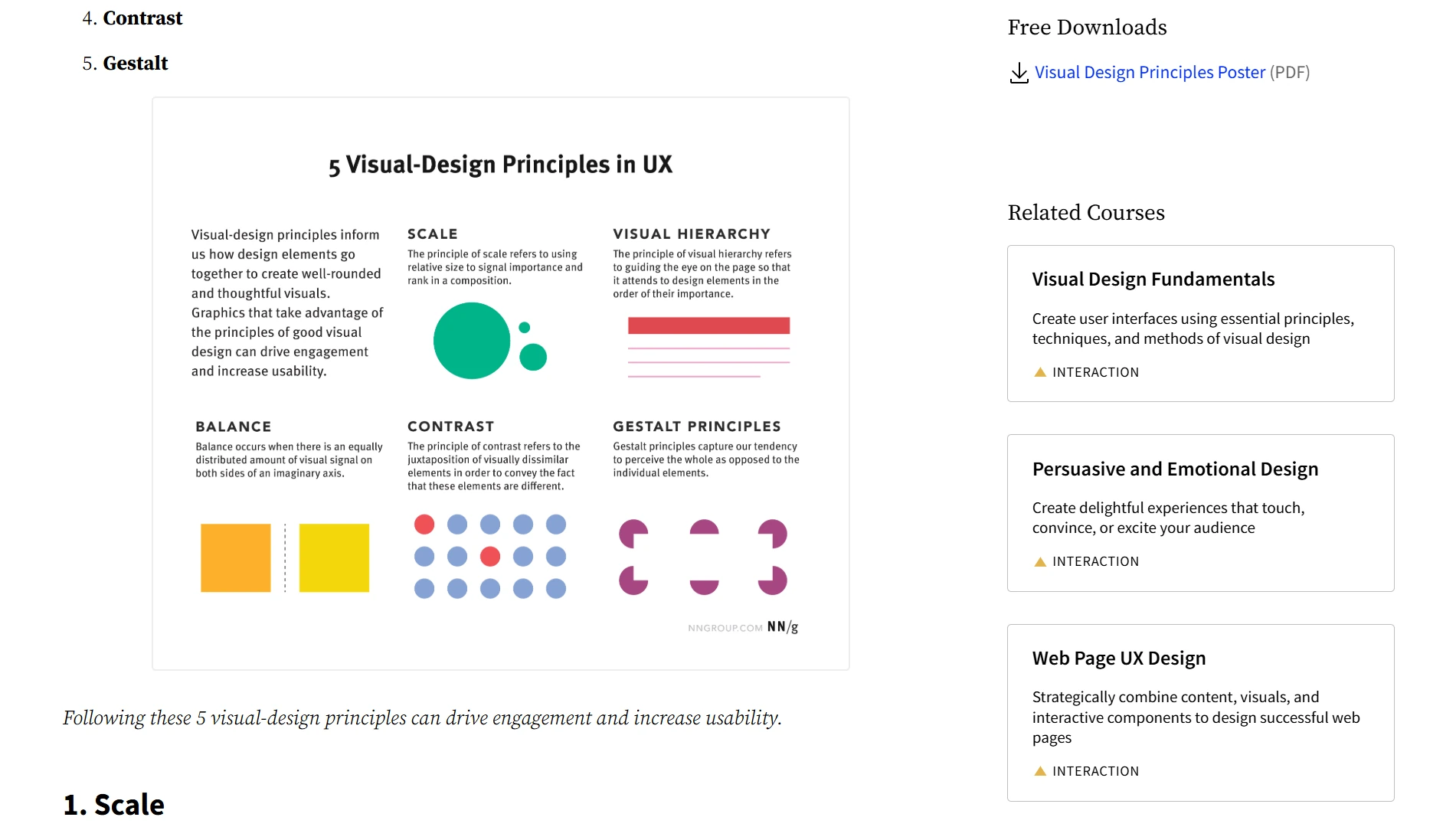
Balance does not require putting identical objects on both sides. A large, dark photograph can carry more visual weight than a larger area of pale text. Nielsen Norman Group’s visual-design principles provide useful explanations of scale, hierarchy, balance, and contrast. Apply them by adjusting size and placement—not by filling every empty corner with decoration.
Assign colors roles
Instead of using every brand color equally, identify a background color, a main information color, and an accent. Reserve the accent for something that genuinely deserves attention.
When the headline, price, border, button, and decorative stars all shout in different colors, you have not created emphasis. You have created a meeting where everyone is speaking.
3. Retire the stock-photo handshake committee
The handshake over the conference table. The team laughing at an unspecified spreadsheet. The headset-wearing man who apparently provides customer service for every company on Earth.
These images are not automatically unprofessional because they are stock photography. They are weak because they communicate almost nothing specific.
A photograph of six strangers applauding a laptop does not explain why your accounting service is helpful. Unless your business genuinely specializes in laptop applause, you can probably find a better visual.
Use this test: could a competitor replace your logo with theirs and publish the image unchanged? If the answer is yes, ask whether the picture is doing enough work.
Better choices show something relevant:
- For a furniture maker, show the joinery, material texture, or finishing process rather than a generic “beautiful home.”
- For a software company, show a readable example of the task becoming easier rather than people pointing enthusiastically at a screen.
- For a local service business, show the actual team, equipment, or finished work rather than anonymous models in suspiciously spotless uniforms.
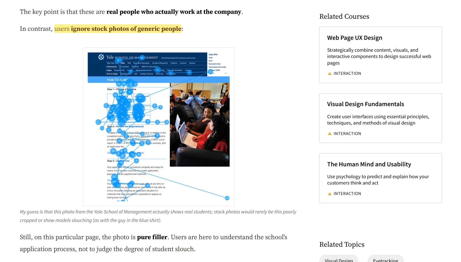
Nielsen Norman Group’s examples of photographs as content draw an important distinction between images people inspect for information and decorative images they may ignore. That is a better selection criterion than “Does this look vaguely businesslike?”
If stock is the practical choice, search for a subject, action, lighting style, and composition—not an abstract business cliché. “Ceramicist trimming a bowl beside a window” gives you a more useful direction than “creativity.” Look for photographs that belong together in lighting and color, too.
You do not need to ban stock photography. Just stop hiring the same imaginary conference-room team for every campaign.
4. Art-direct AI imagery instead of accepting the first attractive result
AI-generated imagery can be useful when you need campaign backgrounds, conceptual scenes, or a coordinated set of visual assets. But “make a professional marketing image” is not much of an art-direction brief.
Specify what professional means for this campaign: materials, lighting, palette, camera angle, subject placement, and space for your message.
For example, a more useful prompt for a hypothetical candle brand would be:
“Campaign photograph of an amber-glass cedar candle on pale sandstone. Soft window light from the left, restrained warm-cream and charcoal palette, natural material textures, minimal props. Place the candle in the right third and leave the left half visually quiet for a headline. Calm, contemporary editorial photography. No added lettering.”
Notice that the prompt describes a usable marketing asset, not merely an attractive picture. The empty area for text is part of the assignment.
For a series, keep that art-direction brief stable and vary the scene: a bedside table, a reading nook, a bathroom shelf. Then select results that feel like the same campaign, rather than choosing each image solely because it looks impressive on its own.
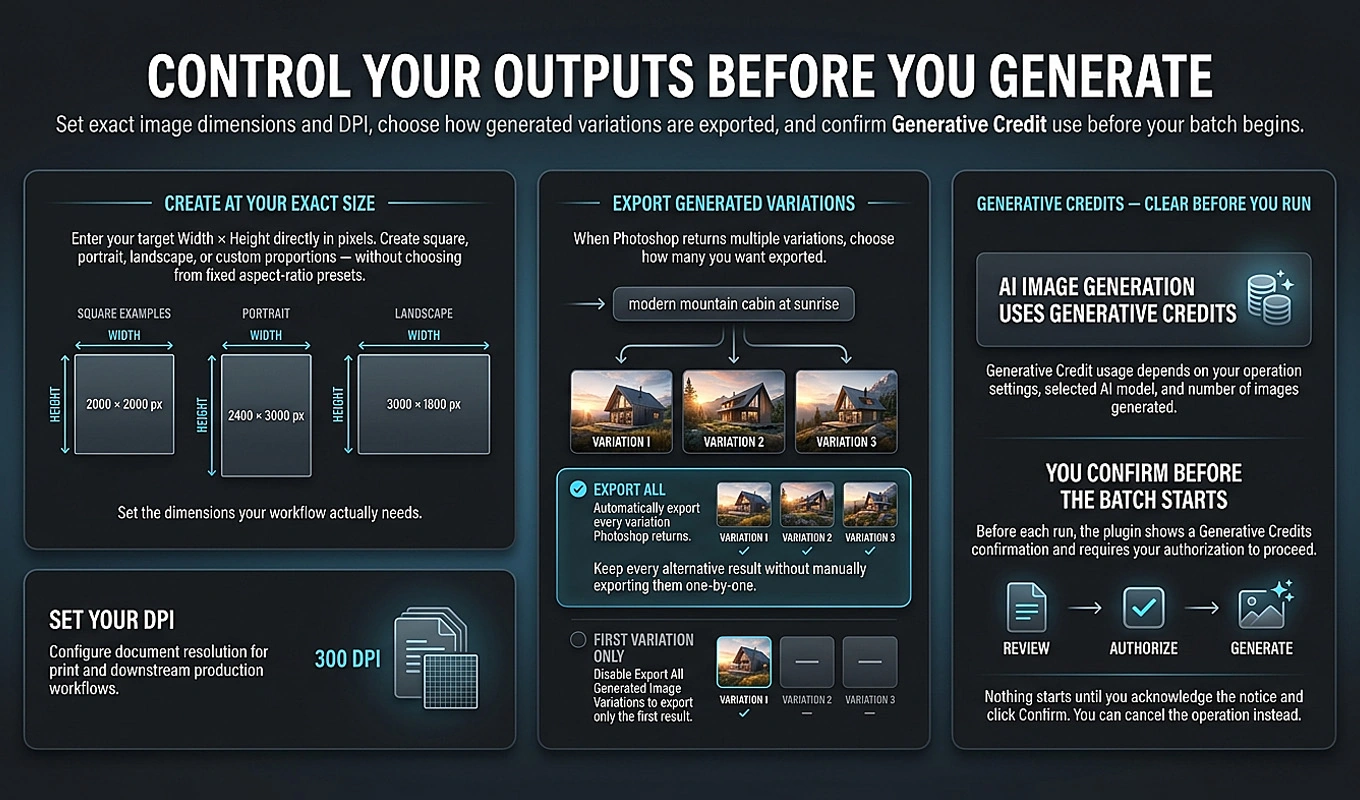
Bulk AI Image Creator: Batch Generative Fill makes this approach practical inside Photoshop when you have many concepts to produce. Put TEXT PROMPTS in cell A1 of a CSV, with one prompt per row beneath it in Column A. The plugin processes those prompts sequentially using your chosen batch-wide model and image dimensions.
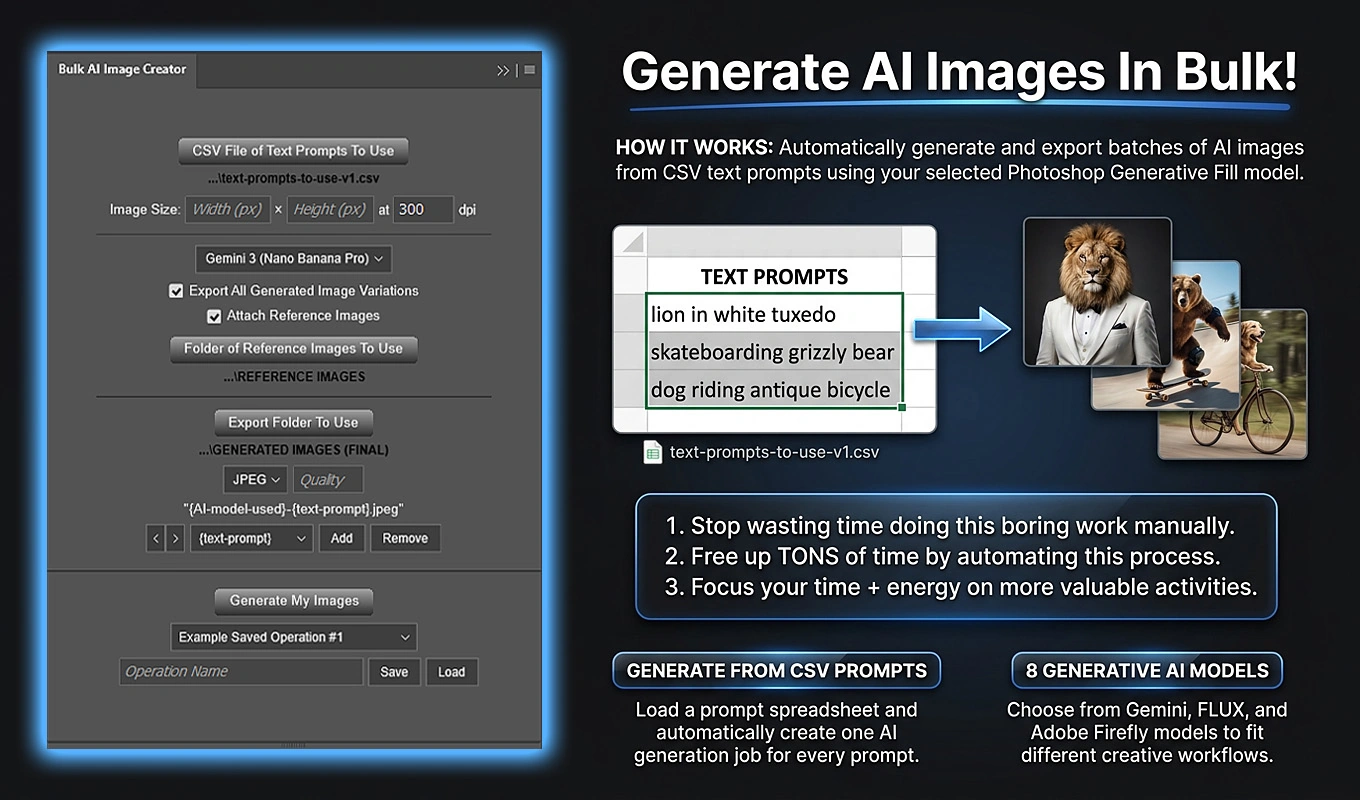
With compatible Gemini and FLUX model options, you can also supply one or two reference images, such as a product photograph and a visual-direction reference. The same reference set is used across the batch, so you do not have to repeatedly attach the same assets for every prompt. You can export all generated variations and curate the strongest, most coherent results afterward.
References provide guidance, not a guarantee of exact product shapes, packaging, or logo reproduction. When those details must be exact, retain your original product imagery and add approved logos and typography separately. Generation runs through Photoshop and can consume Adobe Generative Credits; the plugin requires acknowledgement before starting.
The creative advantage is not simply producing more images. It is exploring a tightly defined visual direction without manually repeating the entire generation-and-export process for every concept.
5. Borrow a strong layout—not somebody else’s identity
You do not earn extra professionalism points for spending four hours inventing a mediocre layout from scratch.
A well-chosen template can provide useful structure: a sensible reading order, balanced proportions, and related layouts for a campaign. Envato Elements’ social media templates and Creative Market’s social media template collection are useful places to browse for that starting structure.
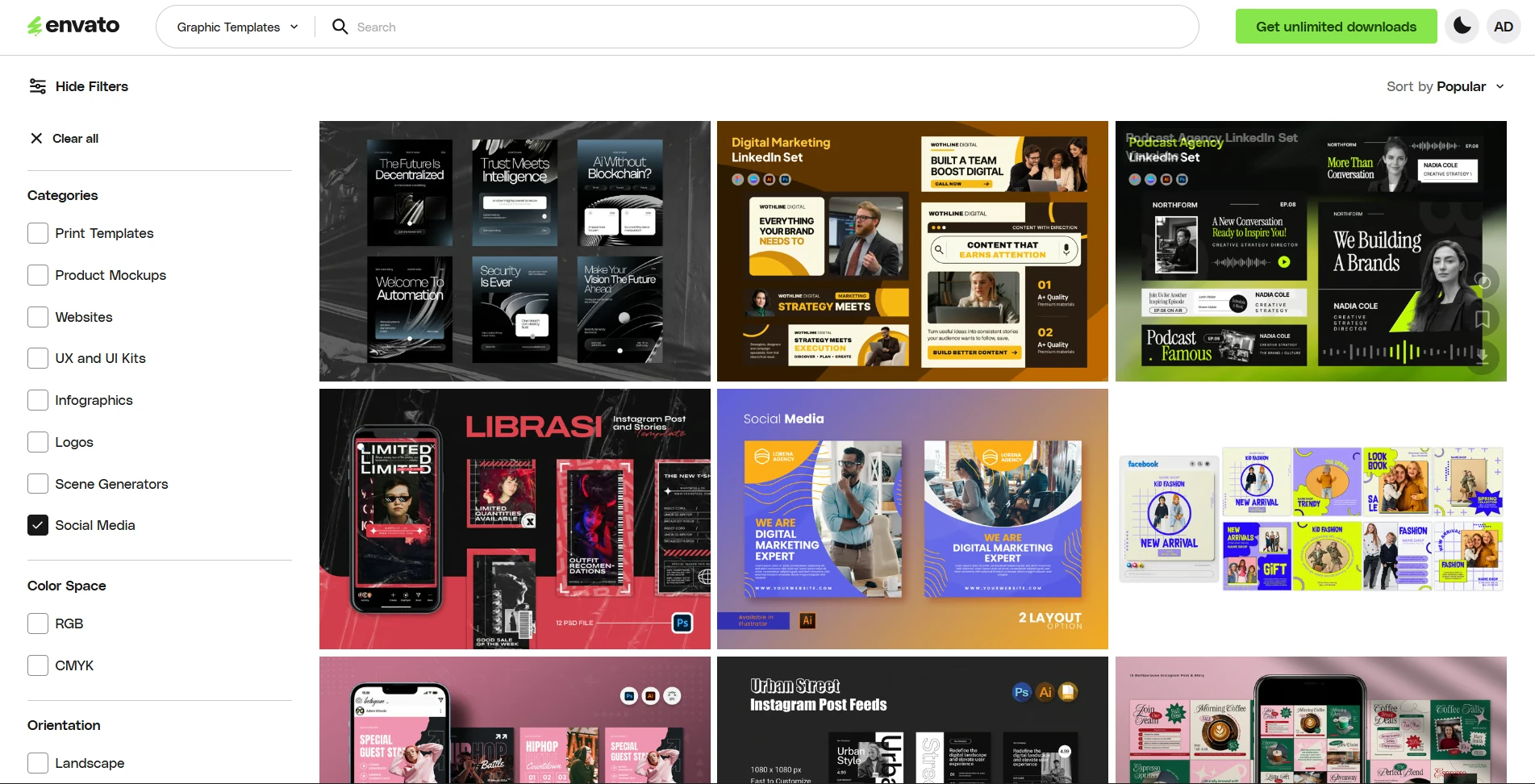
The trick is choosing for your content, not falling in love with the demonstration image.
Before committing to a template, check:
- Headline capacity: Will your real headline fit without becoming tiny?
- Information capacity: Is there an appropriate place for your price, date, location, or supporting detail?
- Campaign coverage: Does the set provide compositions suited to the formats you actually need?
- Practical compatibility: Are the files editable in your software, and have you checked the required fonts, included assets, and usage terms?
Then replace the demonstration photograph early. A layout that looked spectacular around a dramatic fashion portrait might not work around your modestly sized product image. Discover that before you finish customizing everything else.
Keep the useful structure, but replace the visual identity: your typography, your color roles, your imagery, your language, and your branding treatment.
For recurring work, build a small family of approved layouts—perhaps an offer, an announcement, a product feature, and a customer quotation. Consistency does not require publishing the same composition forever. It requires recognizable relationships between the variations.
6. Stop asking tiny images to do a big image’s job
A polished layout cannot disguise a visibly pixelated hero image. Before adding effects, check whether your source photograph has enough pixels for the space it occupies.
A 600-pixel-wide photograph filling a 1200-pixel-wide panel is being enlarged twofold. The same photograph occupying a 400-pixel-wide area within that graphic is a different situation. Evaluate the image’s actual placement, not just the overall canvas dimensions.
Also distinguish insufficient resolution from missed focus, motion blur, or heavy compression. They can all look “blurry,” but they are not the same problem.
First, ask for the original file—not a screenshot, messaging-app copy, or image downloaded from an old presentation. And do not expect changing a resolution field from 72 to 300 without resampling to improve a screen graphic. As Adobe’s explanation of pixels, resolution, and resampling shows, that change does not add pixel data.
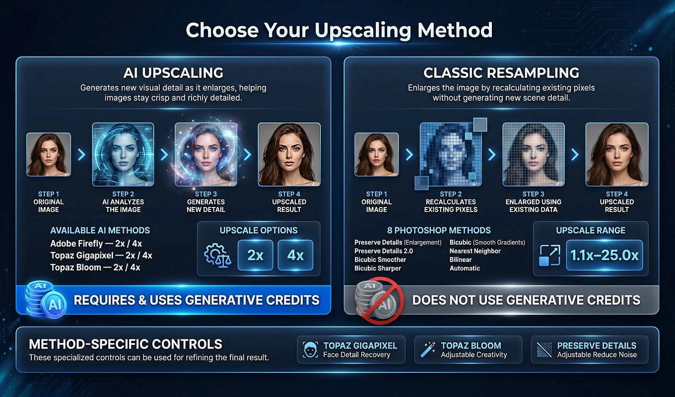
When a better original is unavailable, upscaling can help make an otherwise useful asset suitable for a larger placement. This is especially relevant when you inherit a client’s product library or have a collection of small photographs that cannot easily be reshot.
Bulk Image Upscaler: Batch-Enhance Resolution automates that work across a folder in Photoshop. It provides AI workflows using Firefly, Topaz Gigapixel, and Topaz Bloom in 2× and 4× variants, alongside traditional Photoshop resampling methods for custom enlargement factors. Optional post-upscale sharpening can be included, and the enlarged results are exported separately without overwriting the originals.
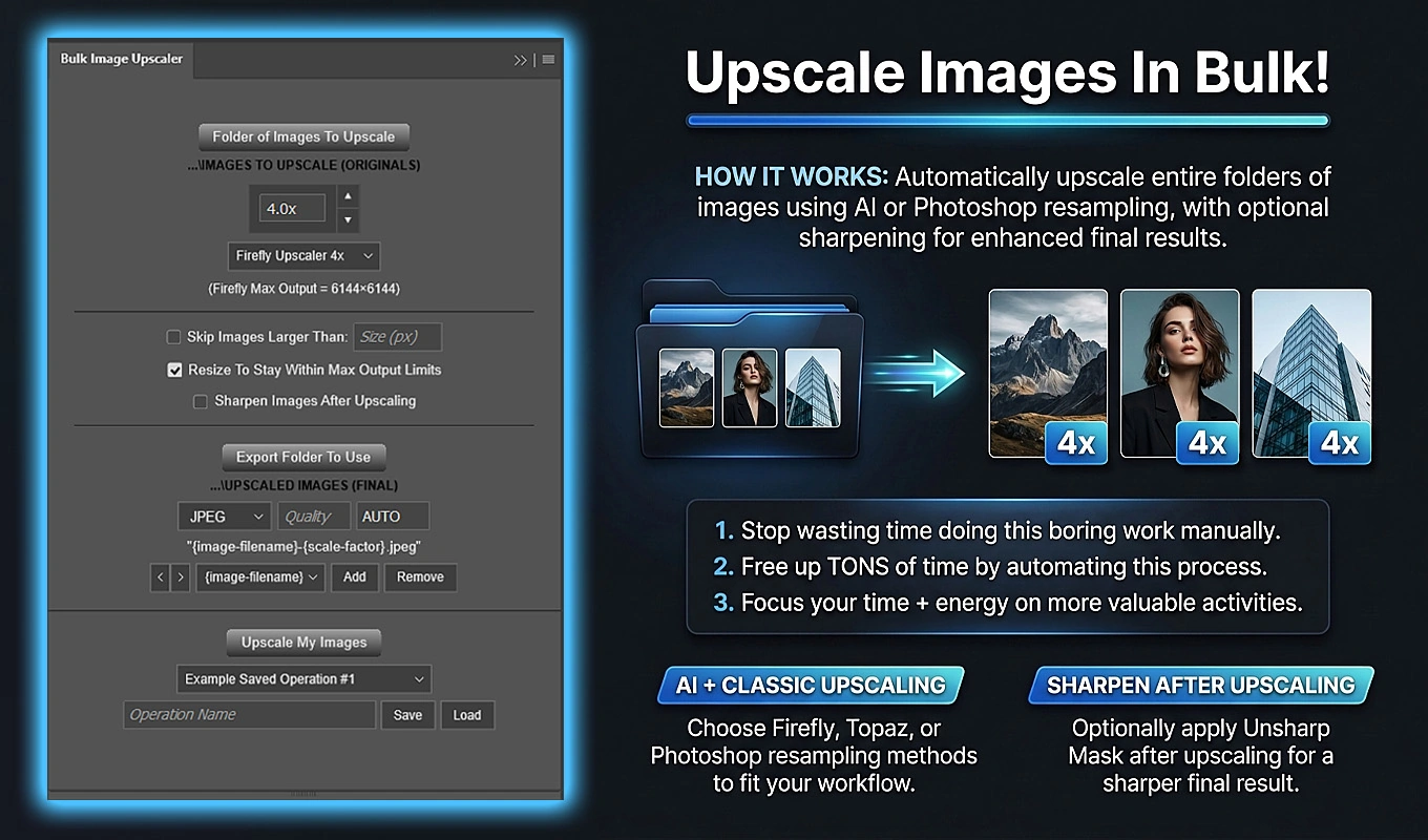
Test a representative sample before running the whole collection. AI methods can consume Generative Credits, and a bigger file is not automatically a more faithful image. Inspect product labels, faces, straight edges, and textures against the original—particularly when the picture represents an actual item or property.
Choose the enlargement that serves the final placement, not the largest multiplier available.
7. Turn your logo or website address into a consistent signature
Branding often looks unprofessional because its treatment changes, not because the logo itself is bad.
One image gets a huge logo in the middle. Another gets a tiny logo touching the edge. A third has a website address in an unrelated font. Individually, these may seem like small compromises. Together, they make the image set feel unmanaged.
Write a short branding specification covering the logo variant, relative size, placement, edge clearance, and text treatment. Decide whether the signature belongs on the asset at all; not every marketing graphic needs an additional watermark.
For image collections with different resolutions, relative sizing is especially useful. A logo set to 12% of image width would be 240 pixels wide on a 2000-pixel image and 120 pixels wide on a 1000-pixel image. Its proportion remains consistent rather than its absolute pixel size.
Bulk Image Watermarker: Automated Batch Logos lets you apply that specification across a folder in Photoshop. Its Simple Watermark layout supports nine alignment positions, percentage-based width, independent edge padding, and opacity control for either an image logo or a text watermark.
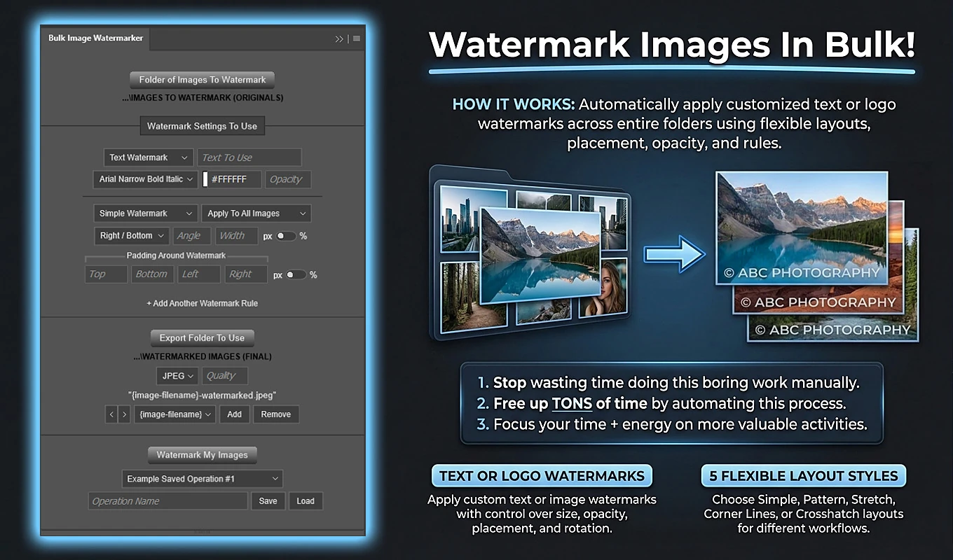
As a starting test, you could use a bottom-right logo at 12% width with 3% right and bottom padding. Review the result on representative images, then adjust the values to suit your particular mark. Those settings are a repeatable starting point—not a universal definition of elegant branding.
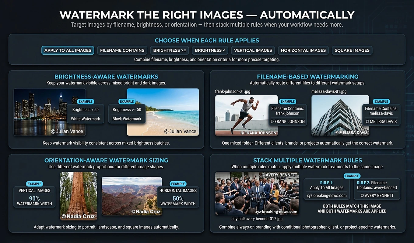
Text rules can add a company name or website address using a selected Photoshop font and color. If you want both a logo and a website address, separate qualifying rules can add both to the same exported image; give them distinct positions or padding so they do not collide.
Once the treatment works, save the operation for future batches. That turns branding from a series of improvised placements into a reusable production rule.
Keep the signature readable, but subordinate to the message. A restrained mark should identify the work, not wrestle the product for attention.
8. Judge the exported graphic where people will actually see it
The final review should happen outside your comfortable, zoomed-in editing view.
A graphic that looks immaculate on a large monitor can become unreadable when displayed in a feed. For example, if a 1080-pixel-wide graphic is shown at 360 pixels wide, 24-pixel type scales to the equivalent of roughly 8-pixel type. The original document’s generous dimensions do not protect small lettering from that reduction.
Inspect at 100% to catch image defects, and at the intended display size to judge communication. They are different tests.
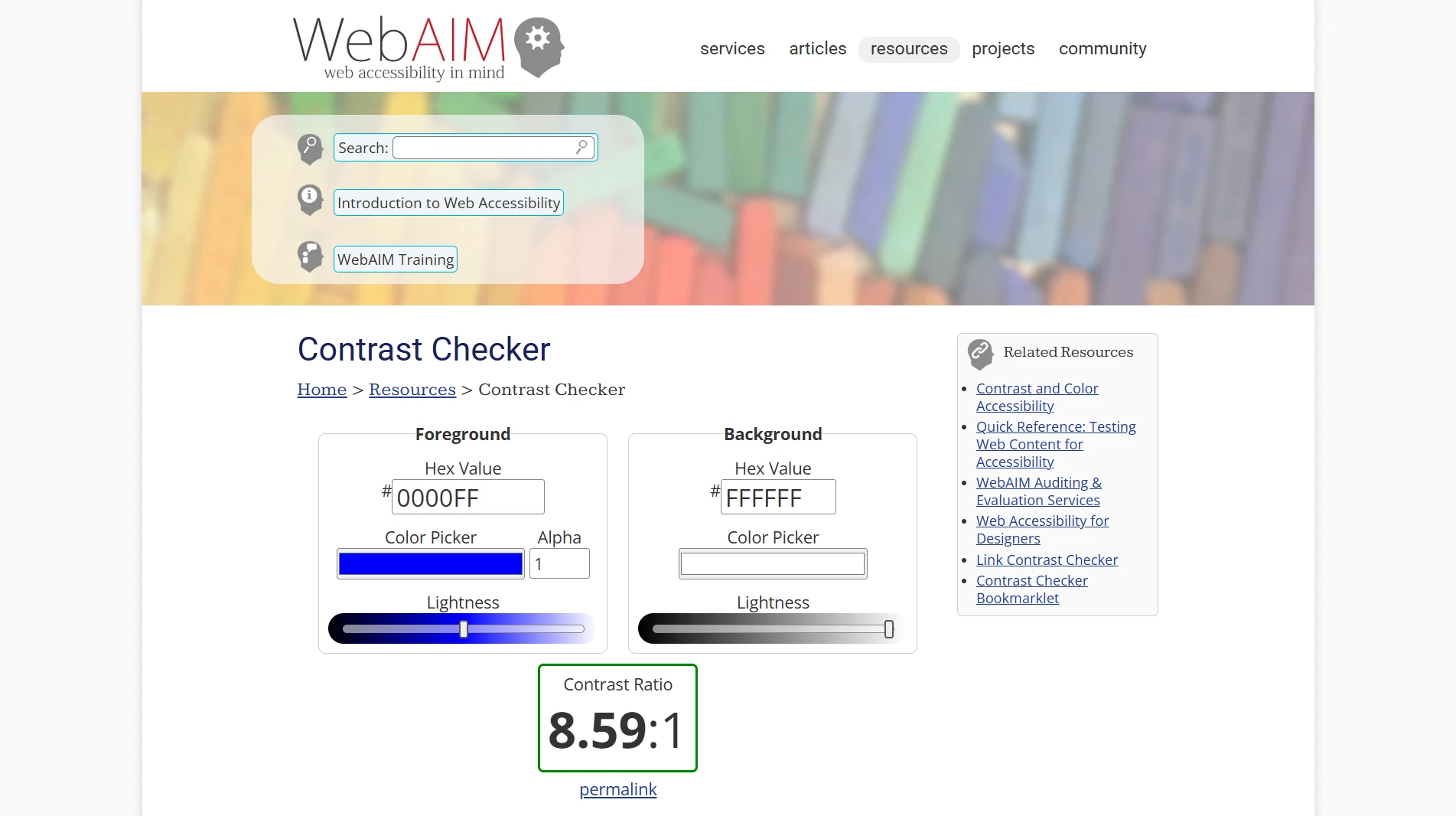
Use WebAIM’s Contrast Checker to evaluate text and background color combinations. Its WCAG AA guidance uses a minimum contrast ratio of 4.5:1 for normal text. For marketing copy, that is a useful starting target—not a substitute for checking the actual rendered graphic. Over photographs, inspect the background directly behind the lettering, or give the text a quieter panel.
Before publishing, make one final pass:
- Message: Can someone unfamiliar with the project identify the main point without an explanation?
- Readability: Are the headline, essential details, and action readable at the intended size?
- Placement: Does the destination’s preview preserve important content without awkward clipping or overlap?
- Accuracy: Are prices, dates, product details, addresses, and claims correct?
- Export quality: Does the exported file—not merely the working document—retain clean text, acceptable image detail, and the expected colors? For online graphics, Adobe’s sRGB guidance is a useful color-management reference.
- Campaign consistency: When the graphics are viewed together as thumbnails, do typography, lighting, color, and branding look like they belong to the same business?
If time is limited, prioritize the biggest visible problem: clarify a confused message, replace an irrelevant image, or fix unreadable text before polishing decorative details. Professional-looking marketing graphics come from clear choices carried through consistently—not from adding more things to the canvas.