9 Design Mistakes That Make Ecommerce Stores Look Unprofessional


An ecommerce store can have a polished logo and an expensive theme and still feel unfinished. The product images arrive slowly. Every button looks slightly different. A discount popup interrupts the first useful thing a visitor tries to do. Switching variants makes the product jump around in the gallery.
These problems are worth separating from personal taste. A colorful store can look professional. A minimalist store can look careless. What matters is whether the design feels deliberate, helps shoppers evaluate the merchandise, and makes the next step obvious.
The following nine mistakes are practical things you can inspect and fix—not reasons to rebuild your entire website. Review your homepage, one collection page, one important product page, and the cart as you work through them.
Mistake #1: Mixing Visual Styles Until the Store Looks Pieced Together
One rounded button is not a branding problem. A rounded button beside a square button, a third-party widget in another font, and a promotional banner with completely different spacing is a pattern worth fixing.
The problem is not simply having “too many colors.” It is giving the same kind of information different visual treatments—or giving different kinds of information indistinguishable treatments. If a newsletter signup, a product purchase, and a minor informational link all look equally important, the page has no clear priorities.
Nielsen Norman Group’s guidance on consistency and standards explains why predictable patterns matter: visitors should not have to keep figuring out whether different words, symbols, and controls mean the same thing.
Create a short design reference before changing individual pages. It should define:
- Typography: one readable body typeface, an optional heading typeface, and consistent treatments for prices, product titles, and supporting text.
- Button roles: a prominent primary action, a quieter secondary action, and a recognizable text-link style.
- Spacing: a repeatable set of gaps and padding values rather than a different adjustment in every section.
- Component behavior: the same treatment for selected variants, unavailable options, sale prices, and error messages throughout the store.
These are organizational choices, not rules that every brand must look restrained. A playful store can use expressive typography and bold color while keeping its controls consistent.
Also check the colors you have chosen for actual readability. WebAIM’s Contrast Checker lets you test foreground and background combinations; the WCAG AA minimum for ordinary text is a 4.5:1 contrast ratio. Pale gray shipping information on a white background may look delicate in a design file but still fail that test.
For a quick audit, compare screenshots of your homepage, collection page, product page, and cart side by side. Look specifically at buttons, headings, prices, borders, and spacing. Fix the repeated inconsistencies before adding more decorative elements.

Mistake #2: Uploading Oversized Images and Making Shoppers Wait
A product grid that appears one image at a time does not feel polished. Neither does a product page where the purchase controls arrive long before the photograph needed to evaluate the item.
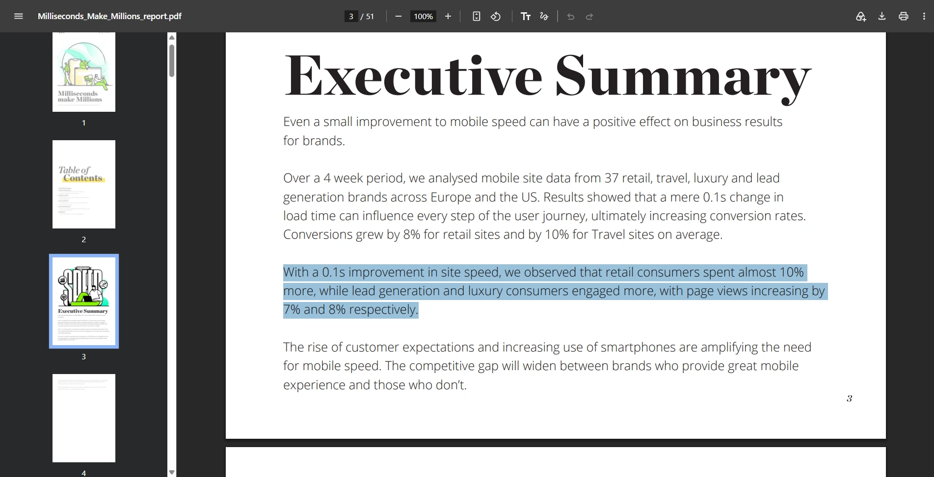
The commercial importance of speed is more than a theoretical concern. The 2020 Deloitte study Milliseconds Make Millions examined mobile data from 37 brands over four weeks. Within its retail findings, a 0.1-second improvement across four measured speed metrics was associated with an 8.4% increase in conversion rates and a 9.2% increase in average order value. Those are observed study results, not a promise that every store will achieve the same uplift.
Start by testing a collection page and an image-heavy product page with PageSpeed Insights, rather than testing only your homepage. Examine the mobile results and the real-user data when available.
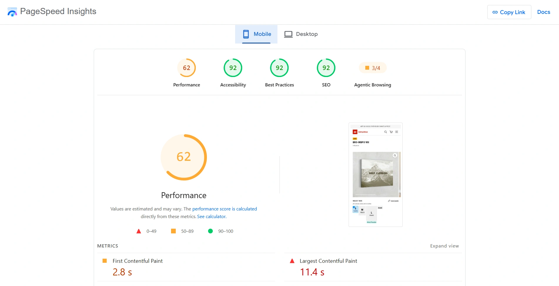
Pay particular attention to Largest Contentful Paint, or LCP: the time until the largest visible image or text block renders. Google’s LCP optimization guidance recommends 2.5 seconds or less for at least 75% of visits and warns against lazy-loading the LCP image. Compressing a photograph helps its download size, but it cannot compensate for a theme that unnecessarily delays requesting it.
Make compression a repeatable publishing step
Keep high-quality masters separately, then prepare delivery files for the store. Use different requirements for collection thumbnails, main gallery images, and detailed zoom views. They do not all serve the same purpose, so they should not automatically receive the same filesize budget.
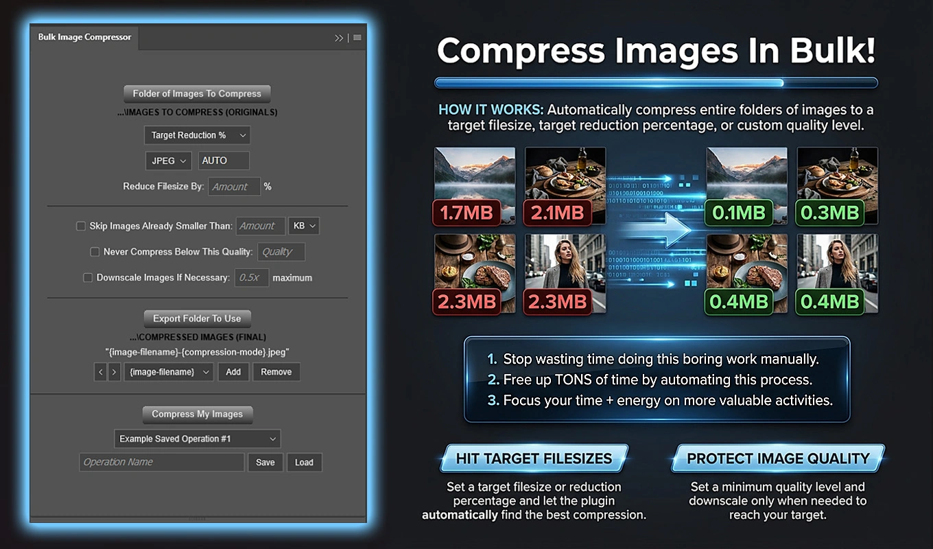
For Photoshop-based catalog production, Bulk Image Compressor: Batch-Reduce Filesizes automates compression across a folder, exporting JPEG or WebP derivatives instead of requiring repeated manual exports. Its three modes suit different publishing goals:
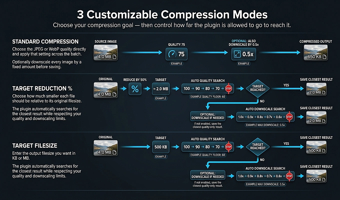
- Target Filesize is useful when you want a batch of images near a chosen KB or MB budget. It calibrates each image individually rather than assuming one quality setting will produce the same filesize everywhere.
- Target Reduction % is useful for reducing a heavy existing library proportionally. A 75% reduction aims to leave approximately 25% of each original file’s size; it does not give every image one identical filesize.
- Standard Compression applies your chosen quality across the batch when you have already tested a suitable export setting.
The target modes measure actual encoded output sizes while searching for a suitable quality. They treat results within ±10% of the target as successful and use the closest permitted result when the target cannot be reached. That automates the tedious save, inspect, adjust, and save-again cycle without pretending filesizes are byte-exact.
Once a compression setup works for a particular image class, save the operation for future uploads. The benefit is not just smaller files today; it is making optimization part of the routine instead of something postponed until the site feels slow.
Do not solve slow loading by making the merchandise look worse
Check demanding images before processing the full catalog: fine fabric, small printed text, hair, foliage, and smooth gradients. Inspect both their ordinary display size and their intended zoom view.
In the plugin’s target modes, Never Compress Below This Quality establishes a quality floor. Compression quality is tried before dimensions are reduced; optional adaptive downscaling is used only when necessary and within your chosen limit. For detail-dependent merchandise, leave downscaling disabled unless you have verified that the smaller dimensions still support inspection.
Finally, retest the live pages. Judge the files visitors actually receive, not just the exports on your computer. A smaller source file is useful, but the finished storefront is the real test.
Mistake #3: Making Navigation Clever Instead of Understandable
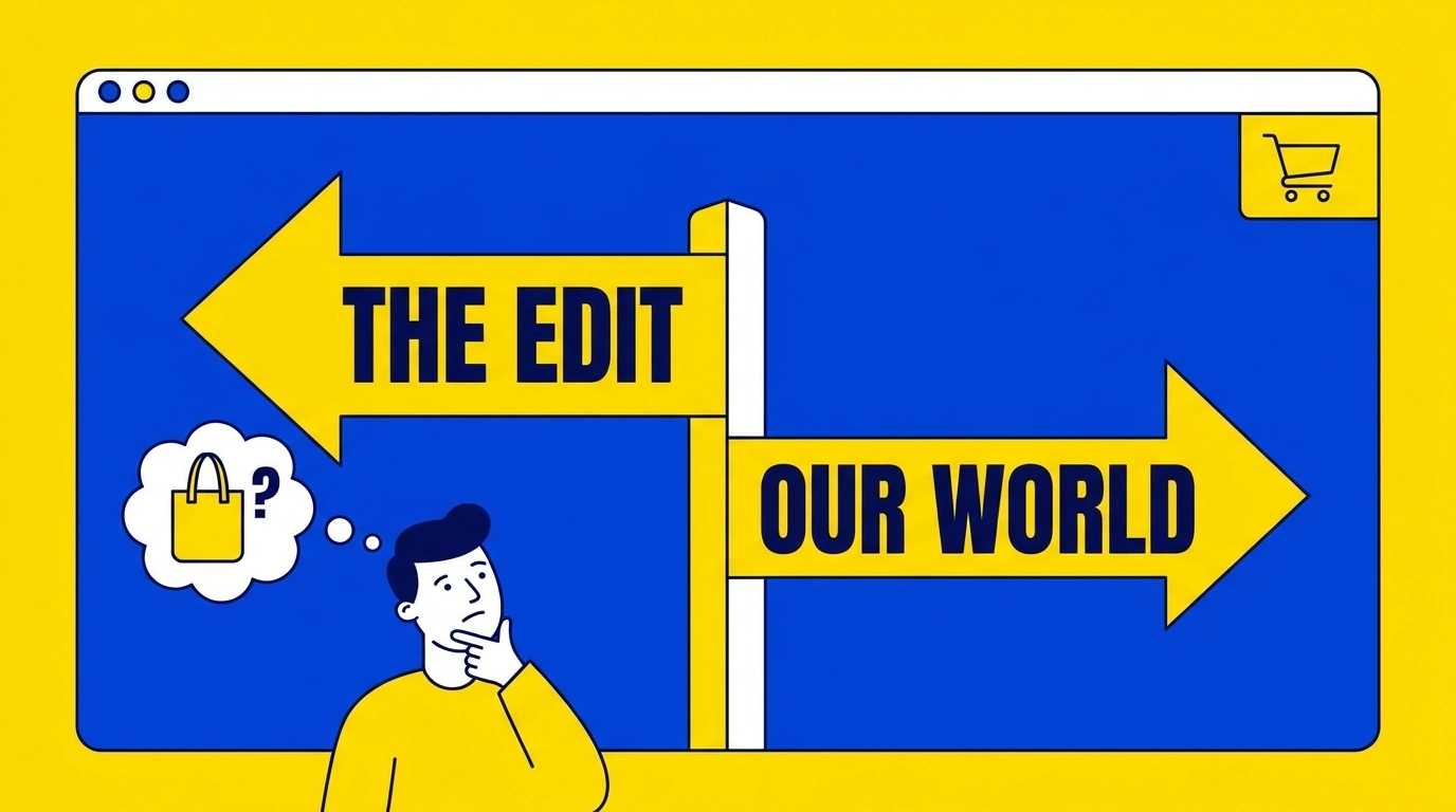
“The Edit,” “Discover,” and “Our World” may fit a brand’s voice. They are less useful when a first-time visitor simply wants to find a tote bag.
Navigation should reveal what you sell before it asks shoppers to understand your brand vocabulary. Keep creative collection names, but place them alongside understandable product categories rather than using them as the only route into the catalog.
Baymard’s research on mobile category navigation found that burying categories under an additional “Shop” or “Products” level can make browsing harder. The important qualification is catalog size: a simple Shop menu can work for a small, homogeneous assortment. A store spanning many product types needs more immediately visible structure.
For a homewares store, “Lighting,” “Tableware,” and “Storage” tell visitors more than three branded collection names. Within those categories, filters should reflect real purchasing decisions: dimensions, material, finish, capacity, or compatibility—not merely whatever fields happen to exist in the database.
Run three practical tests:
- Ask someone unfamiliar with the store to find a particular product type using the menu.
- Ask them to search using the everyday name of the item, not your internal product terminology.
- Ask them to narrow the results to a plausible requirement, such as a particular size or material.
Watch where they hesitate. Do not explain what the menu label means while they are trying to use it; that explanation is precisely what the interface should not require.
Professional navigation does not need to be elaborate. It needs to make the assortment understandable and help visitors reach relevant products without guessing.
Mistake #4: Covering the Store With Popups, Banners, and Floating Widgets
Consider the first mobile visit: a cookie notice covers the bottom, an email offer covers the center, an announcement bar occupies the top, and a chat bubble floats over the remaining product content.
Each feature may have a reasonable business purpose. Together, they create an obstacle course.
Baymard’s live-chat usability research distinguishes between help visitors seek out and help that interrupts them. User-initiated chat can be valuable; unsolicited overlays and poorly positioned sticky controls can interfere with the shopping task, especially on mobile.
Audit interruptions as one combined experience, not as separate app settings. Open the store in a fresh browser session, where you have not already dismissed its messages. Then open a product page directly, because visitors do not necessarily arrive through the homepage.
A calmer configuration might include:
- One concise announcement containing genuinely useful information, such as an accurate shipping threshold.
- An email offer placed inline or introduced after meaningful browsing, rather than immediately blocking the merchandise.
- Chat that remains available without opening a conversation on the shopper’s behalf.
- Clear dismissal controls and settings that respect a visitor’s decision to close a promotion.
This is not an argument for removing necessary consent controls or eliminating customer support. It is an argument for preventing several independent features from occupying the same space or demanding attention simultaneously.
If you test a more aggressive promotion, assess it against the complete shopping journey. Extra email signups are not automatically a good result if the same treatment makes product browsing or purchasing harder.
A useful standard is simple: visitors should be able to inspect a product without first clearing a pile of unrelated messages.
Mistake #5: Publishing Product Images That Look Soft or Blurry
Soft product photography leaves important questions unanswered. Is that fabric textured or smooth? Are the engraved letters clean? What does the stitching actually look like?
Baymard’s research on image resolution and zoom documents how low-quality product images can damage perceptions of both the merchandise and the store. Its testing also shows why a gallery needs enough detail for inspection, not just a photograph that looks acceptable as a thumbnail.
First, diagnose the source of the softness. Compare the original photograph, the exported file, and the live gallery image. Check whether the store is enlarging an undersized file or whether compression has removed useful detail. Do not treat every blurry image as a sharpening problem.
When the source is sound but slightly soft, careful sharpening can provide a finishing improvement. The effect can feel a little like putting on correctly prescribed glasses: edges become easier to distinguish and existing detail feels clearer. The analogy has limits, though. Adobe’s sharpening overview explains that sharpening increases edge contrast; it cannot restore missing detail or fix an out-of-focus area, and excessive sharpening can introduce halos, jagged edges, or noise.
Apply the finishing treatment consistently across the catalog
Bulk Image Sharpener: Automated Sharpening lets Photoshop users configure Unsharp Mask or Smart Sharpen once and apply that operation across a source folder. It is useful when a collection of otherwise good photographs needs a consistent final treatment—not when the original shoot needs rescuing.
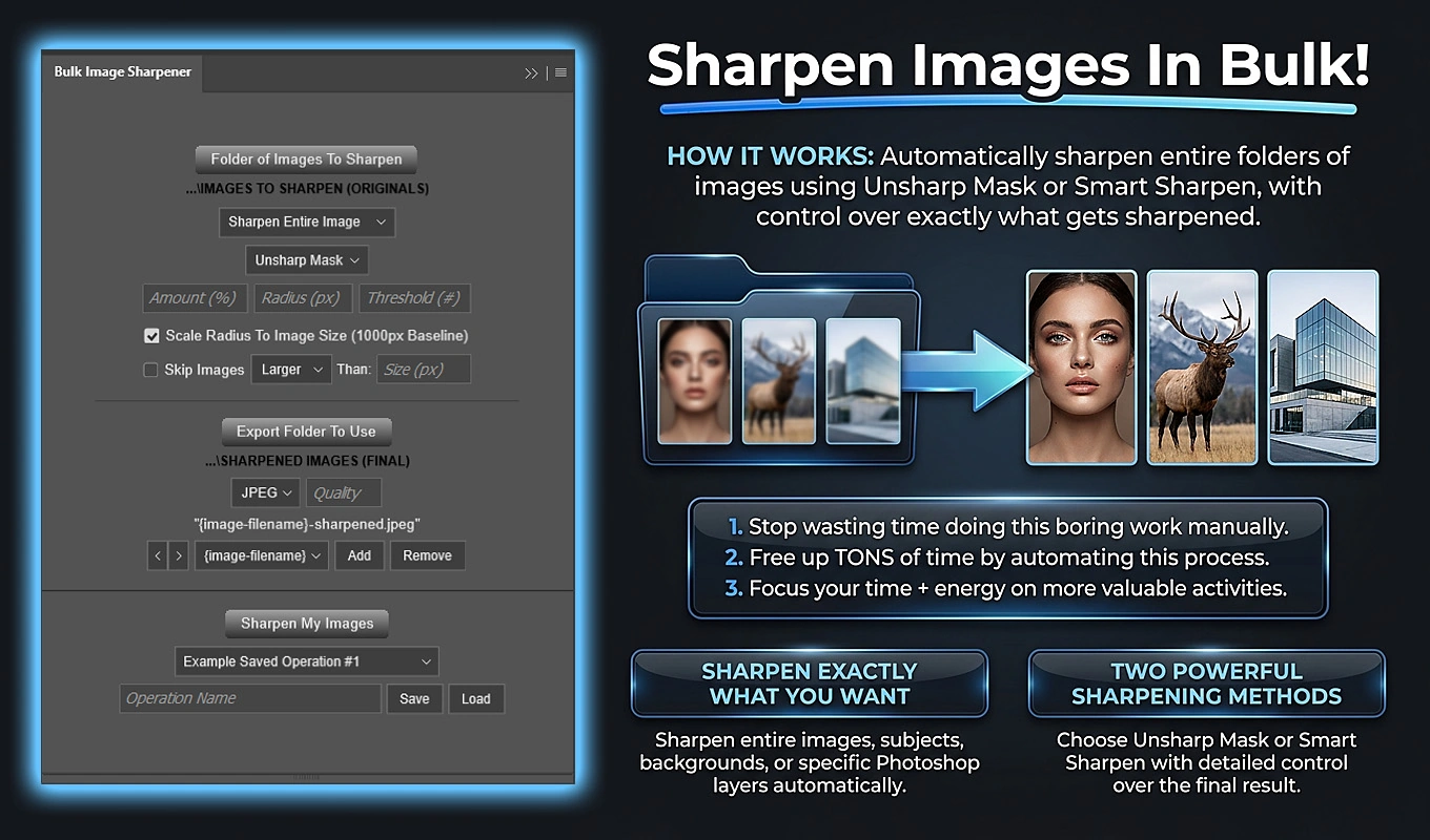
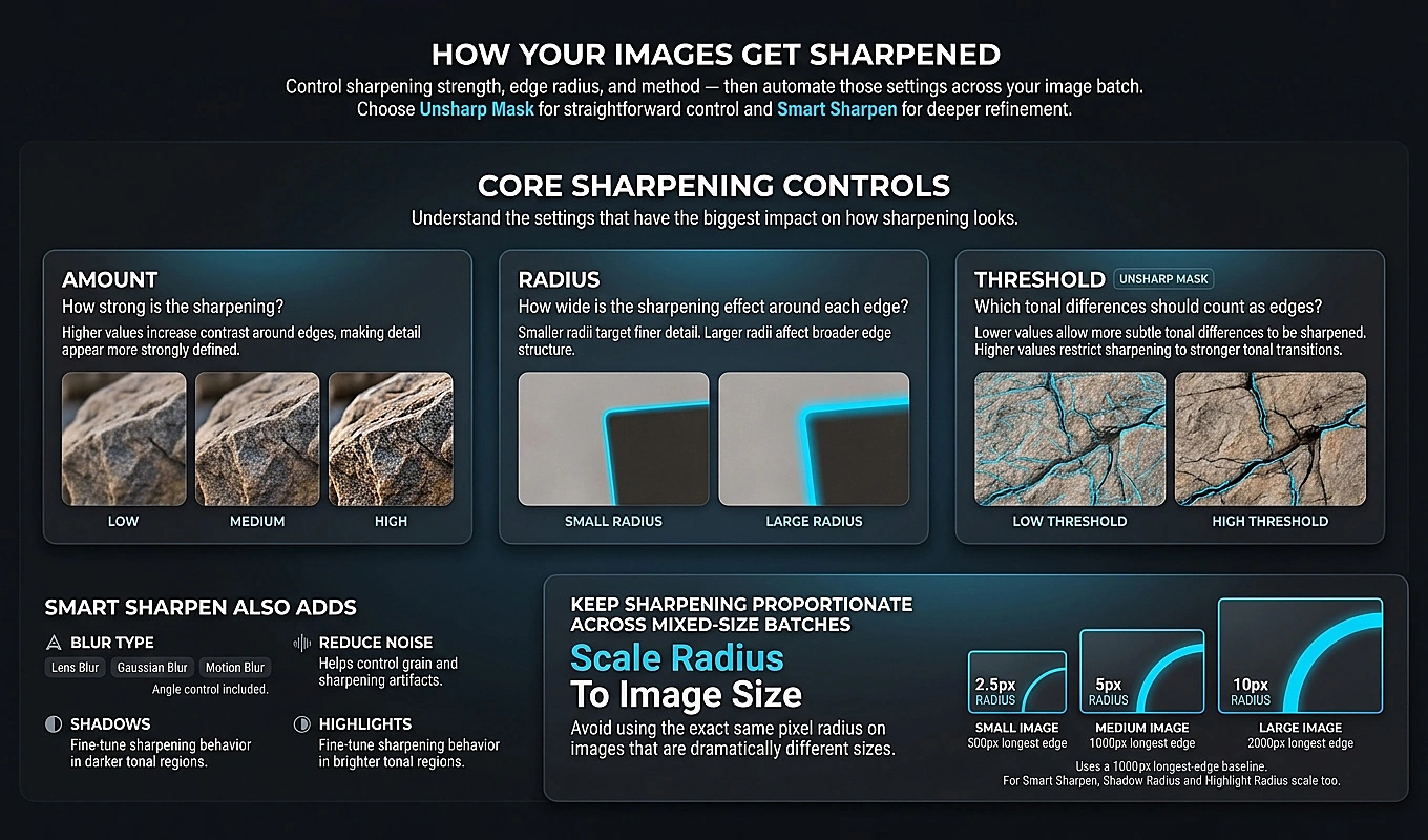
Unsharp Mask provides Amount, Radius, and Threshold controls. Smart Sharpen offers additional controls, including Reduce Noise and separate shadow and highlight adjustments. For ecommerce, the goal is not the strongest visible effect; it is clearer product detail without making surfaces look artificially harsh.
The targeting options also matter. Entire Image sharpening suits straightforward catalog photographs. Subject Only uses Photoshop Select Subject to concentrate the treatment on the detected subject. In consistently structured layered files, targeting a named Product layer offers another way to apply sharpening to the merchandise rather than indiscriminately treating the scene.
For folders containing different resolutions, Scale Radius To Image Size uses a 1000-pixel longest-edge baseline. A configured 1-pixel radius becomes 2 pixels on an image whose longest edge is 2000 pixels. This scales the radius proportionally; it does not automatically discover the ideal sharpening strength for every photograph.
Test representative items before saving a reusable operation. Include a textured product, a glossy product, a label with small text, and an image with smooth background areas. Review the exports at their intended storefront size, and check detailed views at 100%.
Keep the distinction between crisp and overprocessed. Sharpening should make the product easier to evaluate, not make its surface appear rougher, shinier, or more heavily textured than it really is.
Mistake #6: Designing Product Pages Around Persuasion but Hiding Purchase Details
A page can have a beautiful photograph, an enthusiastic headline, and a prominent purchase button while still feeling unreliable. The missing pieces are often mundane: dimensions, what is included, delivery costs, or whether the item can be returned.
This is a layout problem as much as a copywriting problem. Information technically exists somewhere on the website, but it is not available where the shopper needs it.
Baymard’s product-page research recommends showing an order-cost estimate near the buying area, including shipping costs or an estimate with its conditions. Requiring people to add an item to the cart merely to discover basic costs creates unnecessary work.
Organize the product page around a short set of buying questions:
- What exactly am I buying? Specify the selected size, material, quantity, and included accessories.
- Will it fit or work for me? Provide dimensions, fit guidance, compatibility, or other relevant specifications.
- What will it cost? Make variant pricing clear and explain shipping charges or thresholds.
- When will I receive it? Distinguish production or dispatch time from transit time.
- What happens if it is unsuitable? Summarize the actual return conditions and link to the full policy.
Keep the most consequential answers near the price, variant controls, and purchase button. Use clearly labeled expandable sections for longer specifications; do not hide every practical detail behind a vague “Learn More” label.
Be especially precise with product imagery. If a framed print photograph shows a frame that is not included, say so near the buying controls. A lifestyle scene is not a substitute for a clear explanation of the actual purchase.
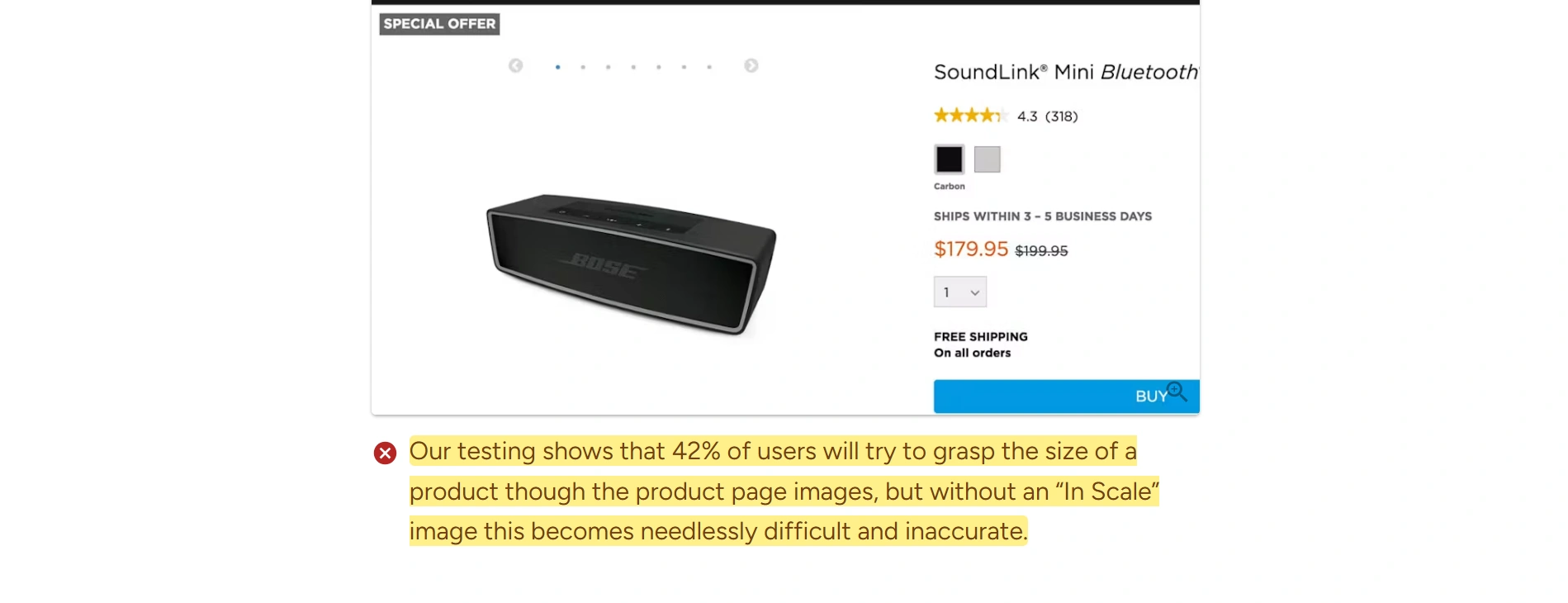
Also show scale where it matters. Baymard’s guidance on in-scale product images explains how recognizable surroundings, objects, or human models help shoppers understand physical size. A crisp photograph of an isolated bag still does not show how large it is when worn.
To audit the page, cover the promotional description and see whether the remaining layout answers the practical questions. Then uncover it. The emotional story should enrich an understandable offer, not substitute for one.
Mistake #7: Treating the Mobile Store as a Shrunken Desktop Site
A desktop preview cannot tell you whether a thumb can reliably select a variant, whether a sticky purchase bar covers an error message, or whether the on-screen keyboard hides the field someone is trying to complete.
Mobile polish is about the entire interaction, not just whether columns stack.
Chrome DevTools Device Mode is useful for checking different viewport sizes and approximating mobile conditions. Its documentation explicitly describes it as an approximation, so follow browser testing with a real phone.
Test a complete purchase path rather than admiring the homepage:
- Open the navigation and move into a product category.
- Apply a filter, open a product, and return to the results.
- Select a size or color and verify the selected state, price, and image.
- Open the image gallery and inspect product details.
- Add the item to the cart, change quantity, and proceed through the relevant form fields.
Look for controls that require precise tapping. Swatches, gallery arrows, quantity buttons, and popup close controls deserve particular attention. WCAG 2.2’s target-size criterion sets a 24-by-24 CSS-pixel minimum for pointer targets, with specified exceptions, including spacing provisions. Treat that as a minimum to evaluate against, not an invitation to make every important control as small as possible.
Check the awkward states too: a long product name, an unavailable variant, a validation error, an expanded delivery section, and a cart containing several items. These reveal layout weaknesses that a carefully chosen demo product can conceal.
Then put the mouse aside and use the keyboard on desktop. Confirm that you can reach the menu, select options, operate dialogs, and identify the focused control. A storefront should not require hover to reveal information essential to buying.
Take screenshots of the failures and attach the action that caused each one. “The site feels bad on mobile” is difficult to repair. “The chat bubble covers the quantity increase button after the cart opens” is a specific, fixable defect.
Mistake #8: Letting Product Mockups Drift Between Designs and Variants
Click between two product options and watch the image. Does the frame move? Does the artwork suddenly become larger? Does one shirt design sit higher on the chest than another?
When the product and scene are supposed to remain comparable, those shifts make it harder to tell what actually changed. Manual mockup production can introduce small placement differences as someone repeatedly resizes, aligns, replaces, and exports artwork.
Start by defining a repeatable image specification. For equivalent views, agree on the scene, output aspect ratio, product position, artwork placement area, and gallery order. This does not mean every photograph must be identical. It means differences should be intentional and informative.
Standardize the template, then automate the replacement
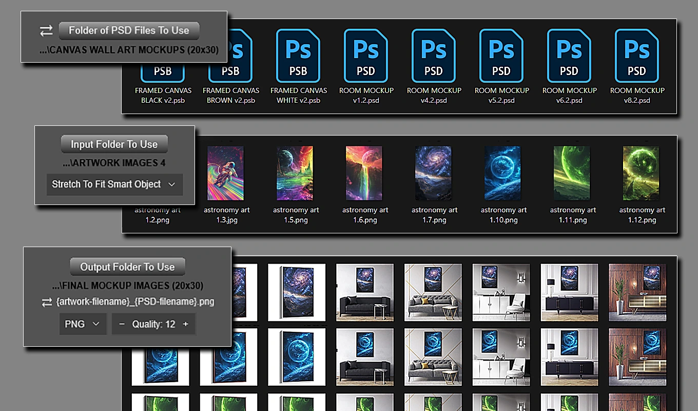
For print-on-demand products, wall art, packaging, and other Photoshop-based mockups, Batch-Replace Smart Objects: Mockups In Bulk replaces repetitive placement work with a configured operation. You provide a PSD or PSB Smart Object template, an artwork folder, and placement and export settings; the plugin inserts each artwork and exports the finished mockup.
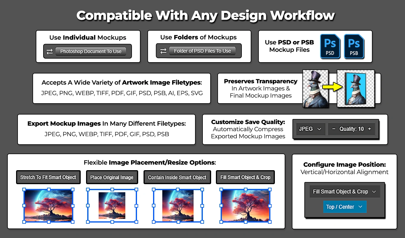
The placement choice should match the merchandise:
- Contain Inside Smart Object preserves the complete artwork and its proportions, but may leave unused space.
- Fill Smart Object & Crop preserves proportions while covering the target area, cropping overflow where necessary.
- Stretch To Fit Smart Object fills the exact area but can alter proportions, so do not choose it casually for designs whose shape must remain accurate.
- Place Original Image is useful when the artwork already has the intended dimensions and resolution.
Contain and Fill support nine alignment positions, allowing you to establish a repeatable placement rather than eyeballing each export. Consistent inputs still matter: differing transparent margins within artwork files can make visible designs occupy different amounts of space despite using the same placement rule.
The plugin can run a folder of artwork against one template or a folder of PSD/PSB templates. For example, 30 designs across three prepared views produces 90 artwork-and-template combinations. Saved Batches retain recurring setups, while Workflows can chain operations with different templates or placement settings.
Build and approve the template before scaling production. Its Smart Object’s internal dimensions provide the placement reference. Convert the artwork layer to a Smart Object before applying the outer perspective or distortion you want replacement artwork to inherit.
Automation removes repeated placement decisions; it does not certify the realism of a mockup. Compare a generated image with a real sample when possible, checking print scale, position, product color, and any accessories shown.
After upload, switch through the actual store variants. Confirm that each option displays the correct image and that equivalent views stay visually stable. Consistent exports only help if the storefront maps them to the right products.
Mistake #9: Using Fake Urgency and Decorative Trust Signals Instead of Credibility
A countdown timer says the sale ends in ten minutes. Ten minutes later, the offer is unchanged and the clock starts again. A stock warning appears on every product. A strip of security badges sits above a footer with no clear contact information.
This is not merely overenthusiastic styling. The interface is asking shoppers to believe claims that the business cannot substantiate.
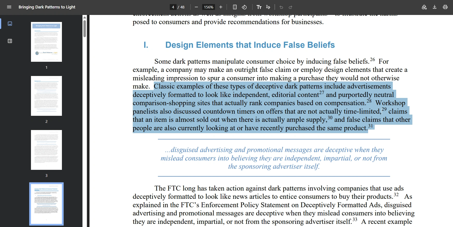
The FTC’s Bringing Dark Patterns to Light report identifies misleading countdown timers and other designs that manipulate consumer decisions. You do not need that kind of pressure to make an offer clear.
Replace manufactured urgency with useful, accurate information:
- Use a genuine promotion deadline, including the relevant time zone when necessary, and make the offer behave accordingly.
- Display inventory warnings only when they reflect real availability.
- Explain genuine order cutoffs or production capacity limits rather than inventing a reason to rush.
- Show authentic reviews and describe verification only when it actually occurs.
- Provide accessible contact information and clear shipping and return policies instead of relying on generic reassurance badges.
Look for contradictions between the design and the underlying offer. Does a prominent free-shipping banner omit a threshold? Does a product badge suggest easy returns while that item is excluded? Does the displayed price change only after the shopper makes an essential selection?
Audit promotional apps as carefully as you audit the theme. Let timers expire, revisit the offer, and verify whether the promised deadline has any meaningful effect. Read the store as someone who does not already know which claims are trustworthy.
Clear conditions need not dominate the page, but they should be readable where the claim appears. A professional storefront makes the offer easier to understand rather than making its limitations easier to miss.
If several of these mistakes apply to your store, prioritize the problems that block buying or undermine accuracy: broken mobile controls, misleading claims, hidden purchase details, and incorrect variant images. Next address loading performance and product-image quality. Then unify the visual styling across the shopping journey.
The goal is not to make the store look expensive. It is to make every important part feel considered: the products are easy to inspect, the information is dependable, the controls behave predictably, and nothing unnecessary stands between the shopper and a confident decision.