Common Photoshop Photo Editing Mistakes Photographers Should Avoid
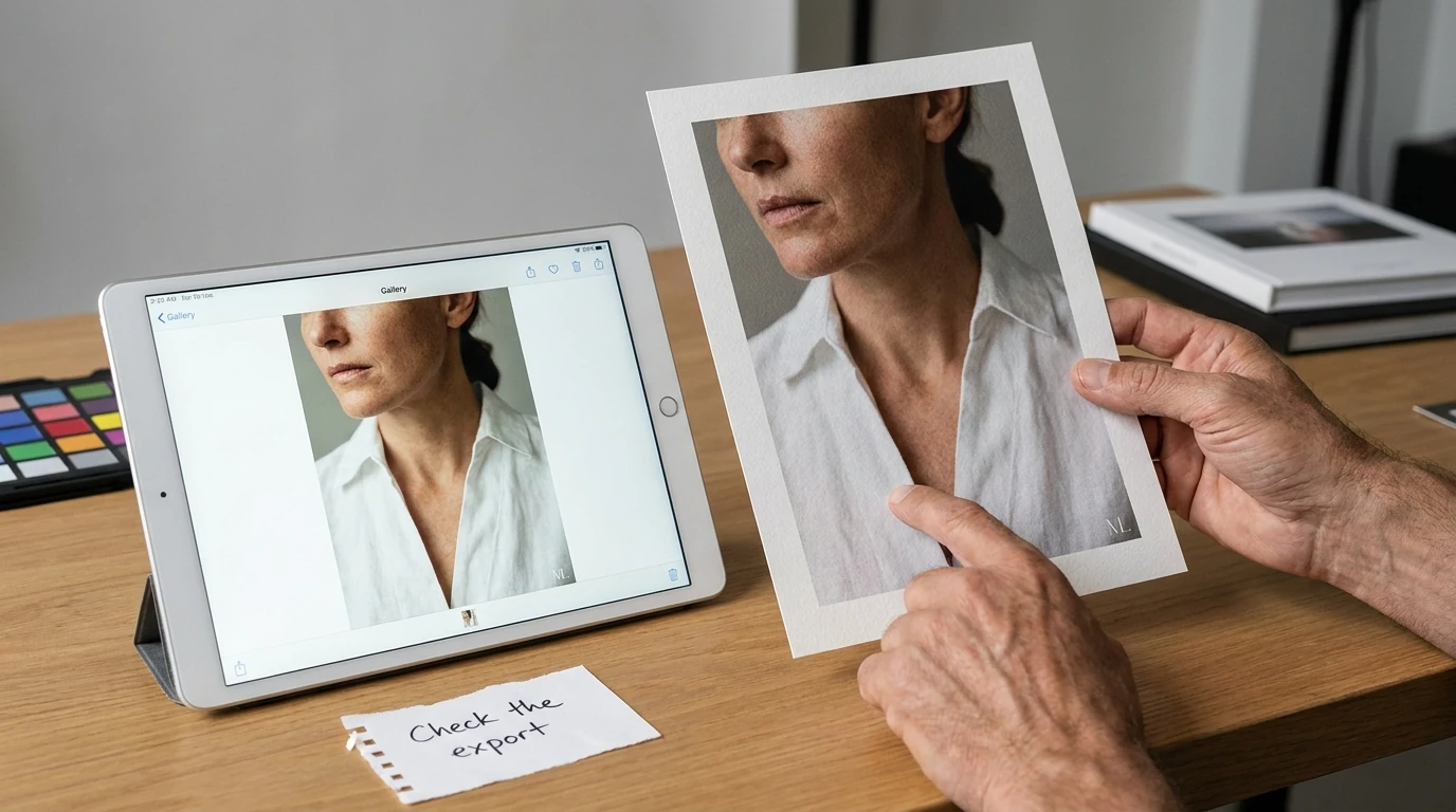
A photograph can look impressive in Photoshop and still fail as a finished image. Skin may look unnaturally smooth, a print may lose important shadow detail, or a perfectly placed watermark may become unreadable in a smaller delivery file. Other mistakes are less visible: rebuilding the same exports by hand, searching through panels, or discovering that an earlier editing decision cannot be reversed.
The most useful corrections are not complicated tricks. They are better decisions about what to change, how to preserve your options, and when to stop judging the working document and inspect the actual deliverable.
MISTAKE #1: Editing destructively without keeping a reusable master
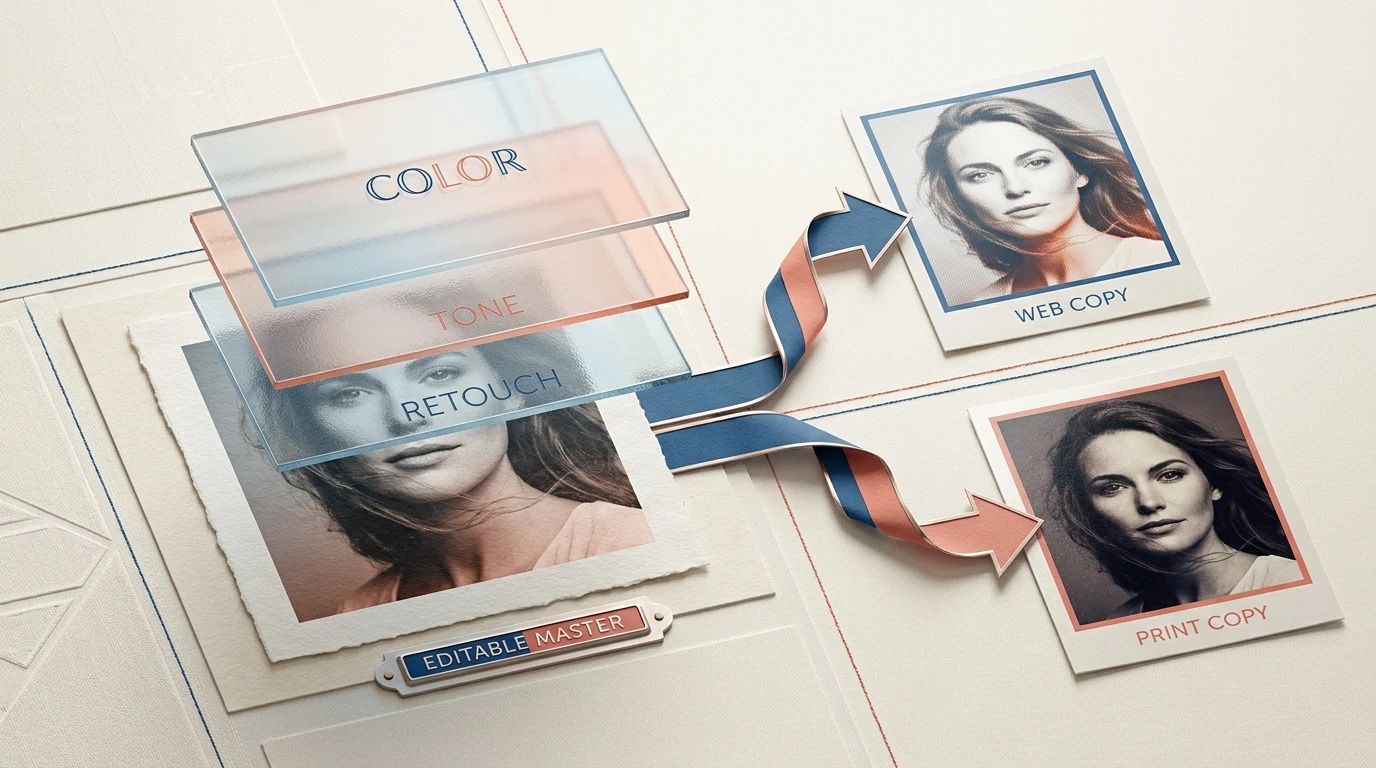
Keeping an untouched original is essential, but it does not solve every problem. If your only edited version is a flattened JPEG, changing the skin retouching or removing an aggressive color treatment may still mean starting again.
Preserve both the original capture and an editable master. In Photoshop, that means separating different kinds of decisions rather than baking everything into one pixel layer.
- Use adjustment layers for tonal and color corrections you may want to revise.
- Use layer masks to control where an adjustment appears instead of erasing image content.
- Apply compatible filters to Smart Objects when you need editable Smart Filters.
- Keep healing and cloning on separate retouching layers, using the appropriate sampling setting for the tool.
Adobe’s guide to nondestructive editing explains these approaches, including reopening Camera Raw settings when a raw image has been opened as a Smart Object.
Make the layer structure understandable, too. Names such as “Remove sensor dust,” “Face brightness,” and “Background color” are more useful than a stack of unnamed copies when you return to a commission later.
Save the layered master separately from delivery files. Adobe’s guide to choosing a photo file format recommends retaining a PSD master and avoiding repeated editing and resaving of JPEGs, which can discard additional information. Generate a new delivery copy from the master rather than repeatedly modifying yesterday’s export.
MISTAKE #2: Correcting the photograph when the display or color profile is the problem
If every print seems too dark or every image looks different outside Photoshop, resist the urge to immediately change contrast and saturation. First investigate how you are viewing the file.
Adobe’s monitor-calibration guidance makes the danger explicit: “Without an accurate monitor profile, you may make unnecessary corrections based on misleading color representation.”
For color-critical work, use a measured calibration and profiling process. Keep room lighting reasonably stable, and avoid making final judgments while a night-light mode or another display setting is deliberately changing the screen’s color appearance.
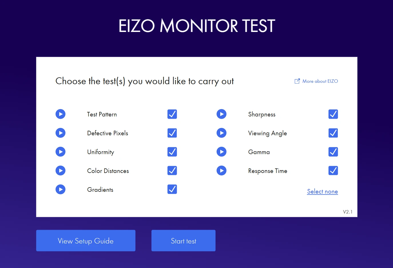
The EIZO Monitor Test is a useful preliminary check for uneven brightness and broken-looking gradients. It can help you notice obvious display problems; it does not replace instrument-based calibration.
There is a second, separate trap: confusing Assign Profile with Convert to Profile.
- Assign Profile changes how existing color numbers are interpreted.
- Convert to Profile translates the colors into another color space, aiming to preserve their appearance within the destination’s capabilities.
Consequently, assigning sRGB to a correctly tagged Adobe RGB photograph is not the same operation as converting it to sRGB. Adobe’s instructions for changing document profiles explain the distinction.
Troubleshoot in order: check the display, check the document’s profile, and then check the exported file. Do not compensate for a viewing problem by damaging an otherwise correct edit.
MISTAKE #3: Treating stronger contrast, saturation, and retouching as automatic improvements
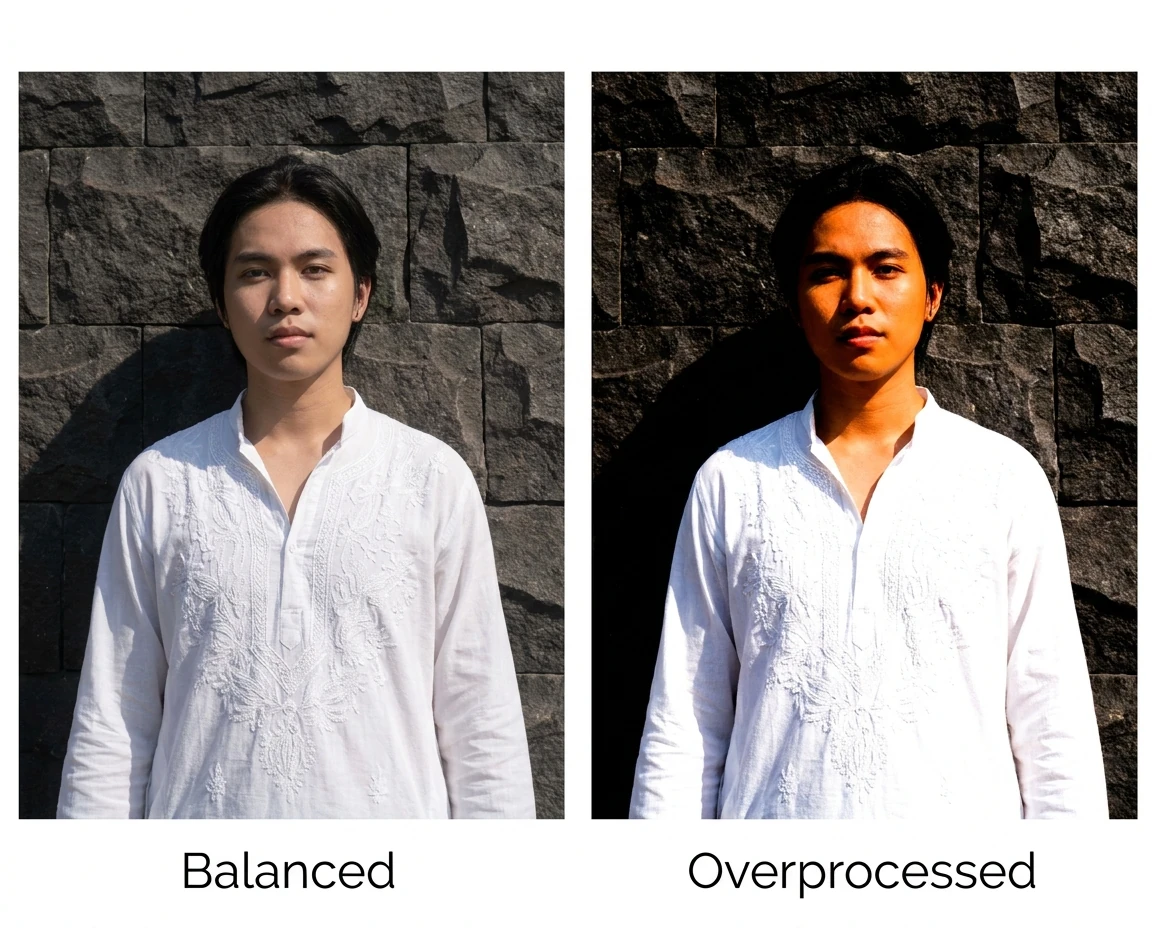
Overprocessing often happens through accumulation. A contrast adjustment looks good. Extra local contrast looks good. A little more saturation looks good. Together, they produce brittle edges, blocked shadows, and skin that no longer belongs to the lighting in the scene.
Before adding an adjustment, identify its job. “Separate the subject from the background” is a useful objective. “Make it pop” is not specific enough to tell you when to stop.
Use these checks to catch the most common excesses:
- For contrast, inspect important textured highlights and shadows—not just whether the picture looks punchier.
- For saturation, compare skin, foliage, and strongly colored clothing before and after the adjustment.
- For retouching, check whether pores, natural folds, and gradual tonal transitions still exist.
- For healing and cloning, look for repeated texture, smeared boundaries, and lighting that changes abruptly across a repair.
The Photoshop Histogram panel can help reveal tonal clipping, and its individual channel views are useful when a strongly colored subject loses detail. But do not edit toward a supposedly perfect histogram shape. A low-key portrait does not need the same tonal distribution as a high-key product photograph.
Likewise, not every clipped pixel is a mistake. A tiny specular reflection can reasonably reach pure white; losing the texture across an entire white garment is a different problem.
For portrait retouching, agree on the brief before removing permanent features. A temporary blemish, an identifying mole, and normal facial structure are not interchangeable “imperfections.”
Finish with a subtraction pass: temporarily disable each major adjustment and ask what useful contribution it makes. If removing a layer improves the photograph, the time spent creating it is not a reason to keep it.
MISTAKE #4: Trusting a selection boundary instead of inspecting the mask
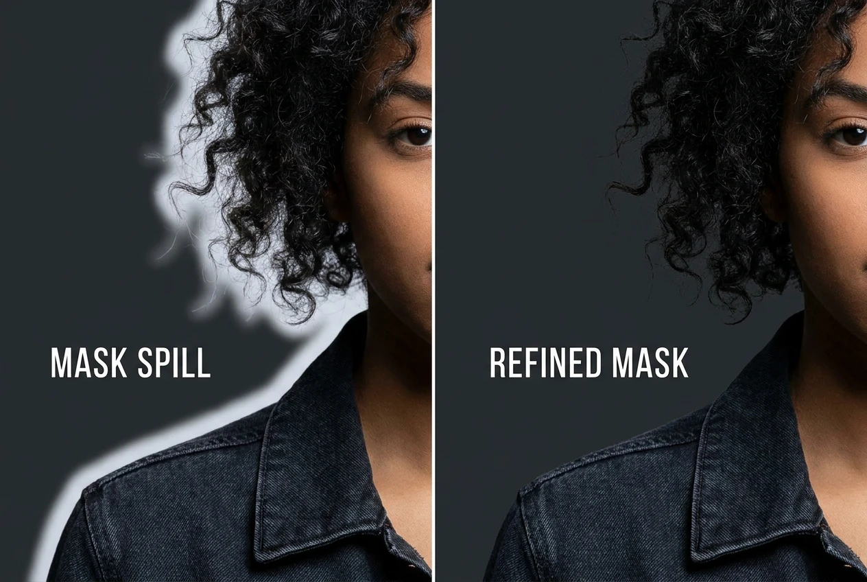
A selection can look convincing while its resulting edit looks wrong. Brightening a face may also brighten a strip of background around the hair. Darkening a sky may leave a pale outline along a mountain ridge. The problem becomes apparent only when the adjustment is applied.
Judge the mask through its effect, not merely through the selection outline.
For isolated layers, use the different previews in Select and Mask. On Black can expose a light fringe; On White can reveal darker contamination; the black-and-white mask view can reveal holes and stray areas.
For local exposure or color adjustments, temporarily exaggerate the adjustment to expose spill. Inspect the boundary, repair the mask, and then restore the intended adjustment strength. This is particularly useful around hair, shoulders, architecture, and horizons.
Do not respond to every rough edge by adding more global feathering. A sharply focused jacket edge and out-of-focus hair should not necessarily have the same transition. Refine the relevant area rather than blurring the entire mask until nothing looks properly defined.
Also inspect the interior. A clean outline does not guarantee that the mask has included every part of the subject or excluded every background patch.
A practical stopping test is to toggle the finished adjustment at normal viewing size. If the viewer notices a glowing outline before noticing the intended improvement, the mask still needs work.
MISTAKE #5: Making every judgment at the same zoom level
Fit on Screen is good for composition and overall balance. It is not enough for checking sharpening halos, cloning defects, or fine texture. Conversely, spending the whole session at extreme magnification can encourage repairs that make the full photograph look worse.
Use three distinct inspections:
- View the whole frame to assess composition, tonal hierarchy, and whether the subject attracts attention.
- Inspect at 100% to evaluate pixel-level defects, noise, sharpening, and retouching texture.
- Check the actual delivery version at its intended presentation size.
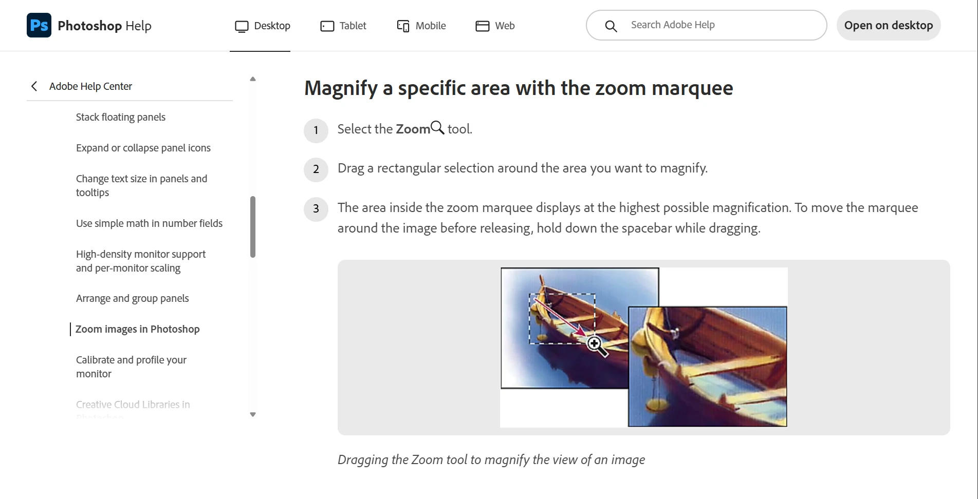
Adobe’s zoom documentation explains that 100% displays each image pixel as one monitor pixel. It is a useful technical inspection view, not a guarantee of how a large print will look from its normal viewing distance.
Sharpening especially needs both technical and practical review. Check edges at 100%, but also ask whether the finished image looks natural when presented as intended. Adobe’s photo-sharpening tutorial distinguishes output sharpening and recommends applying it at the final output size and resolution.
For an important print, inspect a physical test rather than trying to infer everything from a zoom percentage. For a website, inspect an uploaded sample in the actual page layout. The working PSD is only one stage of the viewing experience.
MISTAKE #6: Applying fixed pixel settings to photographs of very different sizes
A repeated setting is not necessarily a consistent-looking setting. The same pixel measurement can occupy a large part of one image and a tiny part of another.
This matters when a folder contains full-resolution photographs, smaller client selections, and web-sized derivatives. An Action that repeats fixed pixel values will repeat those values faithfully—but the visual relationship may change from file to file. The problem is the measurement choice, not automation itself.
EXAMPLE: Making a watermark disproportionately large or too small to read
A 200-pixel-wide logo occupies 20% of a 1,000-pixel-wide image, but only about 3.3% of a 6,000-pixel-wide image. One may look intrusive while the other barely communicates your name.
Bulk Image Watermarker addresses this with percentage-based watermark width. In its Simple Watermark layout, you can size a text or image watermark relative to the current photograph’s width, then control alignment and edge padding. A 12% width therefore becomes 120 pixels on a 1,000-pixel-wide image and 720 pixels on a 6,000-pixel-wide image.
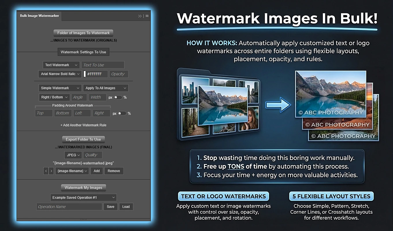
That keeps the horizontal proportion consistent. It does not mean every composition needs the same percentage. A narrow portrait and a panoramic landscape can call for different branding treatments.
Use separate orientation-based rules when appropriate—for example, a smaller width percentage for landscape images and a larger one for portraits. Include a square-image rule if those files need their own treatment. Test the choices with your actual logo rather than treating any percentage as universally correct.
Finally, inspect the smallest published version. A watermark that looks elegant in a large Photoshop document may become unreadable after the image is displayed as a thumbnail. When practical, watermark the final-sized delivery copies.
EXAMPLE: Reusing one sharpening radius across a mixed-resolution folder
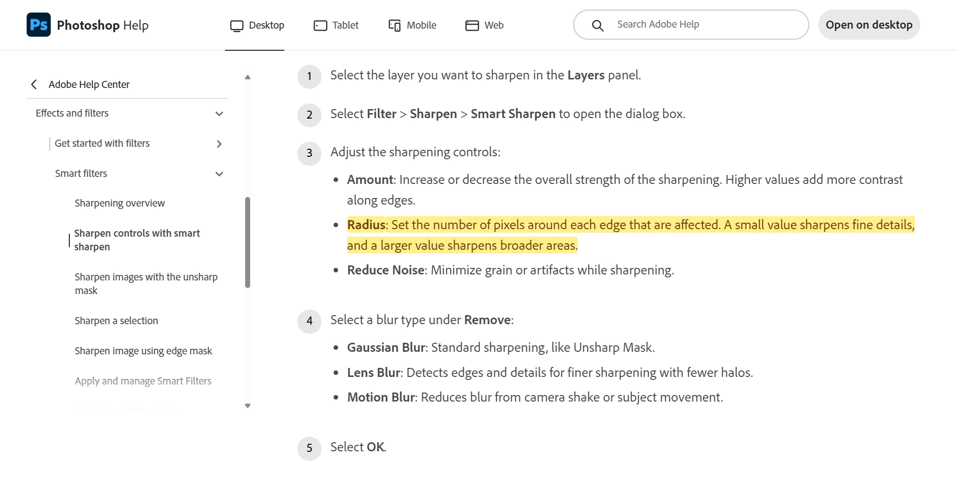
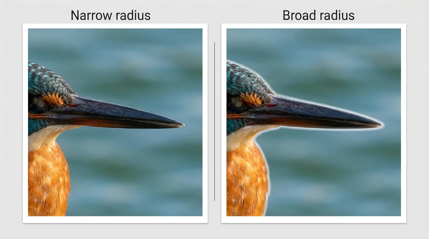
Sharpening has a similar scale problem, but the terminology matters. Radius controls the spatial reach of sharpening; it is not interchangeable with Amount.
As Adobe’s Smart Sharpen documentation explains: “A small value sharpens fine details, and a larger value sharpens broader areas.”
Bulk Image Sharpener can automate Unsharp Mask or Smart Sharpen and scale radius using a 1,000-pixel longest-edge baseline. With that option enabled, the applied radius equals the configured radius multiplied by the document’s longest edge divided by 1,000.
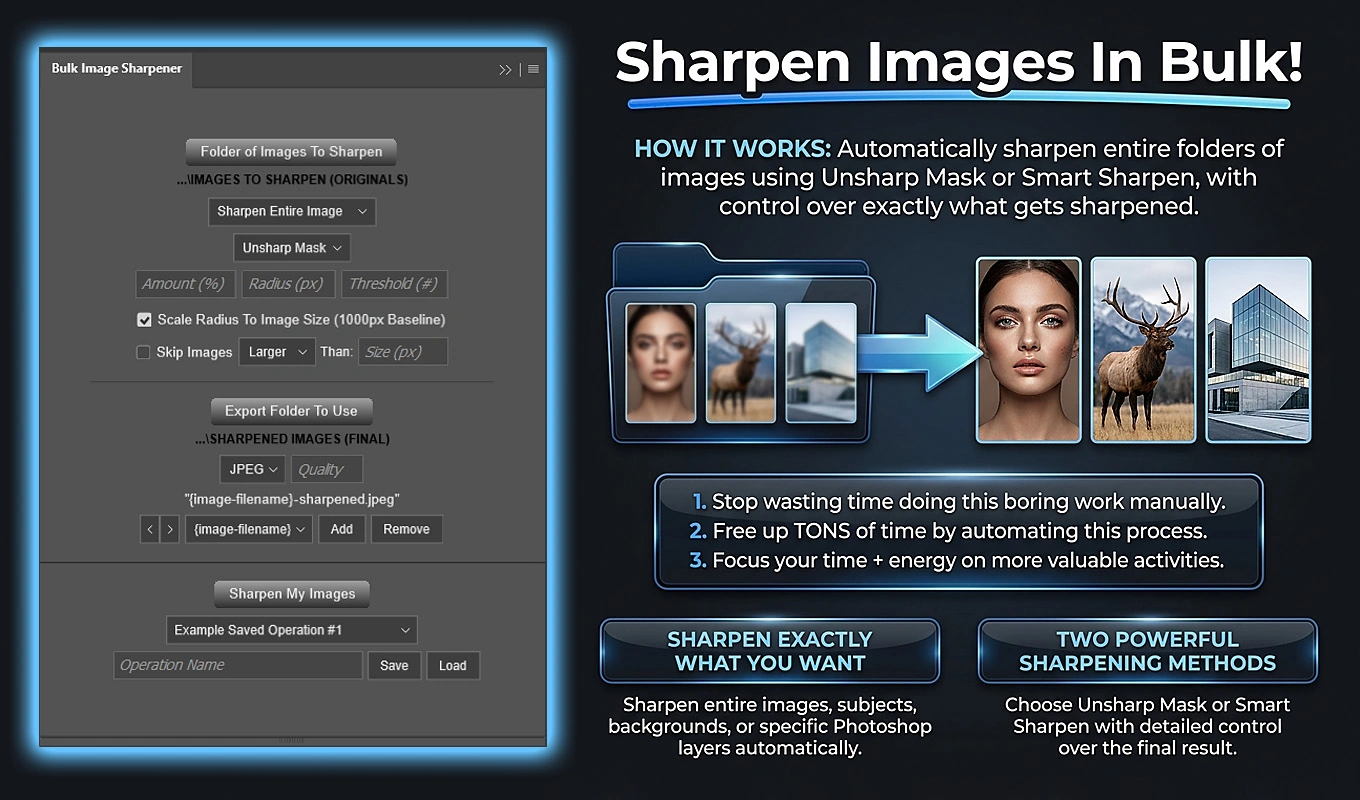
For illustration, a baseline radius of 0.8 pixels becomes 0.8 pixels on a 1,000-pixel-long image and 2.4 pixels on a 3,000-pixel-long image. The plugin scales radius values—not every sharpening parameter or the Amount setting.
This makes sharpening geometry more proportional; it does not guarantee identical perceived sharpness. Noise, focus, subject detail, and output medium still matter. Test representative files, and separate very different image types into different sharpening batches when necessary.
MISTAKE #7: Repeating production work manually after the creative decisions are settled
Choosing a crop is creative work. Re-entering an approved crop ratio across a hundred similar images is production work. Confusing the two consumes attention that could be spent reviewing composition and image quality.
Automate repeatable production from approved PSD, TIFF, or other supported image files. First test a small set that includes difficult compositions, mixed orientations, and unusually small originals. A successful batch should prove the rules—not merely prove that the first file exported.
EXAMPLE: Cropping every photograph separately for the same delivery ratios
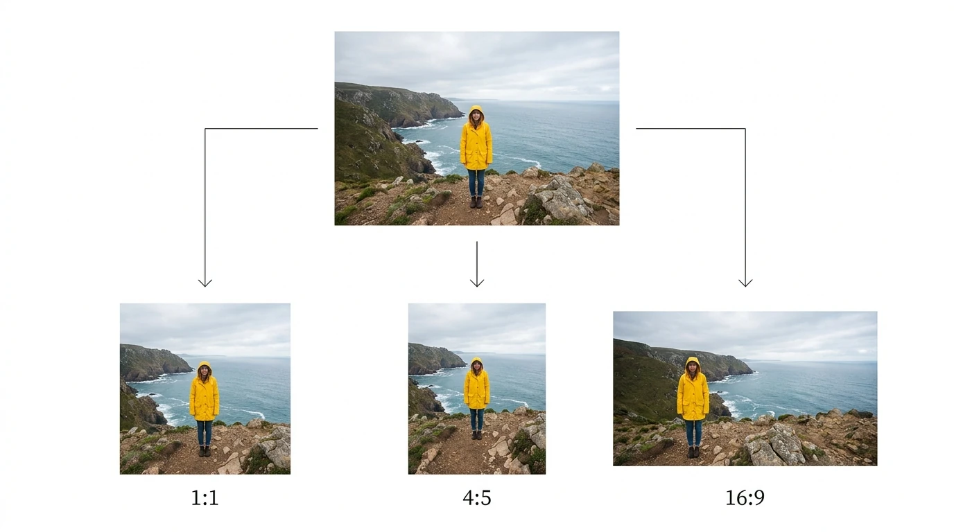
If a client needs square, 4:5, and 16:9 versions, you should not have to reconstruct those operations for every source photograph.
Bulk Image Cropper lets you configure multiple crop operations and generate those variants across a folder. Each operation starts from the original source state, so the 16:9 version is not cropped out of an already-reduced square version.
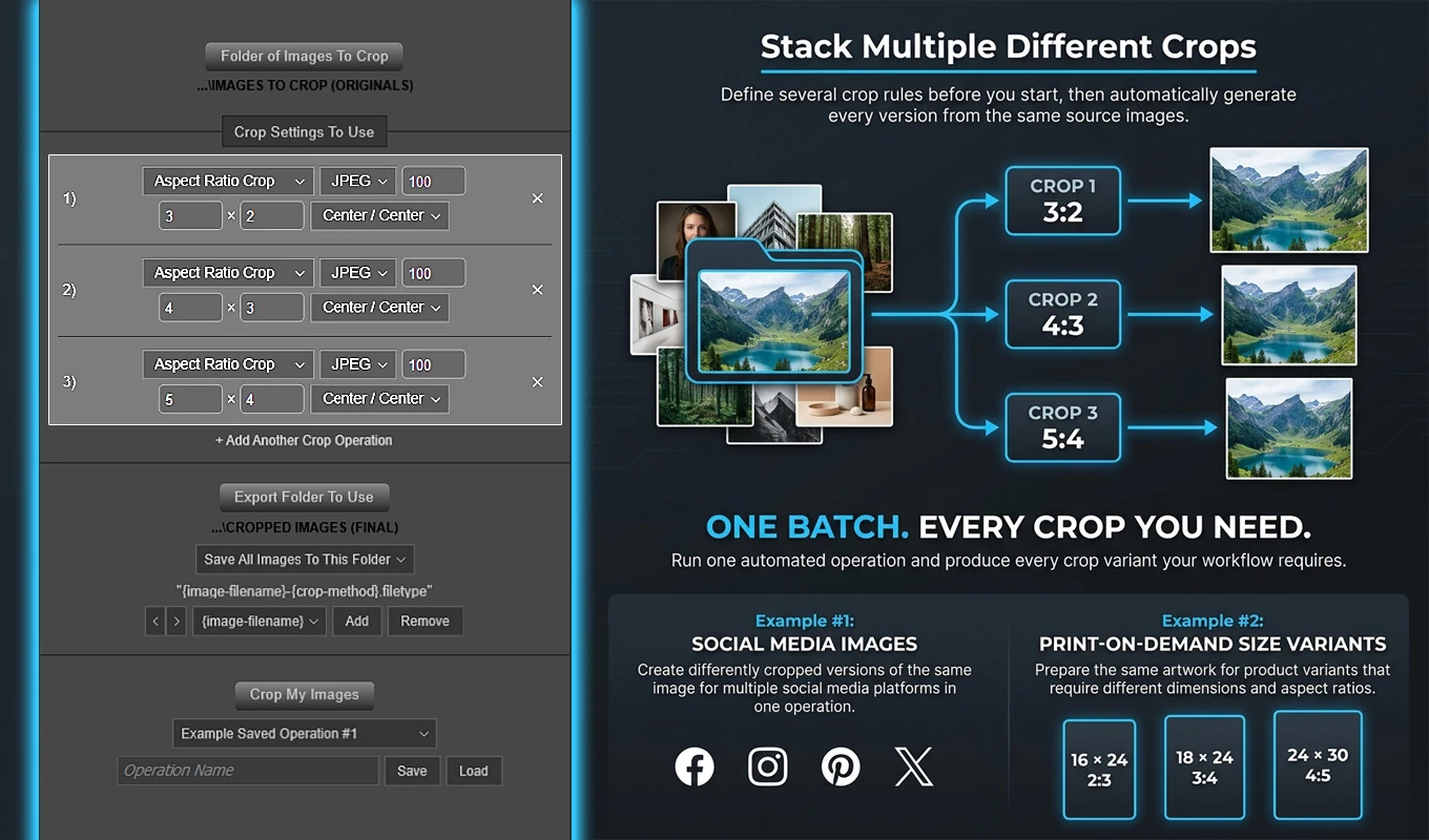
Its nine aspect-ratio alignment positions let you choose which region to retain. For a consistently positioned subject, that can eliminate substantial repetitive setup. For varied compositions, group similar images and review exceptions rather than assuming one anchor will suit everything.
Remember that a ratio is not a pixel size. A 4:5 crop establishes the shape; it does not automatically create a 1,200 × 1,500-pixel file. Save the crop setup for recurring assignments, and group outputs by crop rule when that makes downstream delivery easier.
EXAMPLE: Re-entering resize settings for every required output size
After the composition is approved, dimensions become a separate production task.
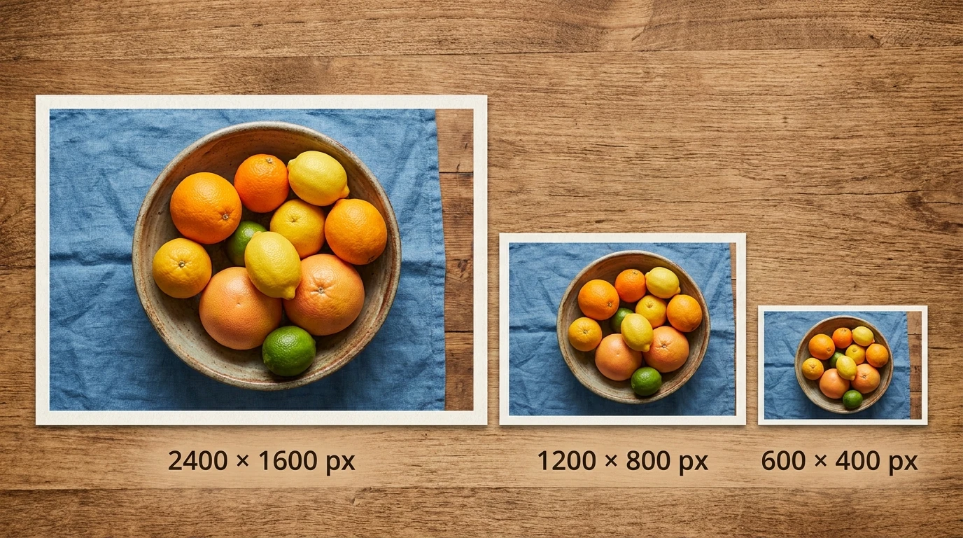
Bulk Image Resizer can generate multiple independently resized outputs from each source. For photographs, Exact Width, Auto Height is useful when width is fixed but proportions must remain intact. Maximum Longest Edge handles mixed portrait and landscape images proportionally.
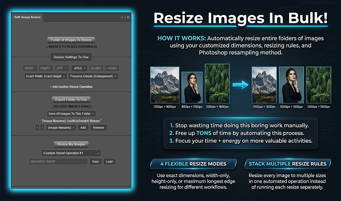
Use Exact Width, Exact Height only when the source already has the required proportions or distortion is intentional. Also check small originals before using Maximum Longest Edge: it sets the longest edge to the target, including enlargement when the source is smaller.
For a crop-and-resize job, export the approved ratio variants first, then resize those outputs in a separate stage. Keep the intermediate folders clearly labeled. Multiple crop rules and multiple resize rules create alternative versions; they are not automatically a combined cross-plugin processing chain.
Save recurring resize configurations with their dimensions, formats, and naming patterns. That replaces repeated setup without giving up control over the deliverables.
EXAMPLE: Updating Smart Objects manually for every wall-art mockup
A photographer selling prints may need each photograph shown in several framed-room scenes. Thirty photographs across three templates means ninety artwork-and-scene combinations.
Batch-Replace Smart Objects automates those combinations using an artwork folder and either one PSD/PSB template or a folder of templates.
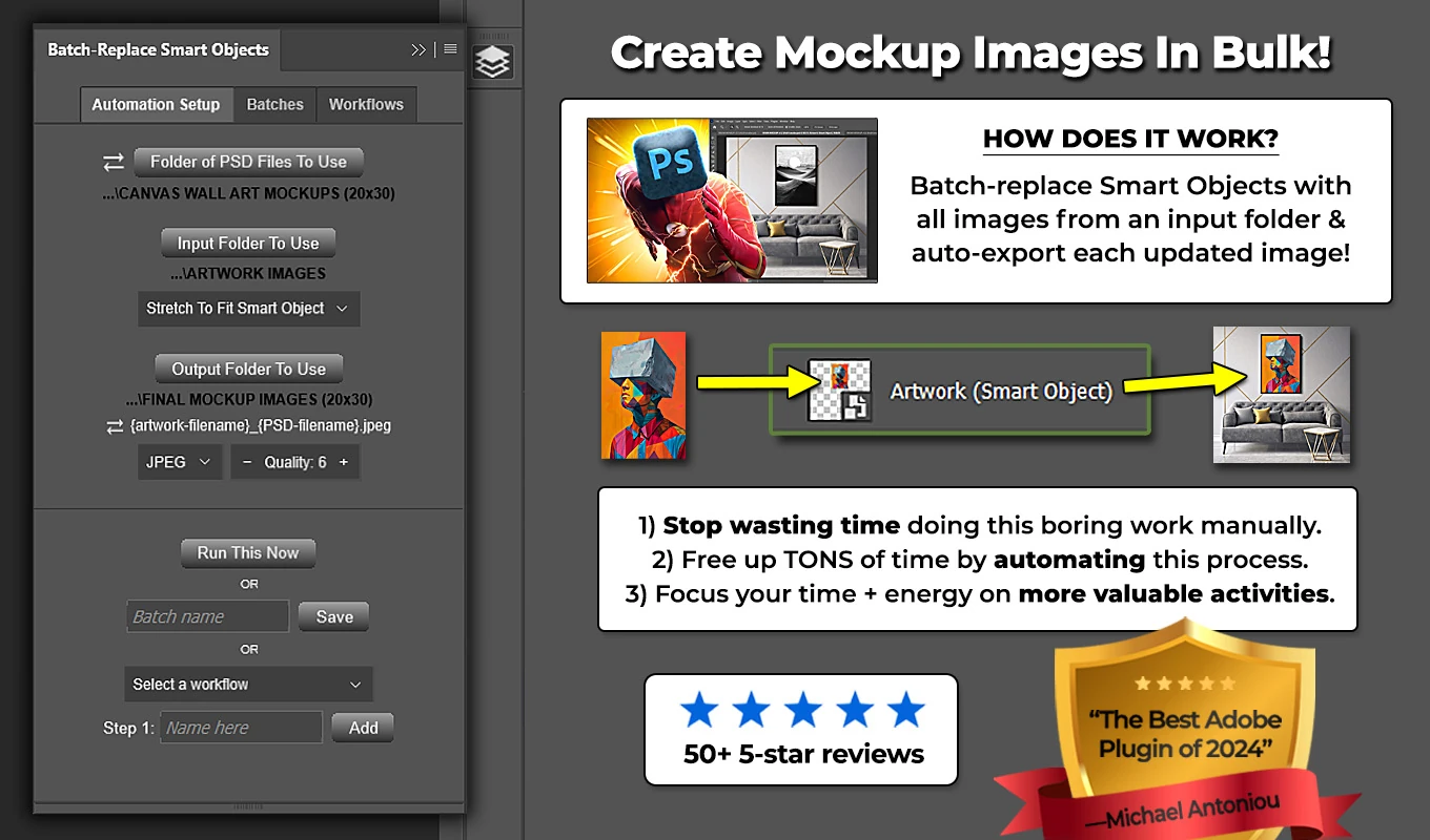
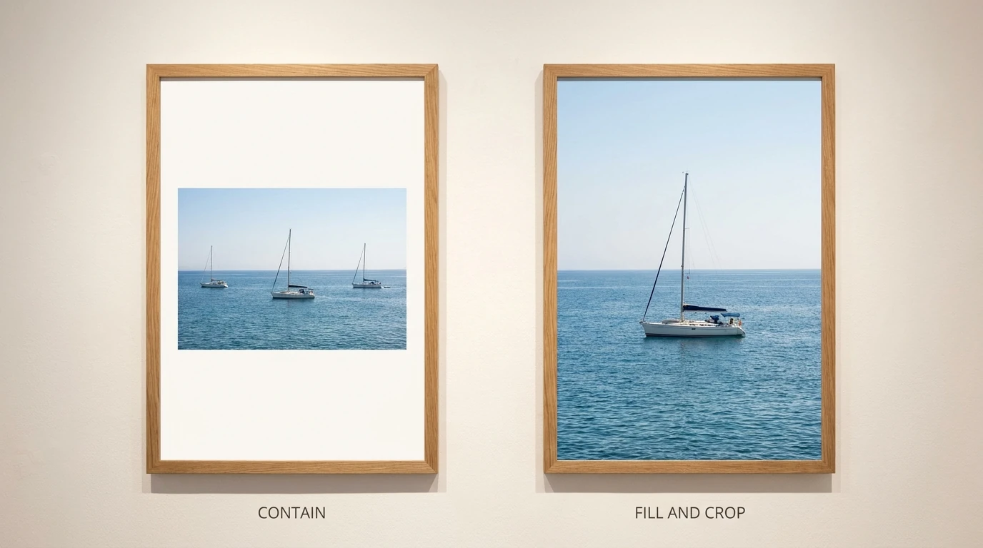
Choose placement according to the promise of the preview. Contain Inside Smart Object preserves the complete photograph but may leave unused space. Fill Smart Object & Crop covers the target area while potentially cropping the photograph. Stretch To Fit can change proportions, so it is generally inappropriate when the preview must represent the photograph accurately.
Validate one template and placement first. Then save the configuration as a Batch, or use a multi-step Workflow when different scenes need different placement or export settings. The repetitive replacement and exporting can be automated; approving how the artwork is represented remains your responsibility.
MISTAKE #8: Keeping a workspace that hides the tools you use constantly
The default workspace is not inherently wrong. The mistake is tolerating a layout that makes you repeatedly search for Layers, mask properties, or tonal information while unused panels occupy the screen.
Build the workspace around the assignment rather than around every feature Photoshop offers.
For portrait retouching, consider keeping Layers and Properties readily visible, with brush-related controls nearby. For tonal and color work, give the Histogram and Info panels accessible positions. Keep enough vertical space in Layers to understand your document without constantly scrolling through a tiny panel.
Close or collapse panels you rarely use. A crowded interface can be just as inefficient as an incomplete one.
Once the layout works, use Window > Workspace > New Workspace. Adobe’s custom-workspace instructions explain how to save the arrangement and optionally capture keyboard shortcuts and menus.
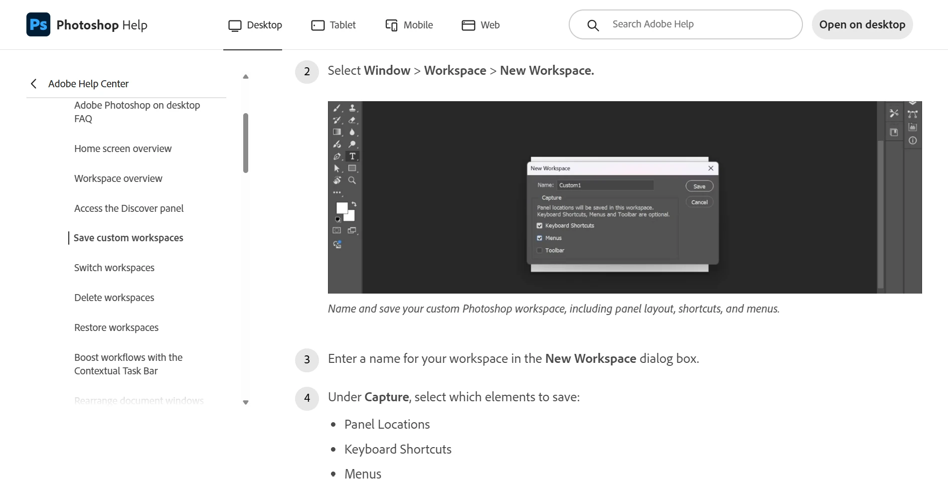
Use a separate laptop layout if your larger-monitor arrangement becomes cramped on a smaller screen. The objective is not an elaborate “professional” interface. It is having the relevant controls available without repeatedly interrupting the edit.
MISTAKE #9: Leaving frequently used commands buried in menus
You do not need to memorize every Photoshop shortcut. Start with the tools and commands that repeatedly interrupt your own work.
During one editing session, note each time you stop to search for a command. Then distinguish between something you need to learn and something that deserves a custom shortcut.
Useful candidates include frequently used tools, mask-related commands, layer operations, and switching between inspection views. Preserve familiar defaults when they already work; customize when the existing arrangement creates friction.
Open Edit > Keyboard Shortcuts, choose the appropriate category, and save a named shortcut set. Photoshop warns when an assignment conflicts with another command or tool. Adobe’s shortcut-customization guide also explains how to export a summary of your current assignments.
If H feels intuitive for a healing tool, you can deliberately reassign it—but H already selects the Hand tool by default. It is not a built-in healing shortcut, and changing it means deciding what happens to the existing assignment.
Introduce a few changes at a time and use them until they become comfortable. Replacing your entire shortcut system immediately can create more hesitation than it removes.

MISTAKE #10: Approving the Photoshop document without checking the delivered file
The final quality-control pass belongs to the exported image, not just the master. Reopen representative deliverables and check them against the destination’s requirements.
Start with dimensions. Pixel dimensions, aspect ratio, and print resolution are related but different requirements. For example, an 8 × 10-inch image at 300 pixels per inch requires 2,400 × 3,000 pixels. Changing only the resolution number does not create additional image detail.
In Image > Image Size, deselecting Resample preserves the existing pixel dimensions while changing the relationship between print size and resolution. Adobe’s print-dimensions instructions demonstrate the distinction. Follow the printer’s requested specifications rather than assuming one resolution value suits every output.
For ordinary web delivery, sRGB is a practical default unless the destination specifies otherwise. Confirm the actual profile and embedding settings in your chosen save or export route; choosing JPEG alone is not a complete color-management decision.
For print, use the appropriate printer-and-paper profile to assess the expected result. WhiteWall’s soft-proofing walkthrough shows the Photoshop setup. Follow your own lab’s submission requirements separately: the profile used to simulate a print is not automatically an instruction to convert the delivery file into that profile.
Before releasing a batch, check:
- Are the actual pixel dimensions and crop correct?
- Does the exported color match the intended result?
- Are skin, skies, and fine edges free of distracting compression or sharpening artifacts?
- Is the watermark legible without overwhelming the image?
- Do filenames clearly distinguish the required variants?
- Have difficult compositions and unusually sized sources been reviewed, not just the first few files?
The strongest workflow separates visual judgment from repetition. Make the important decisions deliberately, preserve an editable master, automate the production steps you have tested, and approve the files your audience will actually receive.