How To Choose A Watermarking Approach For Different Types Of Images
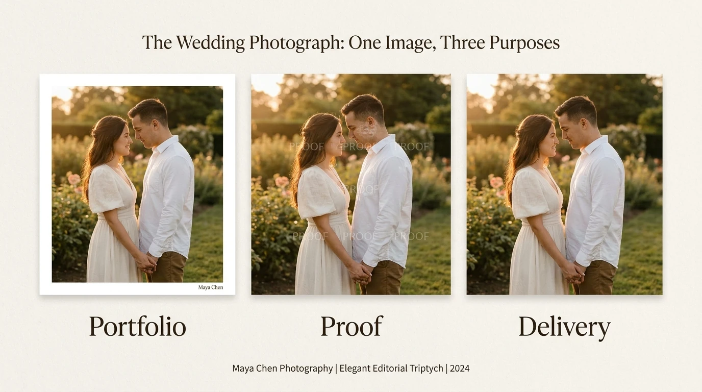

Take one wedding photograph: a portfolio copy might need a discreet photographer credit, a selection proof might need repeated “PROOF” text, and a finished client delivery might need no visible mark at all. Same photograph, three sensible watermarking decisions.
That is why choosing a watermark starts with the job of the image, not the appearance of the logo. Decide what viewers need to see, how prominently attribution should appear, and whether the image is a presentation copy or a review copy. Then adapt the placement, coverage, contrast, and size to suit.
1. Decide what this particular copy needs to accomplish
Before choosing a layout, finish this sentence: “This copy needs a watermark so that…” The answer usually points toward one of four approaches:
- “People can identify the photographer or brand.” Start with a single readable name, logo, or short website address.
- “Clients can review the image without mistaking it for a finished delivery.” Consider a prominent proof label, a repeated pattern, or a line-based overlay.
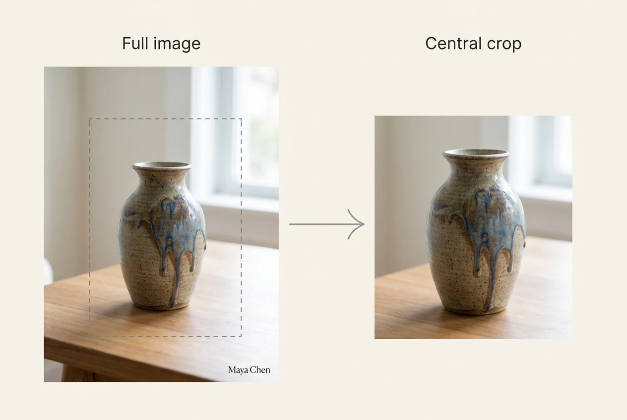
- “The preview should not contain an obvious, completely unmarked central crop.” Distribute the watermark through useful image areas rather than confining it to an expendable border.
- “The recipient needs an unobstructed production image.” A visible watermark may be inappropriate; use a clean delivery copy and handle credit separately.
These are different objectives. A tasteful corner signature can succeed at attribution while doing little to discourage cropping. A dense proof pattern can communicate review status while being unsuitable for a portfolio.
Treat visible watermarks as attribution, branding, or deterrence—not a promise that copying becomes impossible. The useful question is whether the mark accomplishes its purpose without preventing the viewer from evaluating the image.
2. Use a single mark when the photograph needs to stay the star
For portfolio photographs, finished social posts, event highlights, and many landscape images, start with one restrained watermark. This keeps the identity visible without turning the photograph into a background for the branding.
Choose the position by inspecting the composition. On a portrait, avoid faces, hands, clothing details, and anything important to the pose. On a landscape, examine the foreground as carefully as the sky: an apparently convenient bottom corner might contain the detail that anchors the composition.
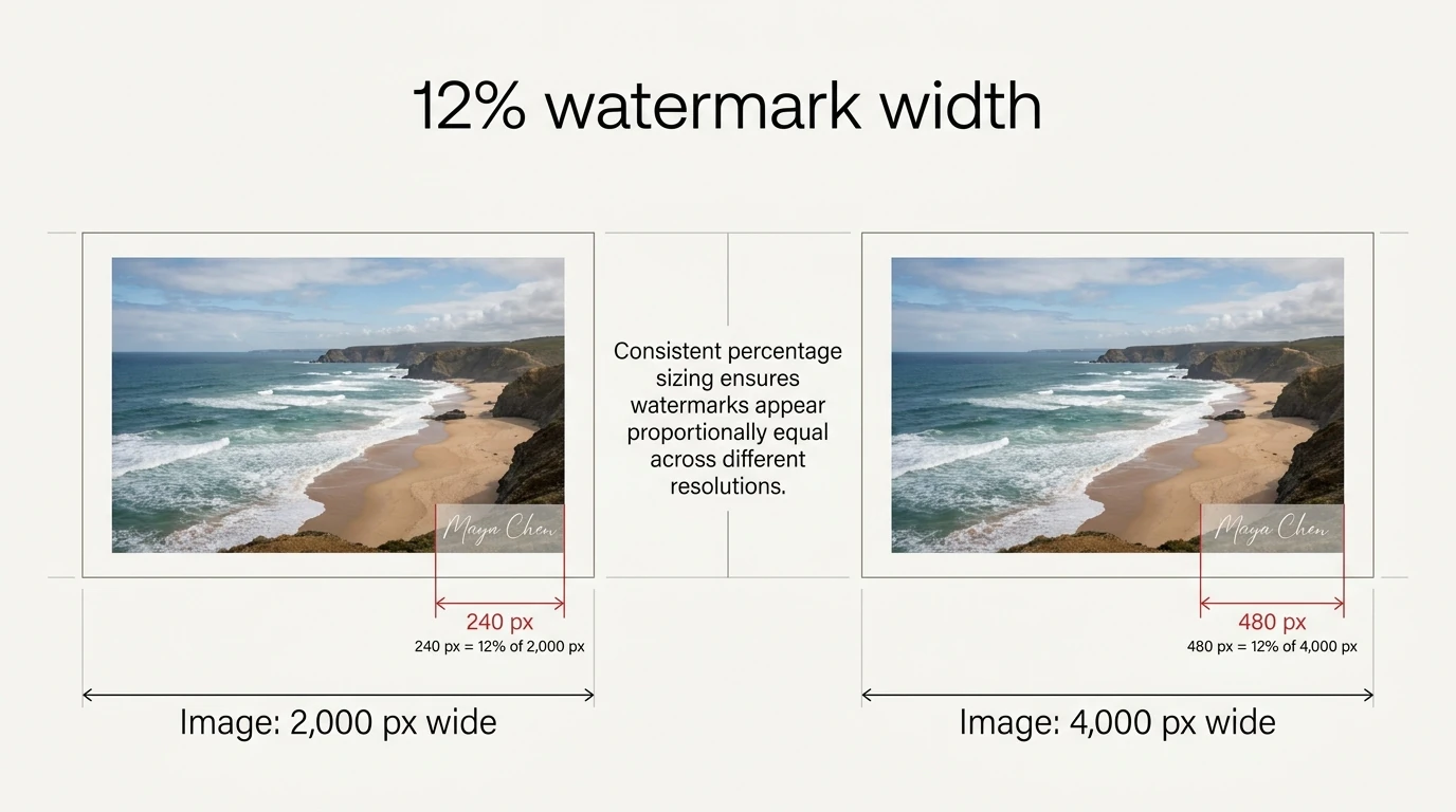
For a first test, try a mark around 12% of image width with a 2% edge inset. Those are starting values, not standards. A long website address may need more width; a compact emblem may feel prominent at a smaller size. Review the result at its intended viewing size before adjusting opacity.
For repeatable Photoshop work, Bulk Image Watermarker: Automated Batch Logos can apply a Simple Watermark across a folder using either text or an image asset. Its nine alignment positions, rotation, opacity, and independent edge padding let you define the treatment once rather than repositioning every watermark manually.

Those alignments are geometric placements, not subject-aware decisions. If the same corner repeatedly conflicts with subjects, create a different treatment for that group of photographs rather than accepting the collision.

3. Choose text for readable credit and an image asset for established branding
A text watermark and a logo watermark solve slightly different problems.
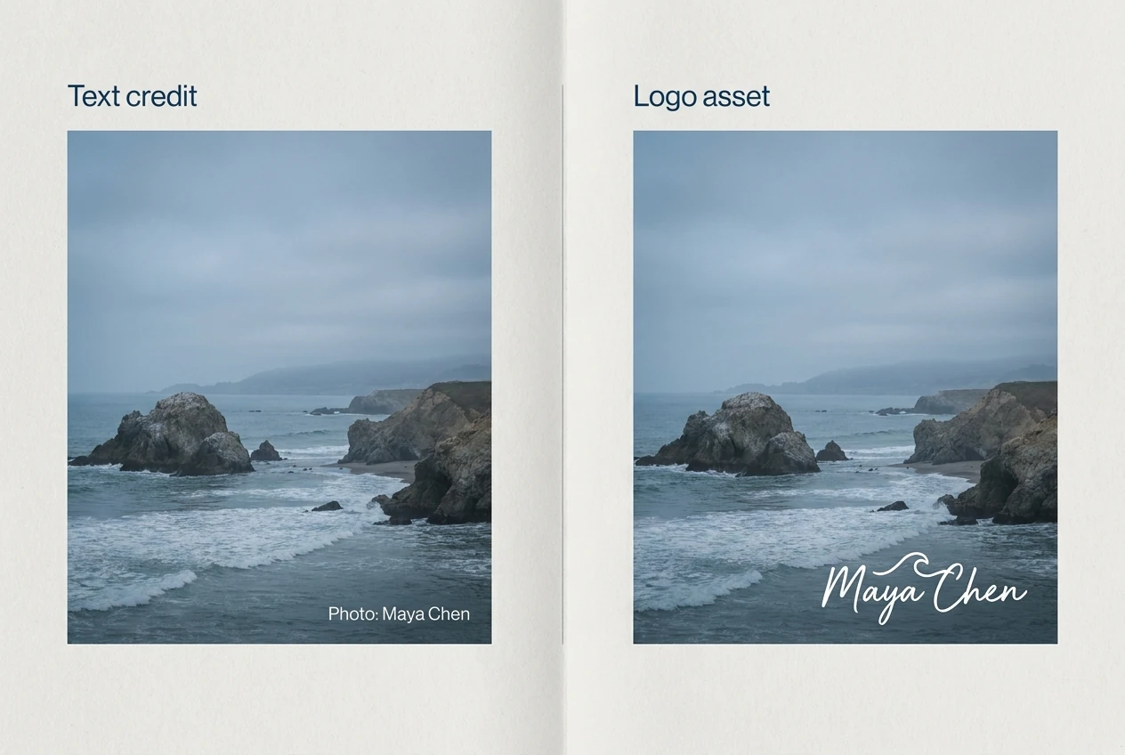
Choose text when the important information is a name, website, project label, or review status. “Photo: Maya Chen” tells an unfamiliar viewer more than an emblem they have never seen. Keep the message short enough to survive the image’s actual display size.
Choose an image watermark when the exact appearance of an existing logo, signature, or graphic matters. This is especially useful when the identity depends on custom lettering or a symbol that would be difficult to recreate with ordinary text.
For a logo without a surrounding box, use an asset with genuine transparency. Adobe’s image-format guide confirms that PNG supports transparency while JPEG does not. Test the asset over both a light and a dark background; the filename extension alone does not tell you whether the artwork actually contains transparent areas.
Bulk Image Watermarker supports both approaches. Text rules use fonts available to Photoshop, along with a chosen color and opacity. Image rules place a selected external asset. For logo-based light and dark treatments, prepare separate logo versions rather than expecting text-color settings to recolor an image.
Avoid putting every available contact detail into the watermark. A name, slogan, phone number, copyright notice, and long URL can become an unreadable block. Also remember that embedding a URL in the pixels does not itself create a clickable link; provide the actual link in the surrounding page or caption when appropriate.
4. Repeat the watermark for client proofs and artwork previews
When an image is meant for selection or approval rather than clean presentation, a repeated watermark often makes more sense than a small corner logo.
Consider a portrait proof. A corner label can disappear from a crop that still contains the person’s face. Repeated text distributed through the image makes the proof status less dependent on retaining the original edges.
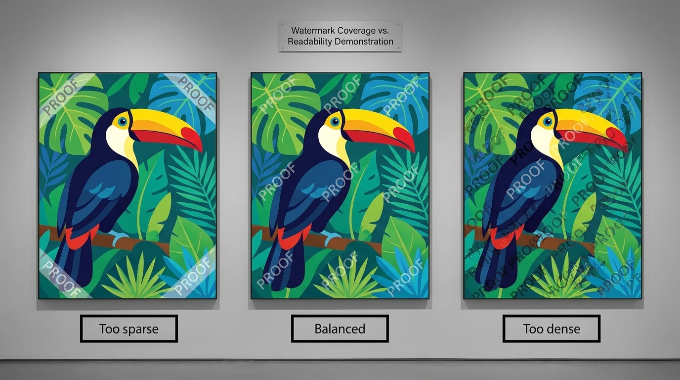
The same reasoning applies to commissioned illustrations, print previews, and design concepts. Place the pattern through meaningful parts of the work, but keep it restrained enough that the client can judge expression, color relationships, composition, or the proposed design.
Spacing matters as much as opacity:
- If the spaces between marks leave a large useful area untouched, the pattern may not meet your coverage objective.
- If repeated words form an almost solid texture, the viewer may struggle to assess the underlying work.
- If the individual words become unreadable at the delivered size, repetition alone does not make the attribution useful.
The plugin’s Pattern Watermark layout builds a repeated field from text or an image asset, with controls for watermark width, spacing between watermarks, spacing between rows, and rotation. This automates the duplication and arrangement across the folder.
Test a plausible central crop of an exported sample. If it loses every mark while retaining most of the useful subject, tighten the pattern or reconsider the layout. A diagonal angle can change the appearance, but angle alone is not a substitute for sensible coverage.
5. Stretch an overlay only when changing its proportions is acceptable
A full-area watermark is not necessarily the same thing as a stretched watermark.
You might want a large central proof label while still preserving the lettering’s proportions. In that case, use a proportionally sized single mark. Stretching is a different choice: it makes the source fill a rectangular region, even if that requires changing its shape.
Bulk Image Watermarker’s Stretch Watermark independently scales the source horizontally and vertically to fill the area inside the chosen padding. That can suit an intentionally oversized “DRAFT” graphic or a purpose-built overlay whose exact proportions are unimportant.
It is usually a poor default for a carefully designed wordmark, a photographer’s signature, or artwork that depends on undistorted geometry. A square logo stretched over a wide photograph will not retain its original shape.
Choose Stretch when filling the available region is the priority. Choose Simple or Pattern when the watermark’s own proportions matter. This distinction prevents a common mistake: selecting a full-image treatment when what you really wanted was simply a larger, proportionally scaled mark.

6. Choose Corner Lines for an unmistakable single-image proof
Sometimes a repeated field feels unnecessarily busy, but a small logo does not communicate “review copy” clearly enough. A centered identity combined with diagonal lines offers a different visual language.
For example, an architectural rendering, product mockup, or commissioned illustration can carry one central project or creator mark while diagonal lines establish that the entire image is a proof.
In Bulk Image Watermarker, Corner Lines Watermark places the watermark in the center and adds two diagonal, corner-to-corner lines forming an X. A configurable gap clears the lines around the central mark. Watermark width and line width can be adjusted separately.
That separation is useful: the identity can remain readable without making the lines equally heavy. Increase the breathing room around the center if the lines visually crowd the lettering.
Despite the name, this is not a watermark placed in a corner. The mark is centered. If the center contains the exact feature the recipient must evaluate—a face, a product mechanism, or a critical design detail—choose another approach. The gap separates the lines from the watermark; it does not stop the watermark itself from covering the subject.
7. Use Crosshatch when broad coverage justifies more visual interference
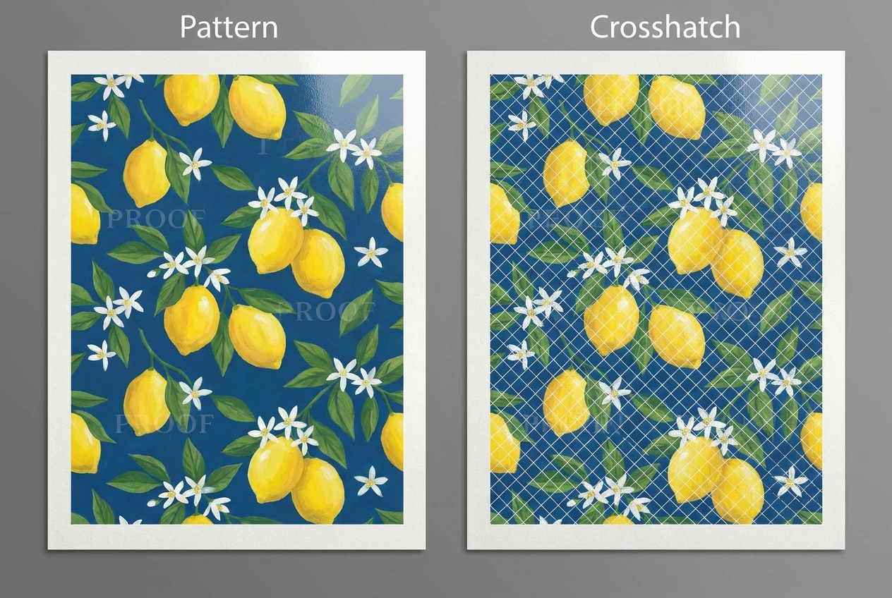
A crosshatched overlay is appropriate when you deliberately want a pervasive preview treatment rather than subtle branding.
Possible uses include commissioned-art previews, surface-pattern proposals, and other review images where the recipient needs to understand the overall work but should not receive an unobstructed presentation copy.
Crosshatch Watermark combines repeated watermark units with diagonal lines running in both directions. In the plugin, grid size controls the spacing of the structure, while separate settings control watermark width, line width, and gaps around intersections.
The distinction from Pattern Watermark is important. Pattern repeats the watermark source; Crosshatch adds a line network as well. Choose it because that additional structure serves the review process, not simply because it looks more protective.
Be particularly cautious with maps, technical drawings, typography samples, and artwork built from fine lines. An added diagonal lattice can compete with the very information the viewer needs to judge. If a client cannot distinguish the original linework from the overlay, try thinner lines, wider grid spacing, or a different layout.
More coverage is only useful while the preview still functions as a preview.
8. Judge contrast at the watermark’s location, not just across the whole image
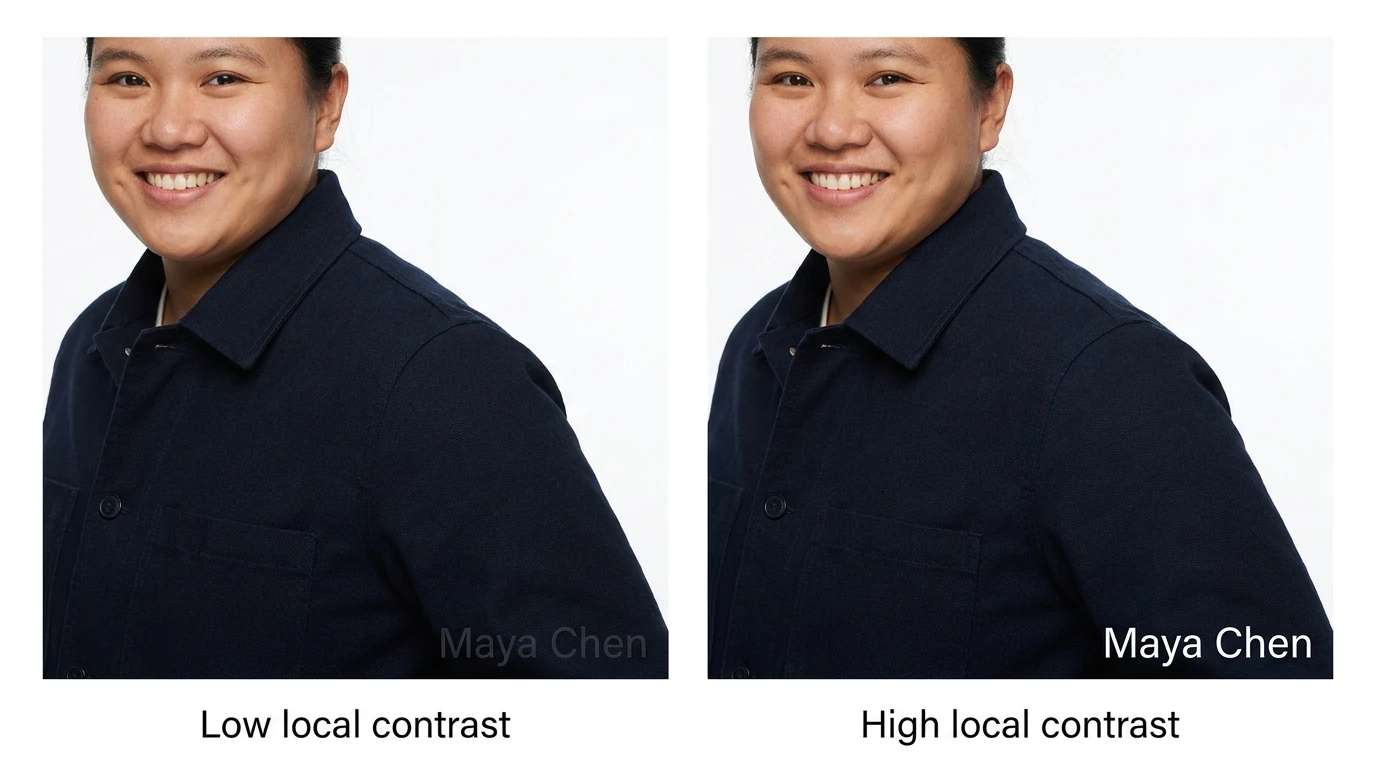
“White watermark for dark photographs, black watermark for bright photographs” is a useful starting rule. It is not a complete placement strategy.
A mostly dark wedding image can contain a bright dress exactly where the bottom-right watermark sits. A bright studio photograph can contain a dark jacket behind the same position. What matters to legibility is the background immediately underneath the mark.
For mixed folders, Bulk Image Watermarker can automate the initial light-versus-dark decision using brightness conditions. For example:
- Create a light text or light-logo rule with Apply If Brightness < 50.
- Create a dark text or dark-logo rule with Apply If Brightness >= 50.
- Keep their layout and sizing consistent, then test representative images.
The plugin calculates average brightness from Photoshop’s document histogram and expresses it on a 0–100 scale. The threshold of 50 is an example division, not a universal visibility standard. Adjust it to suit the actual images.
If you want to understand the tonal distribution behind that decision, Photoshop’s Histogram panel shows how pixels are distributed across shadows, midtones, and highlights.
Whole-image brightness does not measure the specific patch beneath a corner watermark. For difficult compositions, change the alignment or prepare a logo asset with a contrasting outline built into the artwork. Do not expect an average-brightness rule to recognize faces, clothing, or the best empty space.
Finally, avoid trying to fix every problem by lowering opacity. A watermark can be unobtrusive because it is small, well placed, and simply designed—not only because it is faint.
9. Scale for resolution, then adjust for portrait and landscape compositions
A fixed pixel width is useful when all outputs have standardized dimensions. Across a mixed-resolution folder, percentage-based sizing is often a better starting point.
A 240-pixel watermark occupies 12% of a 2,000-pixel-wide image but only 6% of a 4,000-pixel-wide image. If both photographs are displayed at the same width, the second watermark appears proportionally smaller.
With a 12% width rule, the watermark becomes 240 pixels wide on the first image and 480 pixels wide on the second. Its relative width remains consistent.
Bulk Image Watermarker supports percentage-based watermark widths in Simple and Pattern layouts, measured against the current image width. Simple Watermark also supports percentage padding: left and right margins relate to image width, while top and bottom margins relate to image height.
Resolution consistency is only the first decision. Portrait and landscape compositions may need different proportions because a percentage of width produces different results on differently shaped canvases.
For a prominent central proof label—not a discreet corner logo—you could test:
- A horizontal-image rule using 40% of image width.
- A vertical-image rule using 80% of image width.
- A separate square-image rule chosen after inspecting square samples.
On a 2,400 × 1,600 landscape, 40% produces a 960-pixel-wide label. On a 1,600 × 2,400 portrait, 80% produces a 1,280-pixel-wide label. The larger portrait percentage is a deliberate design choice, not an automatic requirement.
The plugin’s orientation conditions let you apply these different rules within one source folder. Use much smaller percentages for restrained corner branding, and judge the exported result at the size people will actually see.
Percentage sizing adapts geometry, not visual weight. A dense emblem and a thin wordmark can feel very different at the same width, so approve each asset rather than treating the percentage as the final design decision.
10. Give different shoots and photographers different rules
Mixed folders do not always need one universal identity. A studio may need to credit different photographers, use different campaign branding, or add proof text only to certain files.
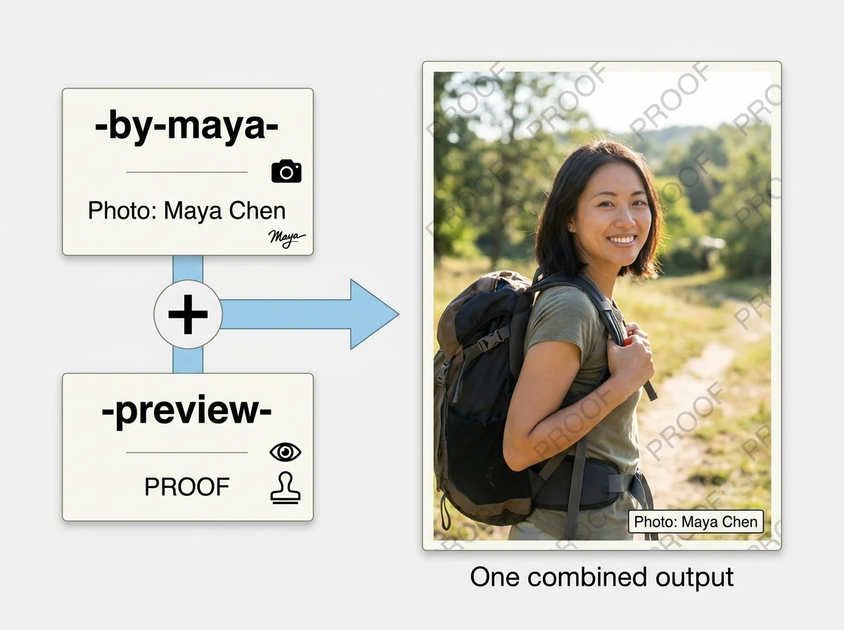
The reliable starting point is a deliberate naming convention. Filenames such as spring-by-maya-preview-001.jpg and studio-by-lee-preview-002.jpg contain explicit routing information.
In Bulk Image Watermarker, filename-based conditions use case-insensitive substring matching. You could configure:
- A text-credit rule containing “Photo: Maya Chen” when the filename includes “-by-maya-”.
- A different credit rule when the filename includes “-by-lee-”.
- An additional Pattern Watermark containing “PROOF” when the filename includes “-preview-”.
The delimiters make the tags more deliberate than searching for a short fragment that might appear accidentally elsewhere in a filename. This workflow depends on accurate naming; it is not automatic photographer recognition.
Conditions can also narrow the treatment. A filename condition for “-preview-” combined with a vertical-image condition requires both to match. Within the orientation group, selecting horizontal and square allows either of those orientations.
Remember that qualifying watermark rules stack. A Maya preview can receive both Maya’s credit and the repeated proof pattern, producing one combined output. Multiple rules do not create separate branded and proof versions automatically.
This is useful when the identities have different jobs: one mark tells viewers who made the image, while another tells them that this particular copy is for review.
11. Recognize when the right choice is no visible watermark
Watermarking is not an improvement in every delivery context. Sometimes it makes the asset less useful or conflicts with the destination’s requirements.
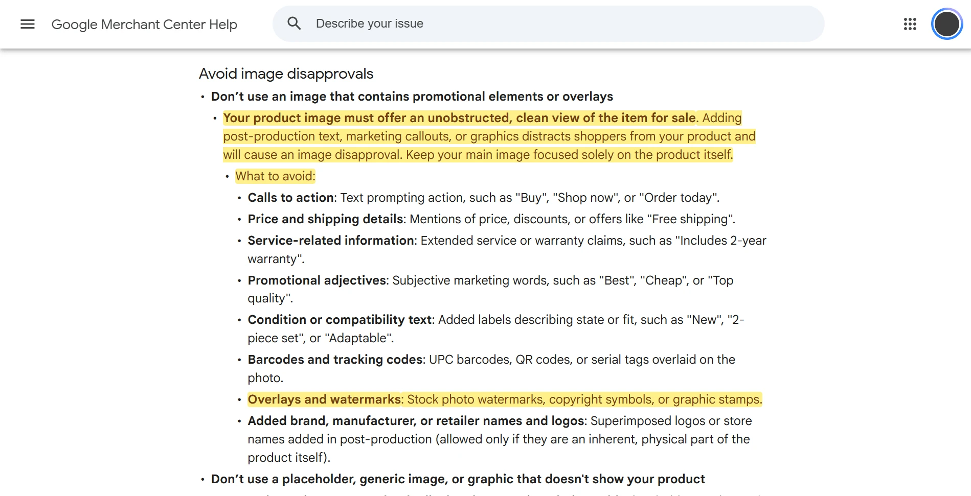
For product feeds, check the platform before preparing a branded export. Google Merchant Center’s primary product-image requirements prohibit added watermarks and promotional overlays. A brand logo physically present on the photographed product is different from a retailer logo superimposed during editing.
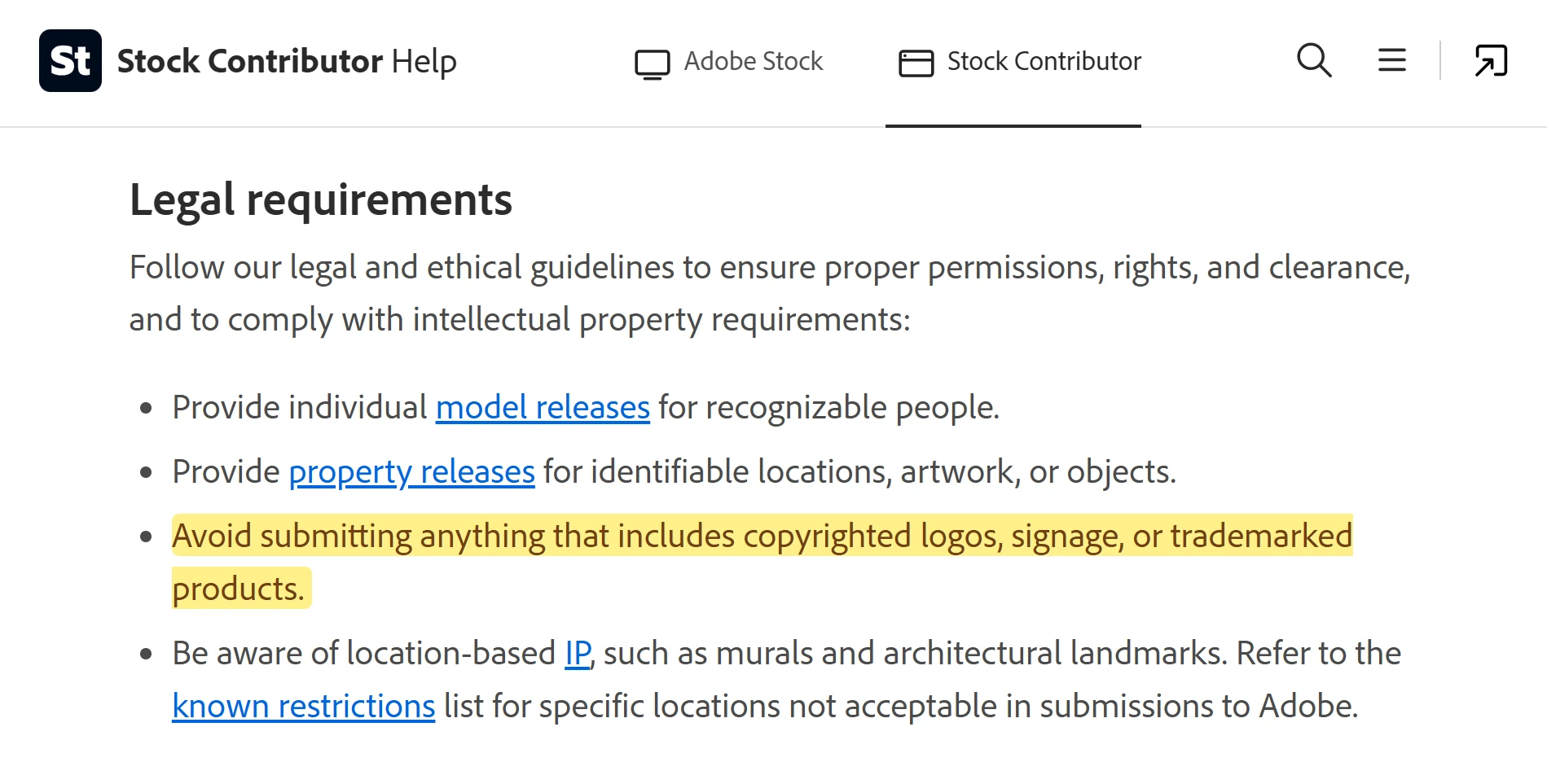
Stock submissions are another separate route. Adobe Stock’s photo-submission requirements call for images without added watermarks, timestamps, or branding. Do not confuse an upload to a licensing platform with a watermarked preview displayed on your own website.
Information-rich images deserve similar restraint even when no platform rule applies. On a screenshot, do not cover the control the tutorial is explaining. On a diagram, protect labels and relationships. On a product-detail photograph, keep the feature buyers are inspecting unobstructed. If there is no suitable empty area, an adjacent credit may be better than an overlay.
A visible watermark, a surrounding photo credit, and embedded metadata serve different purposes. The IPTC Photo Metadata User Guide explains fields for creator information, credit, copyright notices, and usage terms. These let you record attribution and rights-related information without placing all of it across the visible image.
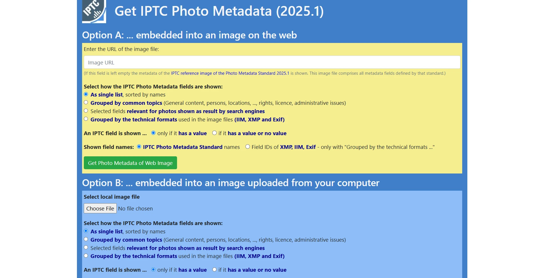
Metadata is not an invisible protective barrier, and you should verify what is present in the delivered file rather than assuming every publishing step retains it. IPTC’s Get Photo Metadata tool can inspect embedded information from a public image URL.
Keep clean masters, public branded copies, and review proofs as distinct assets. That separation is more useful than trying to make one watermark treatment satisfy every destination.
12. Approve a small stress-test batch before processing the folder
Do not approve a watermark from the easiest photograph in the job. Create a small test folder containing representative copies and likely troublemakers: bright and dark scenes, mixed backgrounds, busy compositions, portrait and landscape images, square images, and the smallest intended delivery size.
Export the samples, then ask:
- Can someone read the intended name or message at the actual viewing size?
- Does the watermark interfere with a face, product feature, diagram label, or detail the recipient must evaluate?
- Does the contrast work underneath the mark, rather than merely matching the image’s average brightness?
- For proofs, does a plausible crop retain useful content while losing every watermark?
- Did each filename and orientation group receive the intended treatment?
- Are clean delivery routes still using clean assets?
Inspect full-size files for rough logo edges, but also view the images at realistic page and phone sizes. A watermark that looks excellent while zoomed in may be unreadable in the setting where it matters.
When testing conditional rules in Bulk Image Watermarker, include square images and files without your expected tags. If no rule applies to an image, the plugin does not export it, so confirm that the rule set covers everything you intend to deliver.
Once the samples are approved, save the operation for recurring work and process the full folder. The plugin exports derivative results while closing source documents without saving, preserving the originals.
The aim is not to find one watermark that works everywhere. It is to choose the least intrusive approach that accomplishes each copy’s job: readable identity for display, deliberate coverage for proofs, tested contrast and proportional sizing for mixed batches, and no visible watermark where a clean image is the better deliverable.