How To Maintain a Consistent Visual Style Across AI-Generated Images
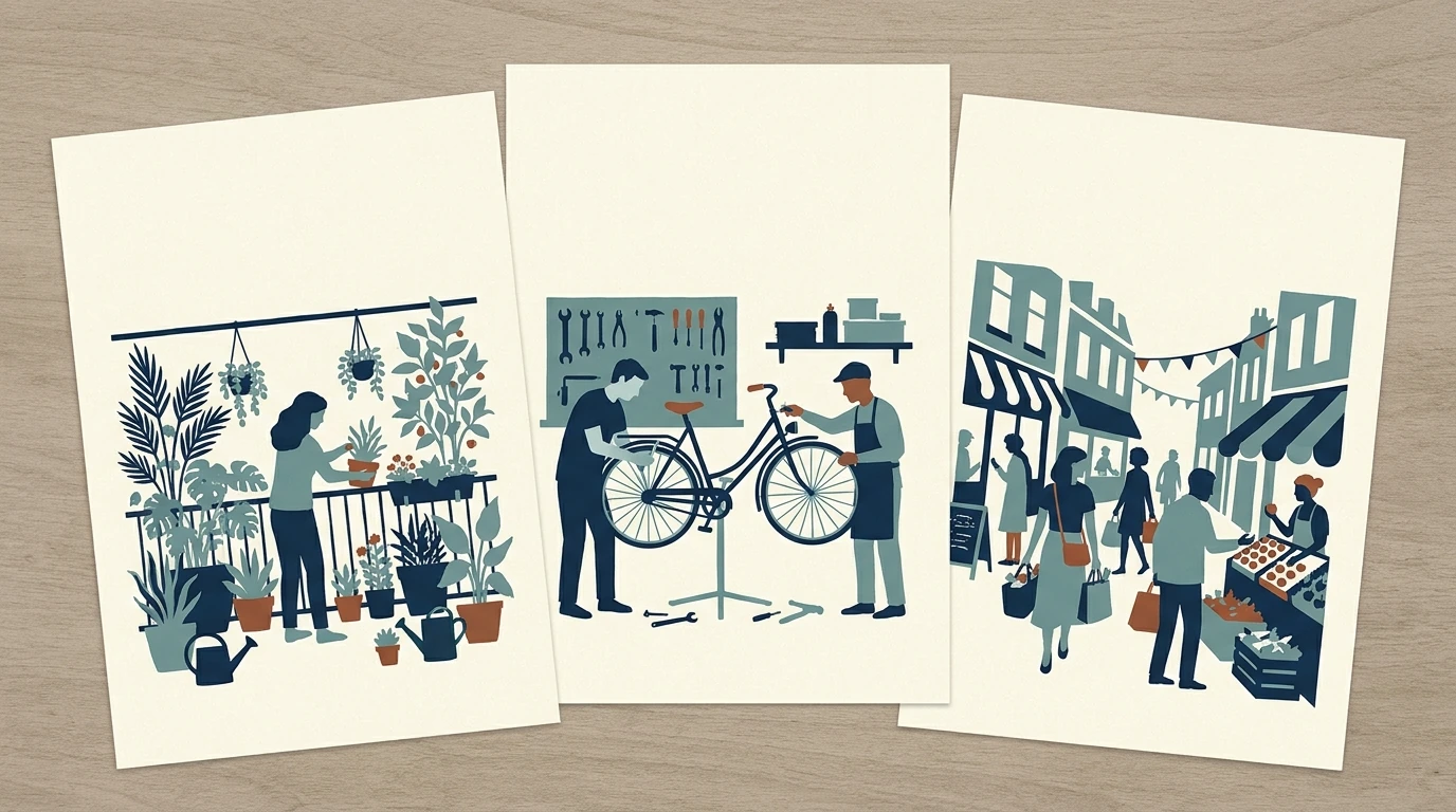

One image has the right palette. Another has better composition. A third looks excellent on its own—but belongs to an entirely different campaign.
That is the central difficulty of AI image consistency: generating an attractive image is not the same as generating a collection that belongs together.
The most dependable approach is to combine an approved visual reference, a reusable block of style instructions, stable generation settings, and collection-level review. Each does a different job. The reference shows the look, the prompt specifies what matters, the settings keep the production process steady, and review catches the results that still wander.
To make that practical, consider a twelve-image city-living guide covering subjects such as balcony gardening, bicycle repairs, public transport, and neighborhood markets. The subjects should change. The visual language should not.
Decide what “consistent” must mean for this project
Before changing another prompt, separate three requirements that often get bundled together:
- Style consistency: the images share a medium, palette, lighting treatment, texture, and level of detail.
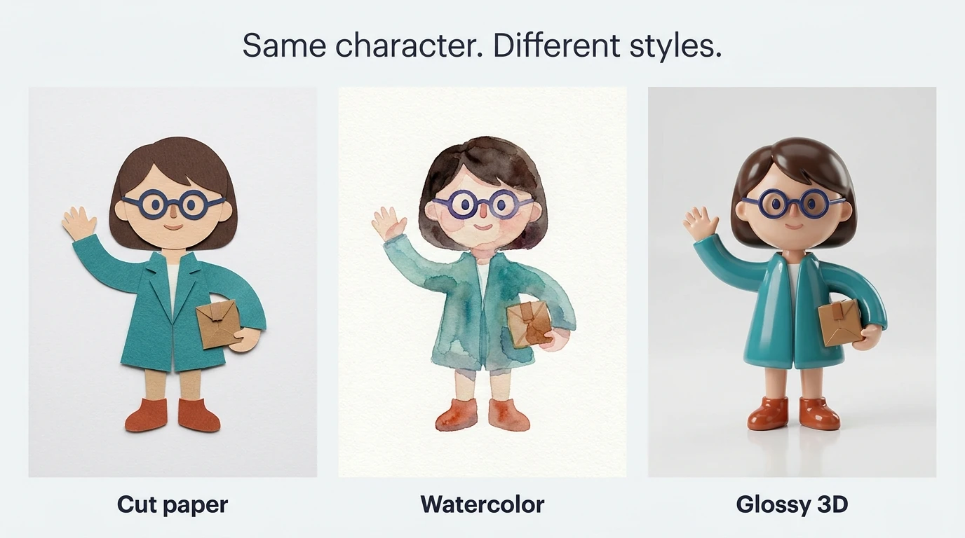
- Identity consistency: a particular person, character, product, or other recognizable asset remains the same.
- Layout consistency: framing, subject placement, margins, and space for text follow a repeatable system.
A set of watercolor illustrations can be stylistically consistent even when every image contains a different person. Conversely, the same character appearing in watercolor, glossy 3D, and documentary photography has consistent identity but inconsistent style.
For the city-living guide, the initial requirement might be style consistency plus a clear area for headings. A recurring mascot would introduce a separate identity requirement.
Write down which properties must remain fixed and which should vary. For example: “Keep the cut-paper treatment, limited palette, and simple silhouettes. Change the activity, setting, props, and arrangement.”
This distinction prevents a common overcorrection: making every image nearly identical when the actual goal is a recognizable family of images.
Write a style card that can reject an image
“Modern, friendly, premium, and cohesive” is a mood description, not a useful production standard. A style card should be specific enough that someone can explain why an otherwise attractive image fails.
For the city-living series, a workable card could read:
- Medium: flat cut-paper editorial illustration, not dimensional paper sculpture.
- Palette: warm ivory background, ink-navy and muted-teal forms, with rust reserved for small accents.
- Shapes: rounded geometric silhouettes with simplified faces and objects.
- Texture: subtle paper grain, visible without becoming the main subject.
- Lighting: flat graphic treatment, without realistic highlights or cast shadows.
- Detail: enough to identify the activity, without intricate background decoration.
- Layout: a clear upper area for a heading added later.
- Exclusions: gradients, glossy surfaces, photographic shading, and generated lettering.
Notice that the palette specifies roles, not just colors. An image dominated by rust would fail even if rust appears on the approved color list.
Keep actual color swatches alongside the written card. The Adobe color palette extractor can pull colors from an approved image and provide HEX or RGB values. Use those values as production targets, then inspect the output rather than assuming that mentioning a color code proves compliance.
For a photographic series, replace the illustration-specific rules with photographic ones: soft overcast daylight, neutral skin tones, restrained saturation, eye-level framing, moderate depth of field, and a consistent contrast treatment.
The point is not to describe everything. It is to identify the few visual decisions that make the collection recognizable.
Choose an anchor reference, not a pile of inspiration
A moodboard helps explore possibilities. An anchor reference defines the approved direction. Keep those jobs separate.
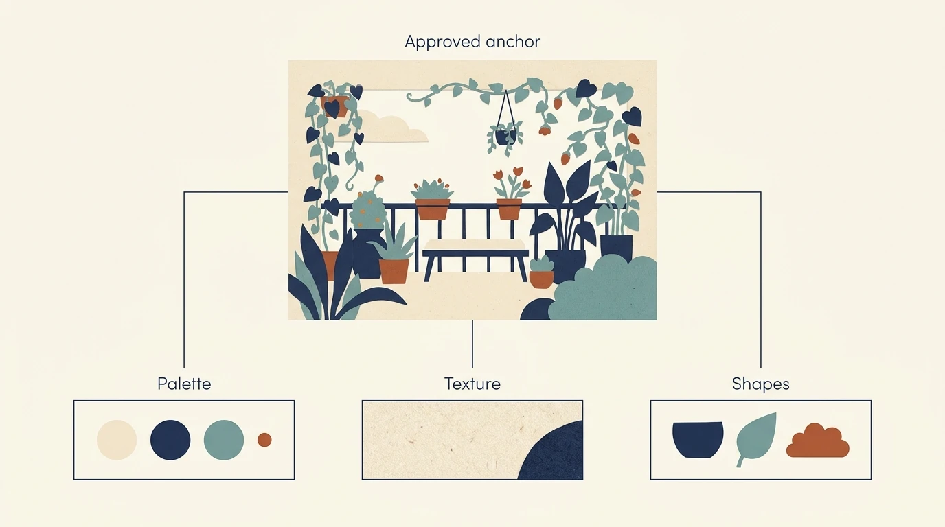
For production, start with one image that clearly demonstrates the desired palette, rendering, texture, and detail level. It should be representative of what the whole series can sustain—not merely the most spectacular image from an exploratory session.
For the city guide, a clear illustration of someone tending balcony plants would make a better anchor than a complicated panoramic cityscape if most planned images feature one or two people performing an activity.
Before approving the reference, ask:
- Which properties should transfer to every new image?
- Which details belong only to this particular scene?
- Does it contain unwanted typography, borders, lighting effects, or decorative elements?
- Can its visual treatment work for both simple and crowded subjects?
Use references you are authorized to use. Once an anchor is approved, keep an unchanged copy in the project’s reference folder.
Also retain two or three rejected near-matches for human review. Label why they fail: “too dimensional,” “accent color dominates,” or “background too detailed.” These are useful teaching examples for collaborators, but they do not automatically belong among the images submitted to the generator.
If you add a second production reference, give it a clear purpose. A second image might clarify the treatment of people or supply a recurring character. Avoid adding another attractive image that quietly contradicts the first.
Separate the changing scene from the permanent style block
Build prompts from components rather than rewriting the entire instruction each time:
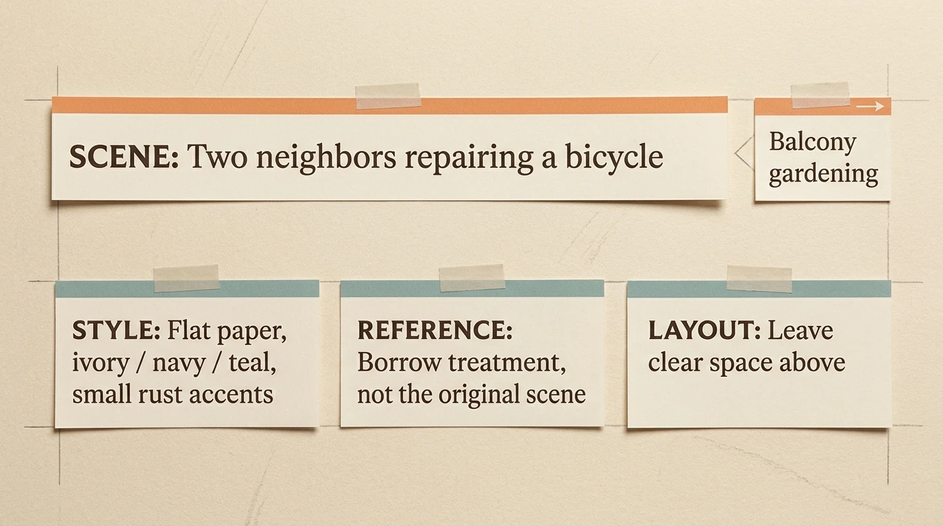
Scene description + approved style block + reference-use instructions + any necessary layout variation.
The scene changes
“A person tending three herb pots on a small apartment balcony.”
“Two neighbors repairing a bicycle at a community workbench.”
“A shopper selecting vegetables at a neighborhood market stall.”
The style block stays unchanged
“Flat cut-paper editorial illustration. Warm ivory background; ink-navy and muted-teal shapes; rust used only for small accents. Rounded geometric silhouettes, subtle paper grain, flat lighting, minimal detail, and generous clear space above the subject. No gradients, photorealistic shading, or rendered lettering.”
This gives you a reusable visual specification rather than a collection of loosely related adjectives.
The reference instructions explain what to borrow
For a model that accepts natural-language instructions about attached images, you might add:
“Use the attached balcony illustration as the visual reference for palette, paper texture, silhouette construction, and detail level. Depict the new activity described in this prompt; do not reproduce the balcony scene.”
Adapt that approach to the tool. A dedicated style-reference control may need only a concise subject prompt, while a conversational image editor can benefit from explicit instructions about each attachment.
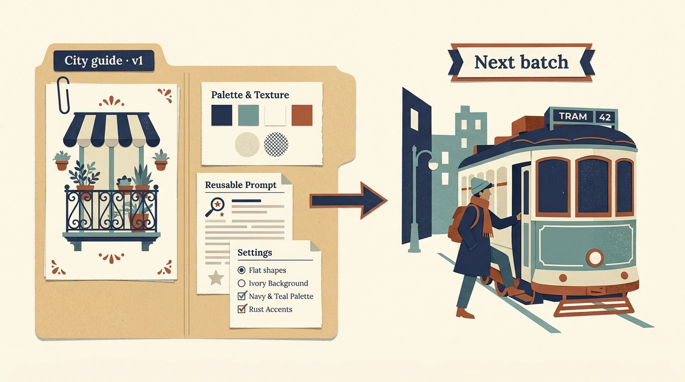
Save the approved wording in a shared document or a file such as city-guide-style-v1.txt. In a custom scripted workflow, read that file and append its contents to each scene. Alternatively, store fields such as medium, palette, texture, layout, and exclusions in JSON, then assemble them into prompt text.
The important part is that the instructions actually reach each generation request. A TXT or JSON file is an organizational resource, not a universal style-lock feature.
Build the prompt list in a spreadsheet
A spreadsheet makes consistent prompt language easier to maintain because the scene descriptions and shared instructions can live separately.
In Excel, create a working sheet with scene descriptions in Column A, beginning at A2. Put the approved style block in F1 and the reference-use instructions in G1.
In B2, enter:
=A2&". "&$F$1&" "&$G$1
Fill that formula down the rows containing scenes. Each result combines a different subject with exactly the same style and reference instructions. Microsoft’s guide to combining text in Excel explains the ampersand method.
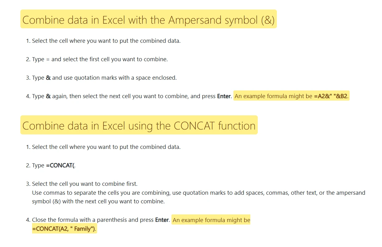
The dollar signs keep the shared instruction cells fixed as the formula moves down. Changing F1 updates the style wording across the working list, which is particularly useful while testing a direction.
Once the prompts are approved, create a separate export sheet:
- Enter TEXT PROMPTS in A1.
- Copy the completed prompts from Column B of the working sheet.
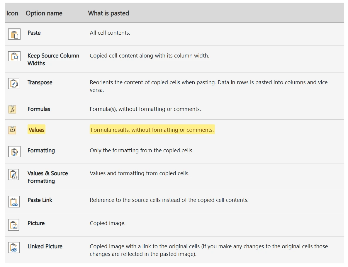
- Use Paste Special → Values to place the finished text in A2 downward on the export sheet.
- Leave every other column on that export sheet empty.
- Make the export sheet active and save it as a CSV.
Microsoft documents both pasting calculated results as values and saving a worksheet in CSV format. Keep the original workbook separately so you retain the formulas and editable style instructions.
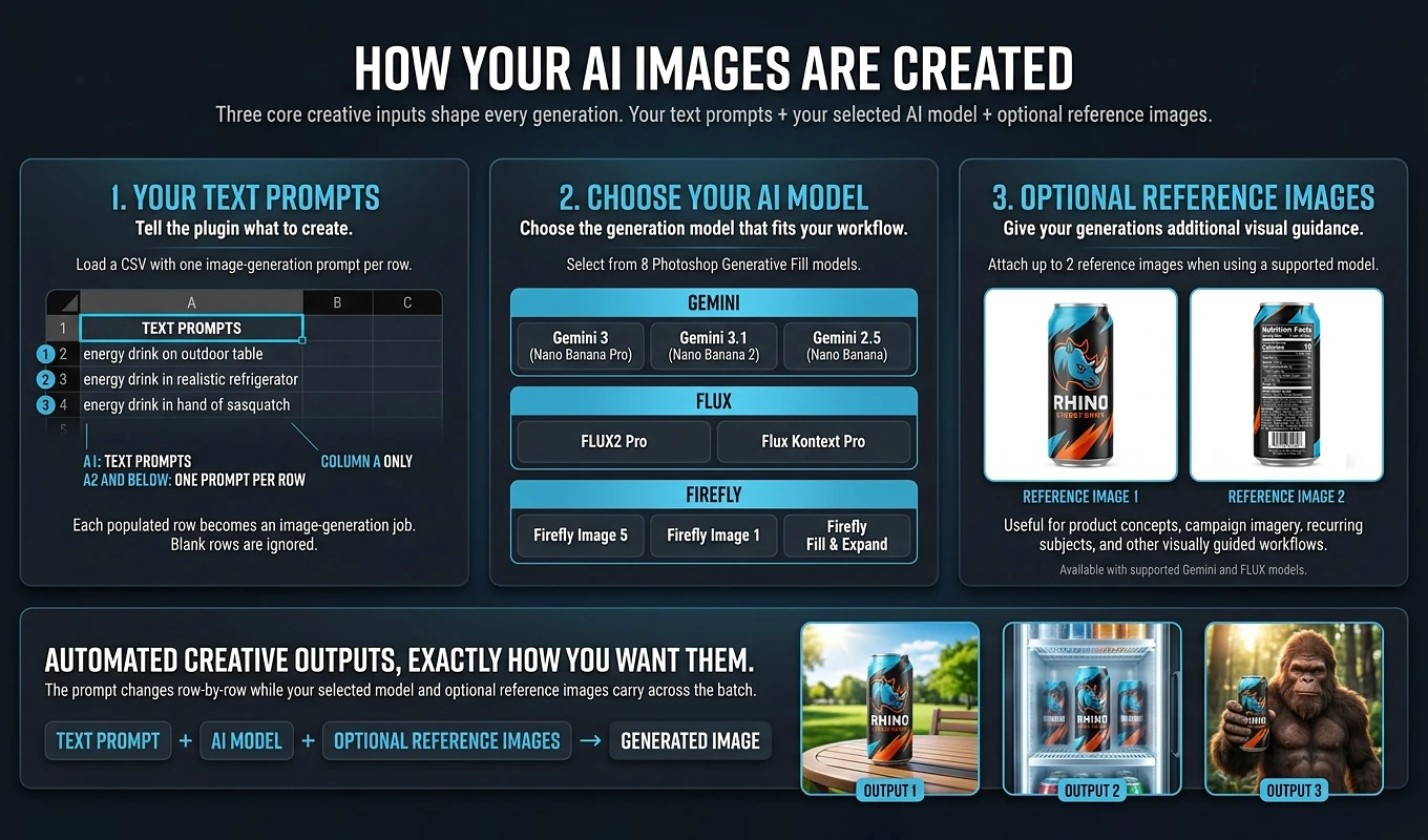
That single-column CSV is also the structure required by Bulk AI Image Creator: TEXT PROMPTS in A1, with finished prompts below it in Column A. Your planning workbook can contain many columns; the generation CSV should not.
Review a few exported prompts before proceeding. Look for accidental contradictions, missing spaces, or scene descriptions that introduce a different aesthetic.
Stress-test the recipe before you scale it
Do not approve a style after seeing it work on one easy subject. Test whether the recipe survives the range of material you actually need.
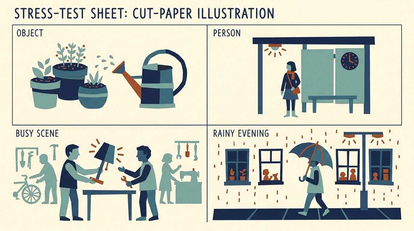
For the city guide, try four deliberately different scenes:
- A simple object-focused image: a watering can beside herb pots.
- A person-focused image: someone waiting at a bus stop.
- A busier scene: neighbors exchanging items at a repair café.
- A difficult variation: a rainy evening street scene.
The last example tests whether the model can depict evening without abandoning the ivory background and flat graphic treatment. If it cannot, clarify how evening should be represented within the illustration system before generating the rest.
Keep the model and version, reference images, output shape, and available style settings stable during this test. Change one meaningful variable at a time. Compare how many results satisfy the brief, not merely which setting produces the single most impressive image.
If your tool exposes a seed, use it as a testing aid rather than your main consistency strategy. Midjourney’s seed documentation explicitly distinguishes controlled experiments from saving a style or character across different prompts.
Approve the production recipe only after it works across several kinds of scenes. Any subsequent model change deserves another small validation round.
Use Midjourney’s style and subject references for different jobs
Midjourney separates aesthetic guidance from subject-reference workflows. Choosing the right mechanism matters more than adding more descriptive words.
Use Style Reference for the visual treatment
Midjourney Style Reference guides qualities such as color, medium, texture, and lighting rather than copying a particular person or object.
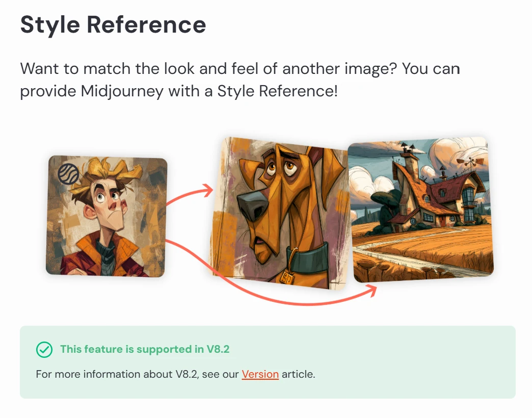
On the website, place the approved image in the Style Reference area and use the lock control to keep it attached for subsequent prompts. In Discord, use --sref followed by the reference image URL.
The --sw parameter controls style influence, with a documented range of 0–1000 and a default of 100. A useful experiment is to compare 100, 250, and 500 on the same test subjects, then retain the setting that best follows your brief.
Keep the accompanying text focused on the scene. Add style descriptors when they clarify the reference, not when they pull against it.
Use the current subject-reference workflow for recurring assets
As of October 2026, Midjourney’s version documentation lists V8.2 as the default. This matters because older character-consistency tutorials describe different controls.
For V8.1 and V8.2, the Edit Model supports up to four reference images through the Attach to prompt area and can work alongside Style References. Use it when you need to bring a recurring character or object into a new scene.
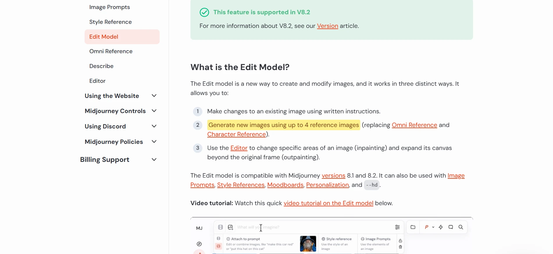
Older V7 workflows use Omni Reference, with one reference image and the --oref parameter.
Keep the distinction clear: “render this new subject in the approved aesthetic” and “depict this same character again” are related requests, but they are not the same request.
Translate the same reference strategy into Firefly or ChatGPT
The underlying method transfers between tools, but the controls do not transfer word for word.
Firefly: separate appearance from arrangement
In the Firefly web app, Style Reference controls let you supply an image to guide the aesthetic and adjust its influence with a Strength slider.
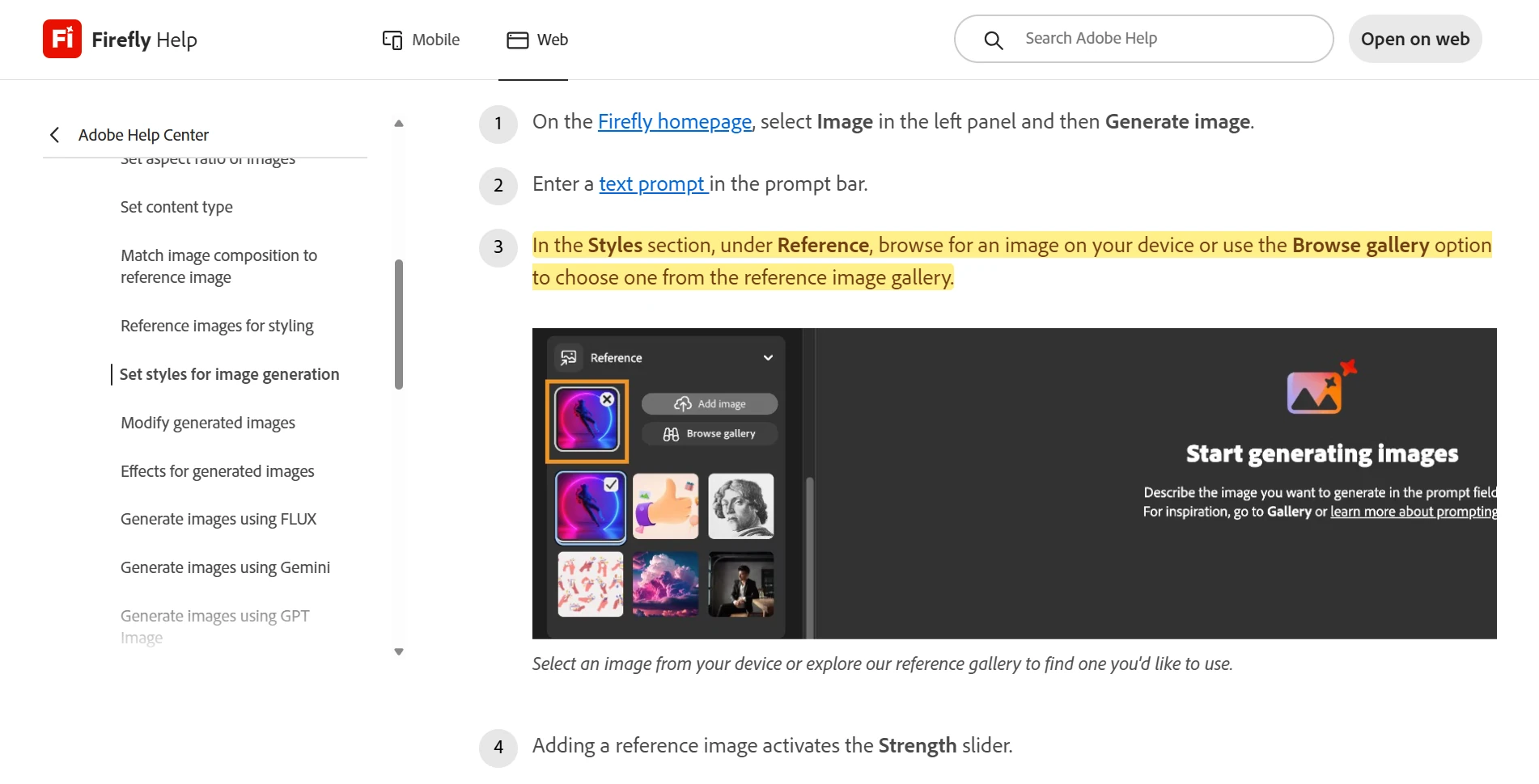
Firefly also documents a separate Composition Reference workflow for guiding structure and arrangement.
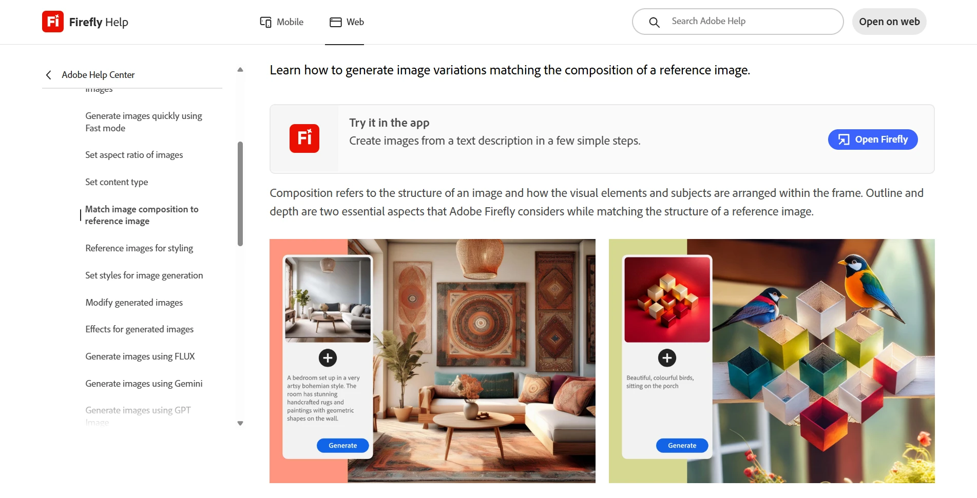
Use the distinction deliberately. If you want different scenes that share an illustration treatment, begin with style guidance. If every image also needs a similarly positioned subject and clear heading space, test composition guidance separately.
Check which controls the selected model exposes rather than assuming every model within Firefly—or every Photoshop workflow—has identical reference options.
ChatGPT: explain the relationship between attachments
OpenAI’s image-creation guidance recommends identifying uploaded images by order and explaining how they relate. It also recommends specific instructions about what should change and what should remain.
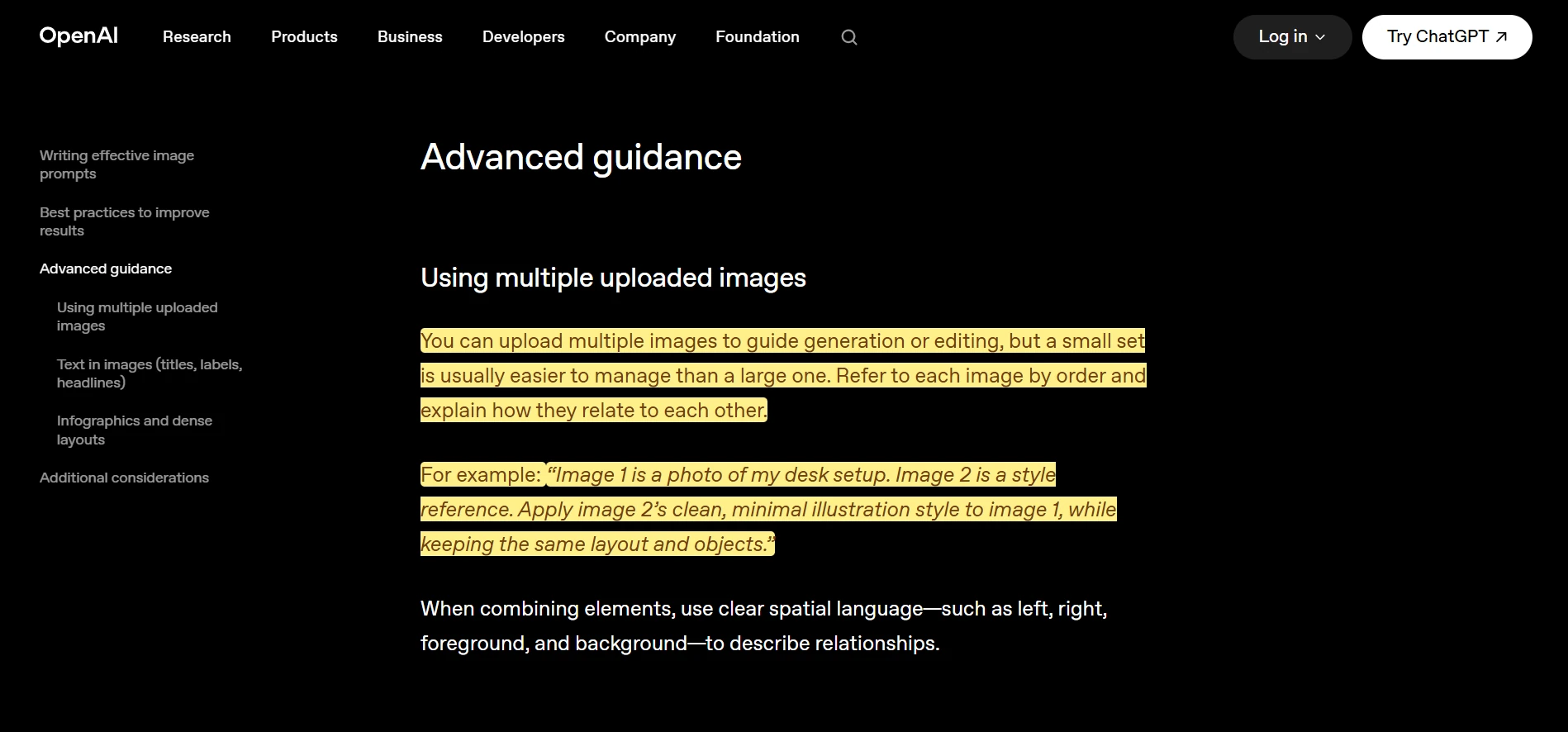
For example:
“Image 1 establishes the illustration treatment: flat paper shapes, restrained grain, ivory background, and navy-teal-rust palette. Image 2 shows the courier character. Create a new scene of that courier waiting beside a bicycle outside a café. Retain the character’s short dark hair, round glasses, and teal jacket. Use the visual treatment from image 1.”
For a correction, narrow the request:
“Adjust only the orange background to the approved warm ivory. Preserve the scene arrangement, character design, and paper texture.”
Whichever interface you use, keep the approved reference and style brief available. Do not make “same style as before” your only production instruction.
Carry approved references and prompt language through a Photoshop batch
Once the style works, the next challenge is applying the same recipe across the complete prompt list without repeatedly rebuilding it.
Bulk AI Image Creator: Batch Generative Fill fits this stage of a Photoshop workflow. It processes a CSV of prompts sequentially through Photoshop’s Generative Fill functionality, using one selected model and one set of batch-wide generation settings.
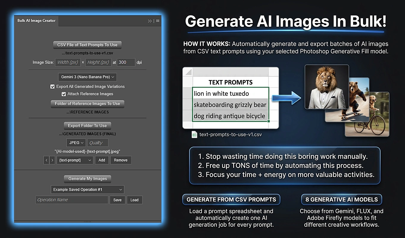
For visual consistency, its particularly useful combination is shared reference imagery plus fully prepared prompt text. You can assemble every prompt with the same spreadsheet-based style block, then supply the same visual references throughout the batch.
- Validate a small group of prompts using your approved aesthetic.
- Prepare the final single-column CSV, including the complete style and reference-use instructions in each prompt.
- Choose a reference-compatible model, such as Gemini 3 (Nano Banana Pro) or Flux Kontext Pro.
- Enable Attach Reference Images and select a folder containing one or two supported reference images.
- Set consistent target dimensions and choose the export folder.
- Run the batch after reviewing the settings and accepting the required Generative Credits acknowledgement.
The same reference set is supplied across the prompts in that operation. A reference might establish the overall aesthetic, while another supplies visual context for a recurring character or asset.
Explain those intentions in the prompts. For example: “Borrow the palette and flat paper treatment from the attached balcony illustration; use the attached courier design for the person.” These are instructions to the model, not separate style and character controls in the plugin.
Reference support depends on the selected model; the plugin’s Firefly choices do not use this reference-image workflow.
Leaving Export All Generated Image Variations enabled lets you review the available alternatives and choose the most cohesive result for each scene. The plugin exports however many variations Photoshop actually returns, rather than assuming a fixed count. Including the prompt and model in filenames helps keep those candidates identifiable.
For recurring work, Saved Operations can restore the model, reference-folder selection, dimensions, and export configuration. The plugin automates repetition; your approved references, prompt framework, and selection criteria provide the art direction. Generation still runs through Photoshop and can consume Adobe Generative Credits.
Treat characters, products, and logos as identity problems
A style reference alone is not a complete specification for a recurring character. If the guide introduces a courier mascot, define its identity separately from the series aesthetic.
A compact character specification might include short dark hair, round navy glasses, a teal jacket, rust-colored shoes, and a particular body proportion. Decide which traits are essential and which can change with the scene.
Use a clear reference that makes those essential traits easy to inspect. When evaluating a new image, review identity and style independently: the right jacket color does not compensate for the wrong illustration treatment, and the right illustration treatment does not compensate for an unrecognizable character.
For products, identify the distinctive geometry, materials, component placement, and markings that must survive. Prompt for those explicitly rather than relying on “same product.”
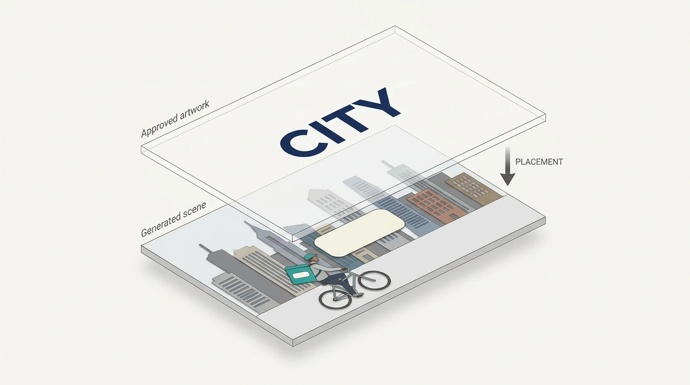
For an exact logo, label, or piece of typography, make a different production decision: preserve and place the approved asset rather than asking the image generator to redraw it in every scene. Generate the surrounding image with an appropriate clear area, then add the original artwork as a separate design element.
This is especially important when a near-match is not acceptable. Reference imagery can guide integration, but approval should be based on the result, not on the fact that the correct file was attached. Midjourney’s Omni Reference documentation, for example, specifically notes that intricate details such as clothing logos may not match perfectly.
Approve the images as a collection
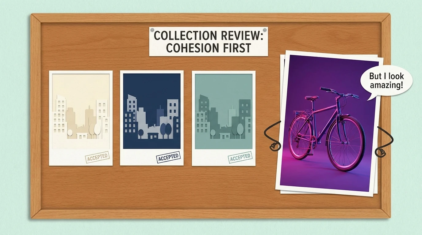
Reviewing candidates one at a time encourages you to choose the most attractive image for each prompt. Those individual winners may form a surprisingly inconsistent set.
Instead, arrange shortlisted candidates in a grid alongside the anchor reference. Keep them at a comparable display size and inspect the collection in two passes.
First pass: thumbnail coherence
Look at the overall rhythm before examining details:
- Does one image have a much darker background than the rest?
- Does the accent color suddenly dominate one scene?
- Are some compositions airy while others feel packed?
- Does one image appear glossy or dimensional beside flat illustrations?
- Is the subject scale broadly compatible across the intended layouts?
Second pass: close inspection
Check texture, edge treatment, facial simplification, object construction, identity, and any unwanted lettering.
For a lightweight review system, rate medium, palette roles, texture, detail level, and layout as pass, adjust, or reject. These are proposed editorial categories, not a universal quality score. A beautiful image in the wrong medium should still fail.
Keep scene correctness separate from style correctness. An illustration can perfectly match the series while depicting the wrong activity.
Record specific rejection reasons in the working spreadsheet. “Too much realistic shading on the bicycle” produces a useful correction. “Doesn’t feel right” does not.
The best choice is the candidate that performs its job within the collection—not necessarily the candidate you would select as a standalone portfolio image.
Repair the specific kind of drift you actually have
Different failures need different interventions. Rewriting the entire style prompt every time makes it harder to identify which part of the recipe needs attention.
If the palette is wrong but the rendering is right
Clarify color roles first: “Keep the background warm ivory; use rust only for small accents.” If the deviation is modest, finish it with a controlled color correction rather than discarding a strong composition.
Photoshop’s adjustment layers provide nondestructive controls such as Curves, Hue/Saturation, Color Balance, and Selective Color. Use them to bring accepted images toward the same finish, while retaining the ability to revise the corrections.
If the medium has changed
A glossy 3D bicycle is not a color problem. Remove conflicting scene language and strengthen the rendering instruction: “Flat overlapping paper shapes, without modeled volume or realistic reflections.”
For the rainy evening scene, specify how the idea should be represented: “Suggest evening with navy window shapes and a few rust light accents; retain the ivory background and flat graphic lighting.” That keeps the subject from redefining the aesthetic.
If the reference’s scene keeps appearing
Make the division between reference and subject explicit. Ask to borrow palette, texture, and shape construction while depicting the new activity. In tools with dedicated reference categories, check that the image is assigned to the intended category rather than a layout-oriented control.
If one local detail is wrong
Prefer a targeted correction when the rest of the image already fits. Identify the part to change and restate the approved properties to preserve.
Do not quietly expand the style brief to accommodate every attractive outlier. If an outlier suggests a genuinely better direction, test it as a new version of the series rather than mixing it into the existing one.
Save the recipe so the next batch still belongs
A finished collection is only half the deliverable if you expect to create more images later. Save the production decisions that made it coherent.
A practical style package should contain:
- The approved anchor image and any additional production references.
- The written style card and actual palette swatches.
- The reusable style block and reference-use instructions.
- The editable prompt workbook and a dated copy of the exported CSV.
- The model name, version where available, output dimensions, and relevant settings.
- A small approved image set showing different subjects in the same treatment.
- Rejected near-matches with short explanations.
- Any finishing adjustments needed for the approved look.
Give the package a version name, such as city-guide-v1. When the model, reference, or aesthetic changes, create a new version and run the stress test again.
Also avoid replacing the anchor with whichever new output looks most exciting. Compare proposed changes against the established collection first. Otherwise, the target can shift gradually while each individual decision seems reasonable.
The practical formula is straightforward: define the visual rules, demonstrate them with a strong reference, reuse the same instructions, test difficult subjects, and approve the results together. The goal is not merely twelve attractive images. It is twelve images that belong together—and a saved recipe for making the thirteenth.