How To Make Already-Taken Photography Images Look Better
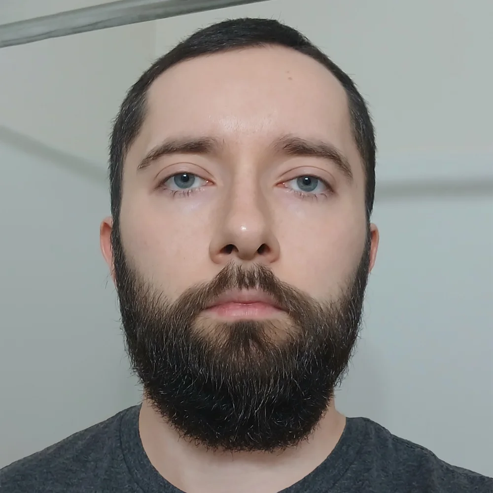
Most already-taken photos improve more from correcting light, color, and distractions than from adding a dramatic filter. Start with the best available original, make the subject easier to see, reduce distracting noise, and apply restrained sharpening. Enlarge the image only if it lacks enough pixels for its intended use.
The important distinction is between improving the photograph’s presentation and recovering information that was never captured. A dark face, an orange color cast, or an awkward crop can often be improved. Completely missed focus and missing highlight detail require more realistic expectations. Here is a practical way to decide what your photo needs—and make those changes without making it look overprocessed.
1. Start with the best file, not the most powerful filter
Find the original before trying to rescue a copy
Before editing a photo downloaded from a message, social post, or screenshot, look for the original camera or phone file. Ask the person who took it to send the original as a file, or retrieve it from the photo library or backup. Compare pixel dimensions rather than assuming the largest file in megabytes is necessarily the best version.
If the photograph is stored in iCloud, Apple’s guide to making copies of your iCloud photos explains how to download unmodified originals. That is particularly useful when you want to start again without an earlier crop or filter.
Keep the original untouched and create a separate working version. If you have several frames of the same moment, compare them before committing to a rescue: a neighboring frame with better focus or a more natural expression may be a stronger starting point.
Identify the problem at two viewing sizes
First, fit the image on screen and ask what makes it feel disappointing. Then inspect it at 100% zoom, especially around eyes, hair, fabric, and smooth shadow areas. Use these clues to choose your first adjustment:
- The whole photograph feels too dark or bright: start with exposure.
- The face is dark but the surroundings look fine: use a local brightness adjustment.
- White or gray objects look orange, blue, green, or magenta: check white balance.
- The subject gets lost among bright objects or excess empty space: revisit composition and distractions.
- Shadows contain colored speckles or grain: reduce noise before final sharpening.
- The image looks acceptable small but breaks down when enlarged: investigate pixel dimensions rather than simply increasing sharpness.
Choose one main problem first. If you simultaneously increase contrast, saturation, clarity, and sharpening, it becomes difficult to tell which adjustment helped and which introduced a new problem.
Use an editor that matches the job
You do not need a specialist enhancement tool for every correction. These are useful starting points for the non-specialist parts of the workflow:
- For phone editing, Snapseed provides tonal adjustments, white balance, selective editing, and healing tools. It is a useful option when the photo needs several small corrections rather than one heavy preset.
- For a free desktop RAW workflow, RawTherapee is a cross-platform RAW processing application. Consider it when you have camera originals and want substantial control over their development.
- If you already use Photoshop, Adobe Camera Raw lets you develop camera RAW files before opening them for further editing. Lightroom is another practical route for organizing and adjusting a photo collection.
Use the editor you can operate confidently. For a single family photograph, a careful phone edit may be more useful than installing a complicated desktop workflow.
2. Fix the light and color before adding a style
Correct the color cast without removing the atmosphere
Start with white balance if the color is obviously wrong. Temperature adjusts the warm-to-cool balance; Tint addresses the green-to-magenta balance. If your editor has a white-balance eyedropper, try a genuinely neutral gray or white area that still contains visible detail—not a blown-out reflection.
Then judge the result by the important subject. A room wall may be cream rather than white, and a shirt may reflect colored light. Treat the eyedropper result as a starting point, not a verdict.
Adobe’s Camera Raw color-adjustment guide explains another important distinction: RAW white balance can be reinterpreted during development, whereas JPEG and TIFF corrections approximate a change to color that has already been applied. You can still improve a JPEG, but extreme corrections deserve closer inspection.
Do not automatically neutralize every warm photograph. Sunset light, candlelight, and evening interiors can be part of the picture’s appeal. Aim to remove an unwanted cast while retaining the mood you want the photograph to communicate.
Separate overall brightness from bright and dark regions
In editors with separate tonal controls, a useful starting sequence is:
- Adjust Exposure until the main subject has a believable overall brightness.
- Lower Highlights if bright areas contain detail you want to reveal.
- Raise Shadows only enough to make important dark areas readable.
- Adjust Whites and Blacks to restore a convincing tonal range.
- Reassess contrast after those changes rather than increasing it automatically.
Lightroom Classic’s tone and clipping guide explains these controls and the histogram’s highlight and shadow warnings. Clipping warnings are useful, but the goal is not to eliminate every warning. A lightbulb or tiny sun reflection may reasonably be white; important texture in a wedding dress deserves more protection.
Watch for a common mistake: lifting every shadow and darkening every highlight until the scene looks evenly lit. Try leaving some depth in the shadows. A night photograph does not need to resemble midday to look better.
Know when highlight recovery has reached its limit
A bright preview does not necessarily mean the original RAW data is irretrievably lost. Try lowering highlights and exposure before giving up. But if the recorded area contains no usable tonal variation, an exposure adjustment cannot reveal the original texture. Turning a featureless white sky gray is not the same as recovering clouds.
When recovery fails, improve the photograph around the limitation. You might crop away some empty sky, prioritize the person rather than the window behind them, or accept a bright background as part of the composition.
Add color selectively
After exposure and white balance look right, decide whether the photograph actually needs more color. Try a small Vibrance adjustment before a large Saturation increase. Watch skin, foliage, and strongly colored clothing as you work.
If one color is distracting, reduce that color rather than desaturating the whole image. A bright red object behind a person may need less saturation even while the rest of the photo benefits from slightly richer color.
For a photograph with difficult mixed lighting, also try a black-and-white version. It can simplify a distracting color relationship, provided the subject still separates clearly from the background. It is a creative alternative—not a cure for blur or missing detail.
3. Make the subject easier to notice
Crop for a clearer photograph, not a composition rule
Before retouching, test whether a modest crop solves the problem. Ask what each edge contributes. An empty strip of pavement, half-visible person, or bright doorway may be drawing attention away from the moment you wanted to preserve.
Try two versions: one close to the original framing and one that removes the most distracting edge. Compare them at the same display size. Keep enough context to explain the scene, and avoid trimming hands, feet, or meaningful objects merely to force the subject onto a “rule of thirds” intersection.
Choose the destination’s aspect ratio early if it matters. An 8-by-10-inch print and a square profile image require different framing. Make that decision before investing time in details that will later disappear outside the crop.
Brighten the subject instead of the entire scene
A backlit portrait often needs a brighter face, not a brighter photograph. Use a soft brush or subject mask to make a small local exposure adjustment. For example, test an increase of +0.2 EV, compare it with the unedited version, and continue only if it helps. That is a trial value, not a universal portrait setting.
Lightroom Classic’s masking guide shows how to apply adjustments with subject selections, brushes, and gradients. These tools let you correct a particular area without applying the same treatment everywhere.
Inspect the boundary of the adjustment. Hair, shoulders, and tree branches should not acquire a bright outline. If the subject appears pasted into the scene, reduce the adjustment or refine its transition.
The reverse can be equally useful: gently darken an irrelevant bright corner or reduce the saturation of a distracting background object. Sometimes the subject does not need more enhancement; its surroundings need less emphasis.
Remove small distractions, then stop
Dust spots, a small piece of litter, or a temporary blemish can be worth cleaning up. Use healing or cloning in small areas and inspect the replacement texture. Adobe’s spot-healing tutorial demonstrates how sampled detail is blended into a repaired area.
Watch for repeated patterns, smeared edges, and a patch whose brightness does not match its surroundings. One clean repair is better than several ambitious removals that leave obvious traces.
For portraits, distinguish a temporary blemish from a defining feature. Preserve skin texture and recognizable characteristics unless the person specifically wants a different treatment. For documentary photographs or accurate product images, avoid edits that misrepresent what was present.
4. Clean up noise and sharpen only useful detail
Do not confuse grain, softness, and missing focus
Noise reduction and sharpening solve different problems. Noise reduction aims to make distracting speckles or grain less visible. Sharpening increases edge contrast so existing detail appears more defined. Neither should be treated as an unlimited repair for a badly focused photograph.
Adobe’s sharpening overview explicitly notes that sharpening cannot restore missing detail or fix out-of-focus areas. That distinction prevents a lot of wasted editing: if eyelashes were never resolved, increasingly strong sharpening may make their blurred outline more conspicuous rather than recover them.
Also ask whether the softness is intentional. A smooth, out-of-focus portrait background generally does not need to be made crisper.
Reduce distracting noise without erasing texture
Inspect both a smooth area and an area containing real detail. Colored speckles call for color-noise correction; grain-like brightness variation calls for luminance-noise reduction. Increase the relevant control gradually, then check hair, fabric, and skin for excessive smoothing.
Adobe’s noise-reduction tutorial demonstrates the distinction and the trade-off: stronger smoothing can remove fine detail. Your stopping point should be “the noise no longer distracts,” not necessarily “every pixel is perfectly smooth.”
Recheck noise after substantially brightening a dark photograph. Make the final sharpening decision after this cleanup, not before it.
Judge sharpening by edges, not slider numbers
For final output sharpening, work on the image at its intended pixel dimensions. Examine a meaningful edge—an eyelash, a clothing seam, or a building detail—and a smooth area nearby.
In Unsharp Mask, Amount controls strength, Radius controls the width of the sharpening effect, and Threshold helps determine which tonal differences receive it. Start modestly and change one control at a time. If you see bright rims, dark outlines, gritty skin, or exaggerated speckles, back off.
Check both 100% zoom and the intended viewing size. Pixel-level inspection helps reveal defects, but the photograph still needs to look natural when someone actually views it.
Apply a tested sharpening treatment across a folder
When a collection already has its exposure, color, and framing corrected, Bulk Image Sharpener: Automated Sharpening can handle the repetitive final sharpening and export in Photoshop. It supports both Unsharp Mask and Smart Sharpen, including Smart Sharpen’s noise-reduction and shadow/highlight controls.
Its targeting options are particularly relevant to photographs. You can sharpen the entire image or concentrate the additional sharpening on Photoshop’s detected subject or background. Subject-only processing keeps the complete merged image underneath and sharpens a copied subject layer above it; it does not remove the background.
There is an important safeguard to understand: if subject detection fails, the plugin falls back to whole-image sharpening for that file. Review the results when selective sharpening is essential. Whole-image and subject/background workflows also merge visible source layers in the working document, so a layered export does not automatically retain the original layer stack.
For mixed-resolution collections, the optional Scale Radius To Image Size setting uses a 1000-pixel longest-edge baseline. A configured 0.5-pixel radius becomes 0.5 pixels on a 1000-pixel-long image and 1.5 pixels on a 3000-pixel-long image. With Smart Sharpen, the main, shadow, and highlight radii all scale; Amount and other non-radius settings remain unchanged.
That is a way to adapt sharpening geometry, not a guarantee that every photograph needs the same treatment. Test a small folder containing a portrait, a textured scene, and a noisy image before processing the collection. The plugin exports separate derivatives and closes source documents without saving, preserving the originals.

5. Upscale only when the image is too small
Calculate the pixels you actually need
A photograph can look better without becoming larger. Before enlarging it, identify the destination: a phone screen, website, album page, or print.
For print planning, multiply the physical dimensions by the requested pixels per inch. At a planning target of 300 ppi, an 8-by-10-inch print needs 2400 by 3000 pixels. Treat that as an example, not a universal requirement; follow the printer’s guidance for the size and viewing conditions.
Adobe’s explanation of image size and resampling clarifies why changing resolution metadata is not the same as adding pixels. Setting a file to “300 DPI” without resampling does not create additional image detail.
If your cropped photograph already meets the destination’s requirements, skip enlargement. If it measures 1200 by 1500 pixels and you need 2400 by 3000, a 2× enlargement is the relevant operation—not an arbitrary 4× enlargement because a bigger number sounds better.
Choose conventional enlargement or a carefully reviewed AI result
Bulk Image Upscaler: Batch-Enhance Resolution automates enlargement and export for folders of images in Photoshop. Its useful distinction for existing photographs is that it offers two different routes:
- Traditional Photoshop resampling methods support custom enlargement from 1.1× to 25.0×. These are useful when you need a specific multiplier, such as 1.5×, or want a conventional, non-generative workflow.
- Firefly, Topaz Gigapixel, and Topaz Bloom methods provide fixed 2× or 4× AI workflows through Photoshop’s Generative Upscale functionality. These require Generative Credits acknowledgement and use AUTO DPI.
For photographs containing people, Gigapixel includes optional Face Detail Recovery. Bloom exposes a Creativity setting from 0 through 10. Test the relevant options on representative images rather than assuming the most dramatic result is the most faithful one.
Evaluate AI enlargement for recognizable features and accurate content. Inspect faces, lettering, jewelry, fine patterns, and object boundaries. Reject an output that changes something important, even if its texture initially appears more impressive. Newly generated-looking detail should not be treated as evidence of what the camera originally recorded.
Account for model limits and avoid double sharpening
The plugin automatically handles AI output-size limits. An oversized 4× request can become the corresponding 2× operation; if 2× still exceeds the model’s limit, the source is proportionally reduced just enough to fit before the AI enlargement.
Consequently, a selected 4× method does not guarantee dimensions four times those of every original. Check the actual exported dimensions. The plugin’s filename components can record the effective scale factor and final width and height, which helps identify how mixed-size files were processed.
Bulk Image Upscaler also offers an optional post-upscale Unsharp Mask pass. Use that when a simple final sharpening treatment is enough. If you need Smart Sharpen or subject-specific treatment, leave that pass off and use Bulk Image Sharpener afterward. Do not apply two strong sharpening passes merely because both options are available.
Compare an enlarged result and its original at equivalent displayed sizes, as well as inspecting the output at 100%. Comparing both at 100% changes the apparent size of the subject and can make it difficult to judge the actual improvement.
6. Build a finish that survives sharing or printing
Use a repeatable sequence, with room for judgment
A practical workflow for an existing photograph is:
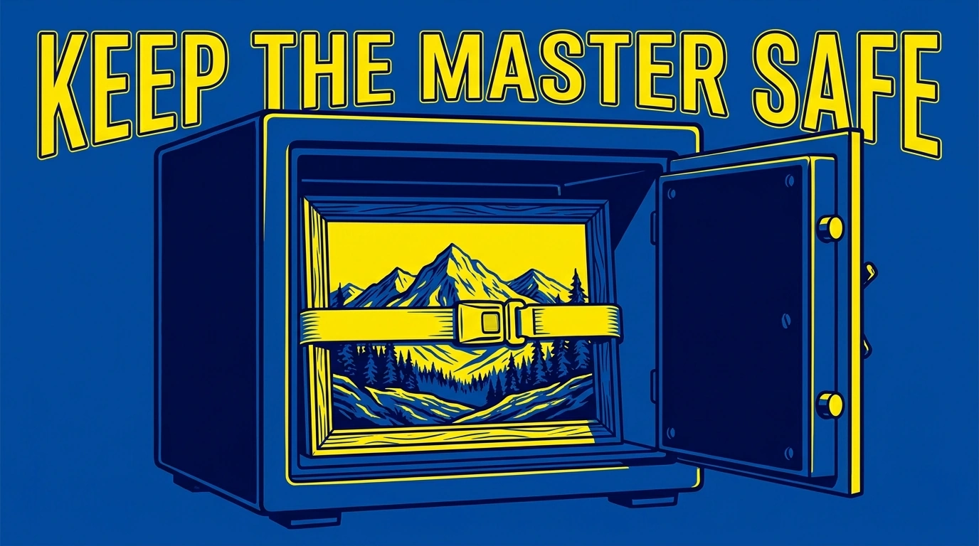
- Retrieve the best original and preserve an untouched copy.
- Choose the intended destination and make any necessary framing or geometry corrections.
- Correct white balance and overall exposure.
- Make local subject adjustments and remove small distractions.
- Reduce distracting noise while preserving useful texture.
- Set the delivery dimensions, enlarging only if necessary.
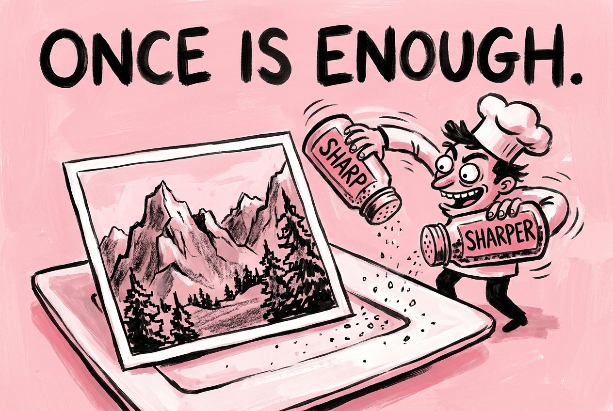
- Apply restrained final output sharpening and export a separate delivery file.
This is a decision sequence, not a requirement to move every slider. A well-exposed photo might need only a crop and a small local correction. A noisy night image may benefit more from restrained cleanup than from additional contrast.
For the two Photoshop plugin workflows, first export RAW or HEIC sources to a supported format such as TIFF. Keep corrected masters, enlarged outputs, and final sharpened deliveries in separate folders. These are separate operations: deliberately select the previous operation’s export folder as the next operation’s source when you want to chain them.
For a recurring collection, save a proven plugin operation after testing it. Still review representative outputs from each new batch; a saved setting cannot know whether the next collection contains noisier files or very different subjects.
Export for the destination rather than maximum numbers
For ordinary web sharing, sRGB is a practical compatibility choice. Adobe’s online color-management guide explains how to convert an existing Photoshop image to sRGB. Convert the delivery copy rather than changing your master simply because you need one web version.
Choose a file format and quality setting appropriate to the destination, then inspect the actual exported file. Photoshop’s export guide explains its quality, color-conversion, and embedded-profile options.
For a print, follow the lab’s requested dimensions and color-profile instructions. If the photograph matters enough to print large, consider a small test print before committing to the final size. For web delivery, open the exported image on the device where it will usually be seen—not just inside the editor.
Know when to stop
Before calling the photograph finished, compare it with the original at the same viewing size. Ask:
- Is the main subject easier to understand or notice?
- Do skin, neutral objects, and important colors look believable?
- Have shadows and highlights retained appropriate depth?
- Are there halos, smeared textures, repeated healing patterns, or altered features?
- Does the improvement remain visible in the exported file at its intended size?
If you are unsure about an adjustment, temporarily disable it. Keep it only if the photograph becomes meaningfully worse without it. This is especially useful for heavy clarity, saturation, and sharpening treatments that can feel impressive while you are moving the slider.
The best way to make an already-taken photograph look better is to solve its specific problems in a sensible order. Recover the best source, correct the light and color, simplify distractions, protect real texture, and finish for the actual destination. Use enlargement and batch sharpening where they address a genuine need—not as substitutes for those more important decisions.