How To Optimize Website Images for Speed Without Making Them Look Terrible

The fastest way to ruin website images is to give every file the same aggressive compression setting and hope for the best. The fastest way to waste bandwidth is to keep oversized, maximum-quality exports because you are afraid of doing exactly that.
A better approach separates three decisions: how many pixels the image needs, how much compression its content can tolerate, and how the browser should load it. Get those decisions right, and you can remove unnecessary weight without sacrificing the details visitors actually notice.
The goal is not the smallest possible file. It is the smallest file that still does its job: making a product look trustworthy, keeping a photograph appealing, preserving readable information, or supporting the page’s design.
1. Find Out Whether the Problem Is Bytes, Pixels, or Delivery
Before lowering quality, examine a representative page—not just a folder of exports. Start with your homepage, an image-heavy category page, and an important product or article page.
Run each through PageSpeed Insights. Review the mobile results and image-related diagnostics. Identify the Largest Contentful Paint, or LCP, element: the large image or text block whose appearance helps determine when the main content becomes visible.
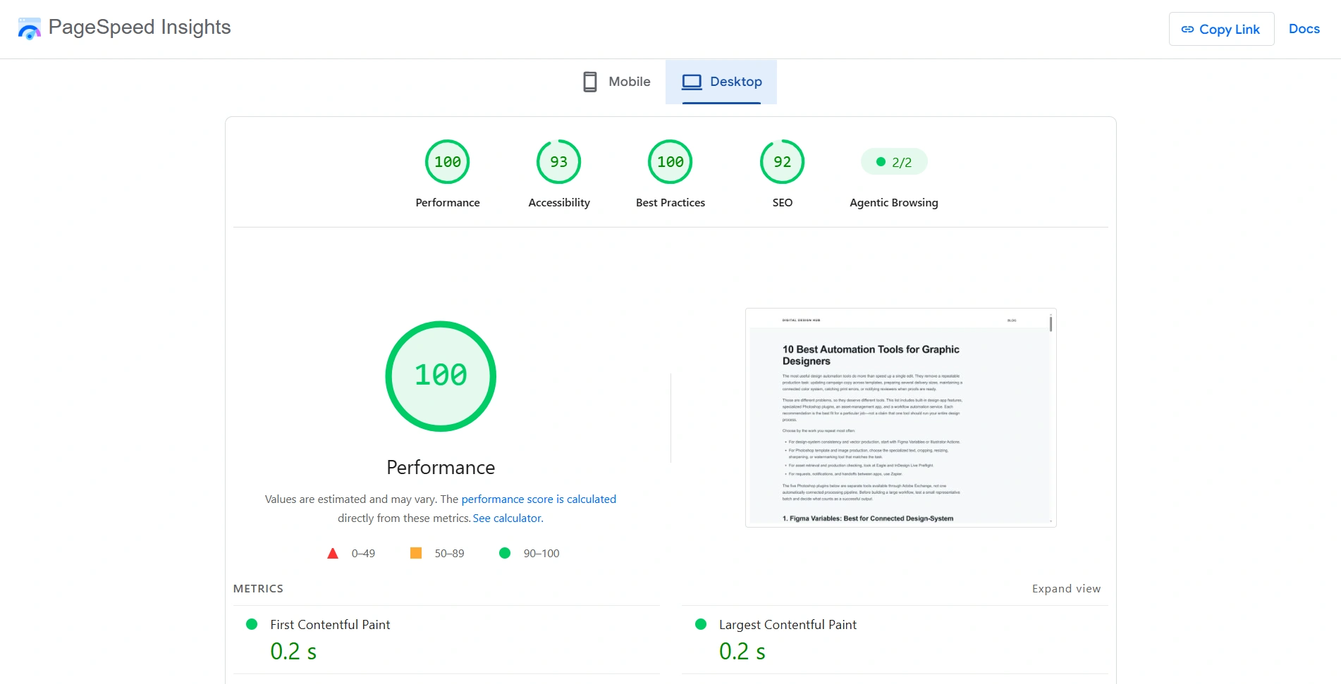
Then use the browser to investigate the actual image requests. The Chrome DevTools Network reference explains the controls for filtering requests, disabling the browser cache, throttling the connection, and sorting by size.
- Open DevTools and select Network.
- Enable Disable cache and reload to examine a fresh visit rather than a cached one.
- Filter to image requests and sort by Size.
- Check the largest files and the image responsible for LCP.
- Repeat at a narrow viewport, then scroll to see which additional images load.
You are looking for different problems that require different fixes:
- A large file at sensible dimensions needs a better format, different compression, or both.
- An image with far more pixels than its display requires needs smaller source dimensions or responsive alternatives.
- A modest-sized hero that starts downloading late needs a loading or discovery fix—not necessarily lower visual quality.
- Dozens of images downloading immediately may need selective lazy loading, even if each individual file is reasonably small.
Set a page budget, not one universal image limit
“Every image must be under 100 KB” ignores how many images appear together and what they need to communicate.
As an illustrative planning exercise, suppose you allocate 300 KB to images needed for the first screen. A 150 KB hero plus three 40 KB cards uses 270 KB, leaving some room for smaller visual assets. That allocation is not a performance standard; it is a way to make competing requirements visible.
A detailed product photograph may deserve more bytes than a decorative background. A catalog grid needs attention to the combined weight of its cards. Decide what the page can afford, then test whether those allocations preserve acceptable quality.
2. Match Image Dimensions to the Actual Viewing Experience
Compression should not compensate for sending unnecessary pixels. If a photograph occupies a small card, visitors should not have to download a full-resolution camera export to see it.
However, “export at the displayed width” is not always sufficient. CSS pixels and image pixels are different considerations on high-density screens. A card displayed at 360 CSS pixels wide may benefit from a 720-pixel source on a 2x-density display.
Use this as a planning relationship:
Required source width ≈ displayed width in CSS pixels × the pixel density you intend to support.
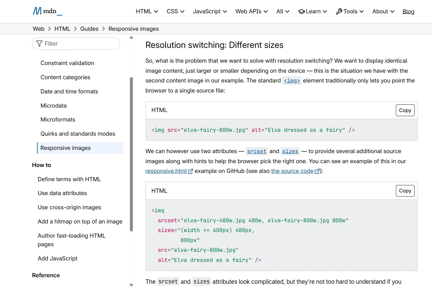
It is a starting point for testing, not a command to provide the largest possible version to everyone. Compare the result on representative devices and provide alternative sizes where appropriate. MDN’s responsive-image guide explains how browsers can choose between sources for different layouts and pixel densities.
Give each image role its own dimensions
- Product cards need enough detail for browsing, not necessarily the resolution required for a zoom viewer.
- Product detail images need to support the largest normal display size.
- Zoomable photography may need a separate, larger asset requested when the visitor opens it.
- Article images should match the content column and the devices on which people read them.
- Wide hero images may need a different composition on mobile, rather than a miniature version of the desktop composition.
That last distinction matters. If the subject becomes tiny on a phone, increasing quality will not solve the problem. Adjust the composition or supply a mobile-specific image.
Also distinguish changing the file from changing its appearance in the layout. Displaying a 4,000-pixel image inside a 400-pixel box does not, by itself, reduce the downloaded file. The browser needs an appropriately sized source.
Prepare these dimension requirements before compression testing. Otherwise, you may spend time finding a quality setting for an image that should have been substantially smaller in the first place.
3. Make WebP Your First Test, but Choose Formats by Content
For many photographic website assets, WebP is a strong first candidate. It can produce lightweight files while retaining convincing visual detail, and it supports transparency as well as lossy compression.
Google’s WebP overview documents support in major browsers and reports smaller lossy files than comparable JPEGs in its published comparisons. Treat that as a reason to test WebP—not a guaranteed saving for every image you own.
The useful comparison is not “JPEG quality 80 versus WebP quality 80.” It is “Which version looks acceptable at the required dimensions, and how many bytes does it use?” Quality numbers are not interchangeable promises across formats.
Where WebP is particularly useful
Start with photographs, editorial imagery, banners, and transparent photographic assets. A transparent product image can be a particularly worthwhile test: WebP can compress the image’s color information lossily while retaining an alpha channel, avoiding the assumption that transparency always requires a large PNG.
Check transparent exports against the actual backgrounds used on your site. An edge that looks fine on white may look wrong on a dark product card.
Where another format may be the better choice
- JPEG remains useful for photographic delivery where compatibility with another system or workflow is important. It does not preserve alpha transparency.
- PNG or lossless WebP may be preferable for screenshots, diagrams, or raster graphics when exact reproduction matters more than aggressive size reduction.
- SVG is often appropriate for genuine vector logos and icons. Avoid rasterizing those assets solely to force everything into one format.
- AVIF is another modern option worth evaluating if your publishing workflow already supports it. Test the actual result rather than assuming one format wins every time.
MDN’s image-format guide is useful when deciding between these formats, especially for assets that are not ordinary photographs.
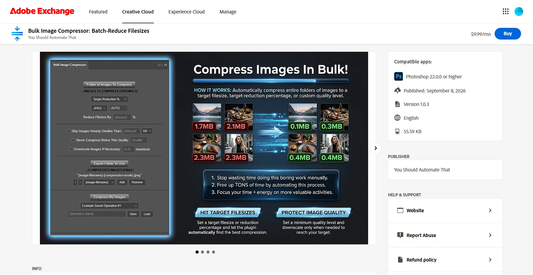
For Photoshop-based production, Bulk Image Compressor: Batch-Reduce Filesizes is a third-party plugin that exports batches as JPEG or lossy WebP. Its WebP pathway can retain transparency where the image and Photoshop’s export support it. It does not export PNG, lossless WebP, or AVIF, so keep assets requiring those formats in a separate workflow.
4. Find Your Quality Floor With a Small, Demanding Test Set
There is no universally correct quality setting. A clean studio photograph, a forest scene, and a softly lit portrait can respond differently to the same compression level.
The practical answer is to establish a tested quality floor for a particular type of image, at particular dimensions, using the encoder you will actually use in production.

Test difficult images, not just flattering ones
Build a small sample folder containing examples likely to expose problems:
- A photograph with fine texture, such as fabric, foliage, hair, or jewelry.
- An image with smooth gradients, such as sky, shadow, or an out-of-focus background.
- A portrait with natural skin detail.
- A product image with crisp edges and small labeling.
- A transparent asset, if transparency is part of the workflow.
Keep the dimensions fixed during your first quality comparison. For WebP, quality values such as 60, 75, and 85 make a useful initial test ladder—not recommended settings for every website. Add intermediate values around the point where visible damage becomes unacceptable.
Record the resulting filesize and a simple verdict: acceptable, borderline, or reject. You are trying to find where additional bytes stop producing an improvement that matters for this use.
Judge the result where visitors will see it
Review each version inside the actual page at its intended display size. Check desktop and mobile, including a high-density screen when that is important to your audience.
Then inspect critical areas more closely. Look for softened product details, unnatural skin texture, visible blocks, rough transitions in gradients, and damaged text edges. Do not make extreme magnification the only acceptance test unless the asset is intended for zooming.
Define what failure means before choosing the smallest file. “The weave of this fabric must remain distinguishable” is a more useful criterion than “quality should be high.”
Use batch exports to make the comparison repeatable
In Bulk Image Compressor, Standard Compression lets you choose one quality from 0–100 and apply it across the sample folder. Run separate tests at your selected quality values, using separate export folders or filenames that include {save-quality} and {width}x{height}.
For WebP, the quality value is used directly on its native 0–100 scale. For JPEG, the plugin maps that scale onto Photoshop’s native 0–12 quality levels. Consequently, nearby JPEG values may map to the same encoder setting; do not expect 101 independently distinct JPEG results.
The plugin creates derivative outputs and closes actively processed source documents without saving changes. Keep using your original source files for new trials, rather than using yesterday’s compressed export as today’s input.
Separate color problems from compression problems
If an export looks washed out or unexpectedly saturated, do not immediately raise its quality. Check color management too. For a conventional sRGB website workflow, Adobe explains how to convert an existing Photoshop image to sRGB using Edit > Convert to Profile.
Prepare color deliberately and verify the browser result. The compression plugin should not be assumed to perform color conversion automatically.
5. Use Target Filesizes Without Giving Compression Unlimited Permission
Once you have tested acceptable quality and dimensions, you can turn those decisions into guardrails. This is where target-based compression becomes more useful than repeatedly guessing export settings.
Bulk Image Compressor offers three distinct strategies. Choosing the right one matters more than selecting the most aggressive option.

Use Standard Compression when a tested quality is the priority
Standard Compression applies one explicit quality across the batch. Choose it when you have a reliable setting for a reasonably consistent group of images and do not need every output near a particular filesize.
Its optional Also Downscale Images By setting applies one fixed multiplier to every processed image before export. For example, 0.5x changes a 3,200-pixel-wide source to 1,600 pixels wide while preserving its aspect ratio.
This is not a “make everything 1,600 pixels wide” setting. Different source widths produce different output widths. Use a fixed factor only when that relationship matches your requirements.
Use Target Filesize when the page has an explicit byte budget
Target Filesize lets you enter a goal in KB or MB. The plugin calibrates each non-skipped source independently: it saves temporary JPEG or WebP candidates, measures their actual filesizes, and uses a binary-search approach to narrow the quality range.
That eliminates much of the repetitive export-check-adjust work. A complicated image can receive a different quality from a simple one while both are being optimized toward the same size goal.
Enable Never Compress Below This Quality using a floor established by your sample testing. For example, if WebP quality 75 was the lowest acceptable setting for a particular product-image group, use that as the lower boundary rather than allowing unrestricted quality reduction.
This protects an encoder setting, not an objectively measured level of beauty. An unusually difficult image can still need individual review even when it respects the floor.

Allow downscaling only as a controlled second step
The target modes try compression quality first. Downscale Images If Necessary is used only when the lowest permitted quality still produces a file above the accepted target range.
When downscaling is needed, the plugin holds that lowest permitted quality and searches for a proportional scale within your allowed boundary. It uses Bicubic Sharper resampling and preserves aspect ratio.
A setting of 0.5x maximum does not force every image to half size. It allows a search between full size and half the original width and height. The actual result might remain at 1x or settle at a scale such as 0.82x.
Choose the boundary from your resolution requirements, not from an arbitrary percentage. If a 2,000-pixel-wide source needs to remain at least 1,600 pixels wide, the corresponding boundary is 0.8x. Allowing 0.5x would permit an output below that requirement.
Because the boundary is relative to each source, group images thoughtfully and check final dimensions. The plugin does not know the CSS width, device density, or zoom requirements of your website.
Understand what happens when the target is impossible
Both target modes treat a result within ±10% of the target as successful. A 500 KB goal therefore accepts approximately 450–550 KB. If the allowed quality and scaling settings cannot reach that range, the plugin saves the closest permitted result it discovered; it does not silently abandon your guardrails.
That is an important distinction between a practical optimization goal and a hard upload limit.
If a system rejects anything above 500,000 bytes, leave margin. The plugin calculates 1 KB as 1,024 bytes. A 430 KB target has an upper tolerance boundary of 473 KB, or 484,352 bytes, when the target range is achieved. Nevertheless, an unreachable-target fallback can still be larger, so verify every file subject to a strict cap.
When an image misses its budget, reconsider the dimensions, composition, format, or budget allocation. Do not automatically lower the quality floor until the image becomes unacceptable.
Use Target Reduction % for proportional cleanup, not uniform web budgets
Target Reduction % calculates a separate target from each source’s original filesize. A 75% reduction means approximately 25% remains: a 4 MB source receives a target near 1 MB, while a 2 MB source receives one near 0.5 MB.
This can be useful when your objective is proportional reduction. It is less directly aligned with a page budget because the starting filesize reflects the source format and encoding, not just the image’s website role. Reducing a large production file by 75% may still leave an unnecessarily heavy web asset.
For a card grid with a defined per-image allocation, Target Filesize is usually the more relevant strategy. For a tested quality recipe without a fixed size goal, choose Standard Compression.
6. Make the Browser Load the Right Images at the Right Time
A well-compressed export can still be delivered badly. These website-side changes are complementary to compression; they do not require making the image look worse.

Connect alternative sizes to the layout
Use srcset to list available source widths and sizes to describe the image’s rendered width. The browser can then select a suitable candidate. Importantly, sizes describes the layout; it does not create that layout. The web.dev guide to srcset and sizes explains this distinction.
For example, this markup assumes a hero displayed at the viewport width minus 32 pixels on screens up to 800 pixels wide, and at 800 pixels on wider screens. The filenames are example assets, and all three versions should share the same aspect ratio:
<img src="/images/chair-1600.webp" srcset="/images/chair-640.webp 640w, /images/chair-960.webp 960w, /images/chair-1600.webp 1600w" sizes="(max-width: 800px) calc(100vw - 32px), 800px" width="1600" height="1000" loading="eager" fetchpriority="high" alt="A linen chair beside a sunlit window">
The width descriptors must match the actual exported widths. If adaptive compression changes an image’s dimensions, update the website’s source information accordingly. Bulk Image Compressor exports files; it does not generate or install responsive website markup.
Do not lazy-load the main hero
Keep the LCP image available in the initial HTML, avoid loading="lazy" on it, and consider fetchpriority="high" for that important image. Do not mark every image high priority. The web.dev LCP optimization guide explains why delayed discovery and rendering can limit the benefit of smaller files.
For images farther down the page, loading="lazy" lets supporting browsers defer requests until the images approach the viewport. Use it selectively, following the browser-level lazy-loading guidance, rather than applying it indiscriminately to everything.
Reserve space before images arrive
Supply correct width and height attributes, or another deliberate aspect-ratio arrangement, while letting your responsive styles scale the image appropriately. This helps avoid content jumping when images load. The guide to preventing layout shifts explains how image dimensions allow browsers to reserve space.
Cache images without trapping visitors on old versions
Ask whoever manages your hosting to configure appropriate caching for static image assets. Long-lived caching works best when changed files receive new, versioned URLs. MDN’s HTTP caching guide covers that pattern.
Compression reduces the cost of obtaining an image. Caching can avoid obtaining the same bytes again. Neither replaces the other.
7. Save the Decisions, Then Verify the Published Result
Once a workflow passes visual review, make it repeatable. The biggest long-term improvement is preventing the next upload from returning to oversized, inconsistent exports.

Save workflows by image role and project
Bulk Image Compressor can save the compression mode, output format, target, quality floor, downscaling settings, skip threshold, filename components, and selected folders as a reusable operation.
Create separate operations for materially different requirements: one client’s product cards, another client’s editorial photographs, transparent assets, or high-detail hero images. Give them names that explain their purpose rather than vague labels such as “Web optimized.”
To restore one, select the saved operation and click Load. The plugin restores its settings and attempts to restore folder access; inaccessible folders must be selected again. You still start the compression operation separately.
Each run applies one configured compression workflow across supported files directly inside the selected folder. Separate groups into appropriate folders and operations rather than expecting the plugin to stack multiple rules or automatically classify website roles.
Use filenames to check what actually happened
During calibration, include {save-quality}, {downscale-factor}, and {width}x{height} in the filename format. Target-mode filenames can report the selected quality and actual scale, rather than merely repeating the maximum downscaling you allowed.
Those values make review easier: you can identify files that reached the scale boundary or check whether output dimensions still meet the layout’s requirements. They are useful records of processing, not proof of visual quality.
Use the skip threshold carefully
Skip Images Already Smaller Than can avoid unnecessary lossy recompression. However, skipped files are copied unchanged: they retain their original format and filename and do not use the compressed-output filename builder.
That is helpful when preserving already-optimized assets. It is not appropriate if every output must be WebP or follow one naming pattern. A small PNG remains a PNG when skipped.
Check the live page, not just the export folder
- Confirm the page requests the new files rather than older assets or different generated derivatives.
- On fresh desktop and mobile loads, check the downloaded image widths and transferred sizes.
- Review important details, transparency edges, gradients, and colors in the published layout.
- Confirm the hero loads promptly, offscreen images are handled appropriately, and image arrival does not shift content.
- Repeat performance tests under comparable conditions and compare several runs, not one score.
- Spot-check unusually large outputs and images that reached your quality or scale boundary.
PageSpeed Insights separates simulated lab tests from real-user data. Its documentation explains that field results cover a trailing 28-day period, so they will not instantly reflect a deployment. Use immediate request checks and repeatable lab tests to verify the change, then monitor real-user results over time.
The reliable formula is straightforward: remove unnecessary pixels, test an efficient format, establish an acceptable quality floor, automate within sensible limits, and verify what visitors actually receive. You do not have to choose between a fast website and attractive images—but you do have to define what “good enough” means for each image’s job.